
 How to Teach Color Theory in Middle and High School ArtWhat am I actually hoping my students will learn when I teach color theory? I ask myself this question because I sometimes to get caught up in planning lessons, preparing materials, and managing all the little daily tasks of teaching without thinking about the bigger picture. Of course, I want my students to understand the color wheel, learn how pigments mix, and explore different color schemes. But ultimately, I want them to develop a sensitivity to color that becomes part of how they see the world. In this post, I want to take you through the sequence I use with my classes to develop this deeper understanding. We begin with the color wheel to explore relationships between hues, then experiment with value, saturation, and complementary color mixing to discover how much variety we can create with just a few paints. Each activity builds toward creating a limited palette, where students bring these skills together to select and mix colors that support their ideas and personal style. This sequence helps students understand color theory through practice and gives them more control in their color choices and insight into how artists use color intentionally in their work. What Paint Do I Use for Color Mixing Activities?I like to use acrylic paint for these activities because it is water-based and easy to modify using mediums. There are also affordable brands with good pigmentation that work well for classroom color mixing. In my introductory classes, I use Chromacryl Student Acrylics and provide warm and cool versions of the primary colors. I typically also purchase a gallon of the Block Out White and Black. For my advanced students, I use Utrecht Studio Series acrylic paint tubes, also with warm and cool hues. Having both versions available gives students the opportunity to compare the hues and see how their differences affect color mixtures. For example, I provide ultramarine blue, which leans toward violet, and phthalo blue which leans toward green. Comparing these warm and cool blues helps students see how the particular pigments they choose affect their color mixtures.  How do I teach students to mix a color wheel?I always start with painting color wheels. Painting a color wheel helps students understand relationships between hues and gives them the opportunity to experience the transparency, opacity and tinting strength of pigments. Many of my students come to class having mixed a color wheel before, and I have found that some are a little resistant to painting one again, but since many haven’t painted one since elementary school I’ve found that their level of understanding often doesn’t extend much past “yellow and blue make green.” What I want them to get from this activity is an understanding of the nuances: the undertones they see, the way pigments interact, and how adjusting the proportions of the primary colors creates a visible difference between secondary and tertiary hues. The first concept I explain is “hue,” which I introduce as the name of a color family, such as red, orange, yellow, green, blue, or violet. Referring to rainbow colors gives students a familiar starting point. We also briefly discuss different color systems, including RYB, CMYK, and RGB. I show examples of each to introduce the distinction between mixing pigments (paints) and mixing colored light (screens). I provide students with either a simple color wheel (download here for FREE) or a more complex color wheel that includes tints and shades (includes UK English and Spanish language version). We begin by mixing the primary colors to create secondary and tertiary colors. An important concept to introduce at this point is “tinting strength,” or the power a pigment has to influence another color when mixed. A paint with high tinting strength can change a mixture considerably, even in a small quantity. Phthalo blue is a good example of a color that overpowers lighter hues quickly. Students quickly discover that mixing equal amounts of two primary colors doesn’t necessarily produce the secondary hue they expect. I encourage students to start with the paint that has less tinting strength (often a lighter color) and gradually add the stronger one. When mixing green, for example, we start with a generous pile of yellow and add a tiny amount of blue to create yellow-green. Adding more blue takes the mixture toward green, then blue-green. We use the same approach when mixing orange, starting with yellow and gradually adding red. Students adjust the proportions by observing their mixtures, aiming for a visible difference between the secondary and tertiary hues. As students mix and paint, they also notice differences in transparency and opacity. Some paints allow the paper or printed lines to show through, while others provide more coverage. Mixing paints with different levels of opacity gives students another opportunity to observe how their materials behave. I encourage them to notice both the hue they are creating and how the mixture covers the paper.  Color wheel worksheet with tints and shades. How do I teach hue, saturation, and value?There are three properties of color I want students to understand: hue, saturation, and value. Hue identifies the color family, saturation describes how bold or muted a color is, and value describes how light or dark it is. After exploring hues through the color wheel, students experiment with modifying their mixtures using white, black, or a complementary color to create variety and dimension in their work.  Exploring value with grayscale and monochromatic scalesWith my introductory students, I start with a simple grayscale and monochromatic value scale. We begin with white and slowly add black, working toward a darker gray each time. Then students choose a hue and do the same thing with color, mixing it with white to create tints and black to create shades. I want them to see a clear difference between each step and discover how much variety they can get from just one hue. This also takes some practice with proportions, since a tiny bit of black can change a mixture very quickly. These value scales are actually the first activity I do in my Monochromatic Landscape lesson. Students then apply what they learned from mixing the monochromatic scale to explore atmospheric perspective in a landscape painting.  Spanish-language version of my grayscale and monochromatic value scale worksheet Exploring saturation with complementary color mixingOnce students have practiced mixing tints and shades, we explore other ways to modify value and saturation. I demonstrate this with yellow: adding black to the yellow we use quickly takes the color toward green, while gradually adding violet creates a more earthy, brown mixture. Comparing the two helps students see that darkening a color can also alter its hue. We then try mixing other warm hues with their complements, such as red with green, and compare the results with mixtures made using black. Students also experiment with gray, or with white and a small amount of the complement, to create lighter, muted variations. I want them to discover different ways to modify a color so they can choose the mixture that works for their painting. This activity is included in my Monochromatic Folded Paper Painting lesson, where students apply their complementary color mixing practice to create a full range of values within a limited palette.  Students practice painting value through folded-paper studies and explore how adding white, black, and complementary colors changes a hue. How do I teach students to mix browns, grays, and neutrals?Complementary mixing helps them move beyond bright colors straight from the tube and teaches students how to make desaturated colors, including earthy hues and neutrals. I use a complementary color mixing worksheet (Free download) where students explore orange and blue, red and green, and yellow and violet. We place the original hues at opposite ends of each row, then gradually change the proportions to create the mixtures between them. The challenge is to account for tinting strength while making each step look visibly different. This shows students the range of colors they can mix from their primaries beyond the color wheel, including beautiful earthy colors they can use in their paintings. This practice is also useful when students begin mixing skin tones, where they need a range of muted colors and careful adjustments to value and color temperature. With my advanced students, we explore mixing our own grays and near-blacks. I like to compare ultramarine blue mixed with burnt umber to phthalo blue mixed with burnt umber, then try both blues with burnt sienna. Adding white makes the differences between these mixtures easier to see. We can also build a value scale from each mixture to explore the range of grays it produces.  Complementary color mixing worksheet alongside an advanced student's art journal exploration of neutrals and color mixing How do I introduce color schemes?Learning color schemes, like monochromatic, analogous, triadic, and complementary, helps students recognize how artists organize color and gives them a starting point for creating cohesive palettes of their own. I like to introduce color schemes through still frames from movies, including Wes Anderson films, Amélie, Harry Potter, and Edward Scissorhands. We look at the colors and connect them to relationships on the color wheel: opposites (complementary), neighbors (analogous), evenly spaced hues (triadic), or variations of one hue (monochromatic). Then we discuss how those choices contribute to the mood of the scene. Complementary colors can create contrast, energy, or tension, while analogous colors can create a sense of harmony and cohesion. A monochromatic palette can convey a mood or emotion. Students then explore these relationships through my color scheme worksheets. The basic versions repeat the same composition so students can see how much impact the color scheme alone makes. Some use abstract designs and others use simple landscape outlines. Keeping the composition the same allows students to compare how different color choices change the mood, contrast, and emphasis within an image. I choose the worksheet based on my students’ experience and the lesson. Some explore warm, cool, analogous, and complementary colors, while others focus on monochromatic, triadic, analogous, and complementary schemes. Students apply this practice in my abstract painting lesson focused on color schemes and my Alma Woodsey Thomas inspired lesson, which also incorporates brushstroke exploration.  Abstract painting exercises exploring different color schemes. How do students create a limited color palette?Creating a limited palette brings these skills together, helping students develop a sophisticated range of colors by varying value and saturation within a small selection of hues. In my Creating Color Palettes worksheet, students start with six favorite hues. They then mix variations of each, adding gray or a complementary color to modify saturation, and white or black to modify value. At the bottom of the worksheet, they select colors from these experiments to try out different palettes. I want them to move beyond choosing favorite colors and consider how those colors work together, with enough variety in value and intensity to give them options in a painting.  In my Watercolor Portrait lesson, students use their chosen colors to represent the values they observe in the face. A dark blue mixture might become the deepest shadow, while a light yellow could become the highlight color. This allows students to bring their own color preferences into the portrait and still include the full range of values in the portrait to create a sense of dimension.  Student example from my watercolor portrait lesson using a limited color palette Learning Color Theory Through Practice and PlayColor theory is something artists can explore for a lifetime, but students can begin building their understanding through simple mixing exercises. Each activity gives them more experience to draw on, and so much of that learning comes from playing around with paint, testing mixtures, and noticing what happens.
I got to take a class with watercolorist Alison Frost, whose work I really admire, and she showed us the test swatches from her studio. It was inspiring to see how many tests she makes as part of her own practice. Choosing colors and understanding how pigments react takes experimentation, even for experienced artists. I want my students to understand that those tests are part of making art. If you’re interested in using these activities with your students, I’ve gathered my most-used color theory worksheets into a bundle with US English, UK English, and Spanish versions. It also includes a slideshow covering the concepts discussed here in English and Spanish.
0 Comments
Your comment will be posted after it is approved.
Leave a Reply. |
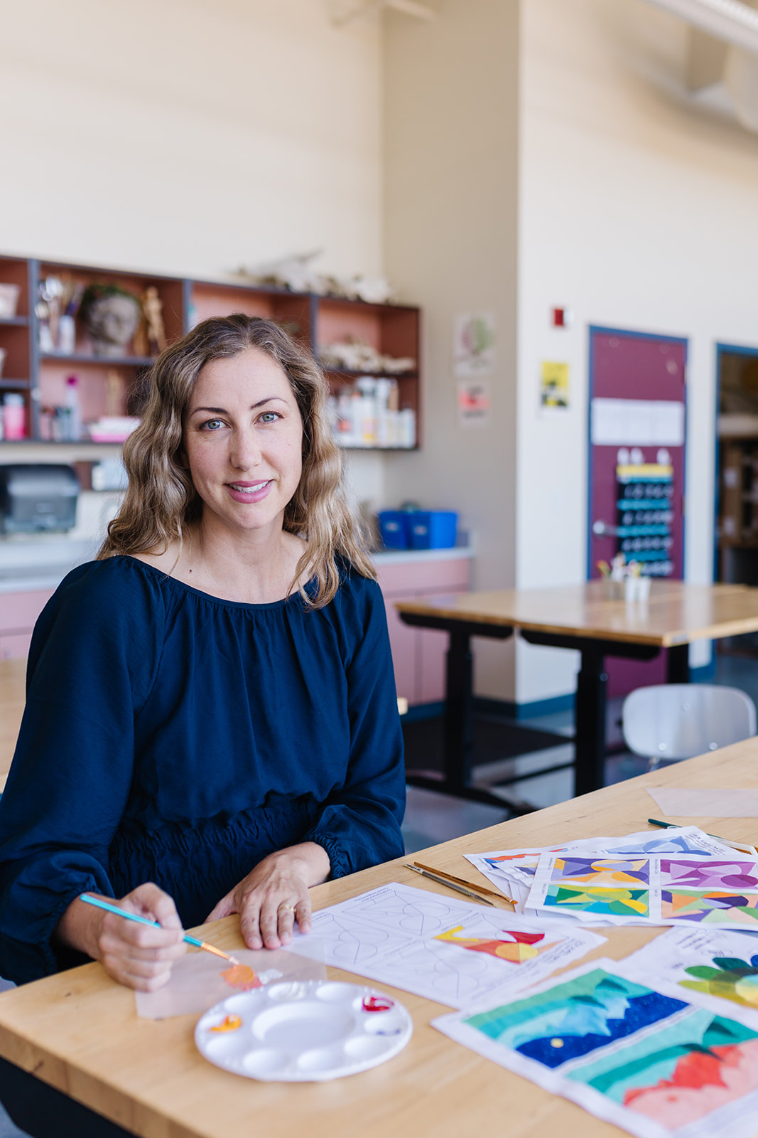
AuthorI'm a high school/middle school art teacher with 16 years of experience. I'm here to help art teachers free up more time and space in their lives through lesson ideas and ready to go content rich, engaging curriculum. Categories
'Syllabus Planning
Sketchbook Covers First Day of School Avoid Teacher Burnout Digital Self Portraits Calaveras Printmaking My Teaching Mistakes Surrealist Techniques Features of the Face Bilateral Mirror Activity Gees Bend Art Lesson Women's History Arts Assessment Favorite Fall Lessons Chicano Artists Art Materials Guide IB Process Portfolio What is Art? Pattern Design Figure Drawing Drawing Hands Contour Shoes Negative Watercolor |
 RSS Feed