 How to Use Adobe Photoshop for BeginnersBack in 2020, I moved to a new state and started teaching Digital Art for the first time. While I had 20 years of experience using Photoshop and Illustrator in my own work, I had only worked with students on digital skills individually due to limited resources at my previous school. Excited by the opportunity, I developed a project-based curriculum to teach both basic and advanced tools for photo manipulation, illustration, and simple animation. This curriculum guides students through a series of projects that build on each other, helping them master Photoshop's menus, panels, and tools. Students use Wacom tablets and styluses, and projects are inspired by current digital design trends and contemporary artists. A key part of the curriculum includes beginner Photoshop tutorials, to teach students to manage their workflow and problem-solve both individually and collaboratively. For an introductory project, I designed a lesson I call Visual Autobiography which teaches students to create a layered self-portrait. This project provides students the opportunity to introduce themselves, reflect on creative expression, and learn the basics of Photoshop  Key Photoshop Skills and TechniquesThe Visual Autobiography project introduces a variety of basic skills, keyboard shortcuts and tools. It is also a great way for students to introduce themselves to the class and for me to get to know the students. The skills covered in this lesson include:
 IB Art Exhibition 2020, student work that inspired this digital portrait project Digital Portrait Project InspirationThis lesson was inspired by an IB (International Baccalaureate) Art project created by a student for his exhibition a few years ago. (To see this students full exhibition check out this blog post) His digital self-portrait told the story of an inoperable brain tumor he had since birth, requiring periodic treatment to maintain his vision. These treatments were physically challenging and left him drained of energy. As an active outdoorsman and mountaineer, he used the metaphor of a wildfire in the mountains to express the challenge of his tumor. The portrait shows his silhouette filled with a mountain landscape. Above his ear, smoke from a wildfire rises, and a helicopter is shown responding to the fire. An MRI scan of his brain is faintly visible in the silhouette. This image poetically tells his story, and I found it so moving that I wanted to develop a lesson around visual storytelling and metaphor.
Portrait Double ExposureI have always been fascinated with darkroom double exposure art and liked the idea of introducing this art form digitally to my students for this project. Double exposure art, where two images are blended to create a single, visually striking piece, has evolved from traditional darkroom photography to modern digital art. In darkroom photography, this effect was achieved by exposing the same piece of film twice, overlaying two separate images. This required precise timing and a lot of trial and error to get right. In Adobe Photoshop, creating double exposure art is much more accessible. Artists can blend images easily using layer masks and adjusting the opacity. The use of blend modes and adjustment layers offers the possibility of fine tuning the resulting images to create focal points and cohesion of color scheme. Overall this digital process allows for more control and creativity compared to the old darkroom techniques and impressive results can be accomplished by beginners.  Contemporary Double Exposure ArtistsI like to incorporate Contemporary Digital Artists into my curriculum for students to explore and be inspired by. The artists I share for this lesson include: Barett Biggers, Alexis Folliot, Antonio Mora, and Jenya Byguzou.  Meeting the Bear King by Barrett Biggers Barett Biggers creates dreamy portraits by blending faces with nature elements like forests and flowers. His use of vibrant colors and smooth gradients makes his work pop. For students, studying Biggers' highly detailed compositions (which have a lot of elements) demonstrates how important it is to balance colors and contrasts to make both images in a double exposure stand out while still looking cohesive.  Downtown by Alexis Folliot aka Nevessart Alexis Folliot who goes by nevessart online, combines faces with landscape and architectural elements, creating an intriguing mix of the organic and the structured. Her work demonstrates how negative space (white space) can add visual interest and depth to portraits. Using mostly black and white with low-saturation pops of color, she shows how subtle use of color can draw the eye throughout the composition. Teaching students to play with negative space in Photoshop can help them learn how to effectively guide the viewer's eye.  Photo Collage by Antonio Mora Antonio Mora’s work has a mysterious, dreamlike quality. He often merges faces with abstract textures and landscapes, using high contrast and dramatic lighting to create depth. Mora's portraits are great examples of how contrast can set the mood and make key elements stand out. Students can learn to use contrast to add drama and focus in their own double exposures.  Art by Jenya Vyguzov Jenya Vyguzov is known for his detailed and intricate double exposure portraits that combine photography, nature, and fashion. His use of fine textures and patterns creates rich, complex images. Students can draw inspiration from his work, especially his influences from fashion and album art, to experiment with layers and blending modes in Photoshop, adding texture and depth to their own projects while tapping into pop culture.  Mind Mapping ActivitySince the focus of this lesson is visual storytelling, I wanted to guide students through reflective activities to help them develop their ideas. One of my favorite pre-work activities is mind mapping. This technique allows for structured brainstorming and encourages non-linear thinking, where even seemingly peripheral ideas can become the foundation of a project. We start with a partner activity where students discuss synonyms for "autobiography" and choose the one that resonates with them most. This chosen synonym becomes the center of our mind map, and we explore the associations that branch out from it. I love mind mapping because it often leads to unexpected paths and helps students push beyond their initial ideas to find something truly intriguing.
Gathering Photographic ElementsAfter developing a direction for their projects, students gather photos for their project, either from their own camera rolls or from copyright-free online sources. These photos will be layered into their portraits to tell their story. They also need a base photograph of themselves. Students can pose however they like, and we discuss how different poses convey various messages and moods. I encourage them to use accessories if it fits their story (e.g., sunglasses, goggles, helmets, hats) and to take their photos against a solid background to simplify creating the selections in Photoshop. I've seen students get wildly creative with their portraits, from hanging upside down to make their hair look like it's floating upward, to using a fan to add movement. Some students may struggle with being photographed. I address their concerns individually and offer solutions, such as taking their photo during a private session or using a different photo from their past. I reassure them that the portrait is just a base for the double exposure techniques and that their face will be obscured in the final piece, making the portrait more of an "outline" than a dominant element in the composition.  Each tutorial breaks down a technique, tool or skill, each video is less than 5 minutes Beginner Photoshop TutorialsTo teach the technical skills in Adobe Photoshop needed for this project, I use a series of pre-recorded video tutorials hosted privately on YouTube. This allows students to learn at their own pace. While I use the SmartBoard to demonstrate simple techniques to the whole class, students find video tutorials more effective for complex tasks because they can pause and practice as needed. I also provide a handout highlighting key tools in the Photoshop toolbar to help students memorize the icons and understand tool grouping. Students access these Adobe Photoshop beginner tutorials through EdPuzzle or Google Classroom. Each class begins with a “warm-up” to review or re-teach skills covered in the videos. I created these tutorials during virtual learning and continue using them because they've proven successful. Having my own tutorials ensures that students receive consistent, step-by-step instruction tailored to their needs, rather than relying on existing YouTube or Adobe content.  Screenshot of Virtual Sticker Awards and comments on the group Google Slides critique presentation Art Reflection ActivityWhat I love most about these portraits is how expressive they are. Students become deeply invested in the stories they tell through imagery, often using their own photography. This project is a perfect start-of-the-school-year activity to get to know your students and for them to get to know one another. Students choose a variety of stories to tell, and sometimes they are quite personal. It's important to build a supportive classroom environment to encourage sharing these expressive artworks. Throughout this unit, I include several opportunities for partner discussions where students share their progress and offer constructive feedback. We also do gallery walks where students leave their files with the layers panel open on the screen, and classmates leave post-it note encouragements and questions. By building community along the way, students are ready for a reflective and constructive critique discussion by the end of the unit. To prepare for the critique, students write a reflection about two of their artistic choices and how these choices support their narrative. We present their work in a group Google Slideshow, and students verbally share their reflections with a small group of 4-6 peers. After the small group discussion, students view all the portraits (I teach multiple sections, so it's fun for students to see their friends’ work) in the slideshow and offer Virtual Award Stickers. They are limited to 3 awards and must justify their selection in a comment on the slideshow, explaining why the artist received this award. Students always enjoy this part of the critique, but it does require oversight to ensure the comments are appropriate and use artistic vocabulary. Students are graded on these comments, which helps maintain focus. Additionally, I monitor to ensure students stick to the 3-sticker limit. Digital Art for BeginnersI hope you feel empowered to teach digital artmaking tools, as they are wonderfully accessible to beginners and allow students to engage with their own photography. If you're looking for more Adobe lessons for beginners, check out my Digital Art Lesson Bundle (this lesson is included). This resource includes a variety of projects and tutorials designed to help students master digital art techniques while expressing their creativity.
0 Comments
 Travel JournalingAs a high school art teacher, I'm always looking for ways to encourage my students to engage in regular sketching and drawing practice to hone their observation and visual perception skills. This past school year, I had the chance to lead a student trip to Germany, and it was this adventure that sparked my newfound passion for travel journaling and sketching. The trip was organized around the themes of history and art, and as the art teacher, it was my role to create an art component for our journey. Knowing we would encounter emotionally challenging histories and realities of Germany’s past, I began researching travel journaling as a way for students to document and process their experiences. I aimed to make the travel art journal approachable and accessible, especially since not all the students were art students. My goal was to introduce travel sketching for beginners techniques and incorporate elements of a travel journal and scrapbook to ensure everyone could participate and benefit from the creative process. During all this planning, I never anticipated just how profoundly travel journaling would impact my own art and teaching practice. Keeping a travel art journal transformed my experience on the trip, guiding me to stay present and ultimately changing the way I travel forever.  Travel Art KitWhen preparing for our trip, I knew I needed a travel sketch kit that was lightweight yet included all the essentials. My kit comprised a compact watercolor sketchbook, a fine-tipped pen, a pocket watercolor palette, a watercolor brush pen which holds a small amount of water to paint on the go (this was a game changer), a glue tape runner, and a roll of Washi tape. In addition to these materials I also brought some materials that we could share as a group including Posca pens, crayons for texture rubbings, white gel pens and extra paper. To organize the kits I used mesh zipper bags from Blick art materials that I found in my classroom and repurposed for this purpose. The bags were 10" X 13" which was a good size for including the 8.5" X 11" photocopies I created as a guide to the museums would visit, museum scavenger hunts and art journal guide I created for the trip. I have updated and expanded on this guide and created a *free* Travel Journaling Get Started Guide (pdf with links) for you in hopes it will inspire you and your students to try travel art journaling.  DIY Watercolor Dot CardsFor a lightweight alternative to pocket watercolors, check out watercolor dot cards. I learned about these from a fellow teacher on Instagram after I had purchased the pocket watercolor sets and wished I had known sooner! While the pocket watercolors I packed for Germany worked great for my students, they were a bit bulkier. Watercolor dot cards, on the other hand, are ultra compact and easy to carry. You can buy them pre-made or DIY your own with tube watercolors by placing small dots on a piece of watercolor paper and letting them dry. Just grab a water brush pen, touch the dot, and you're ready to start sketching.  DIY watercolor dot cards Preparing Travel Journaling KitsIn preparation for the trip, I spent time prepping my journal, experimenting with the materials I had ordered, and trying out various techniques like Washi tape resist, architectural sketching, texture rubbings and mixed media collage. During our pre-trip meetings, I presented these techniques to the students, encouraging them to get comfortable with the supplies and to cut out images ahead of time, especially if travel sketching wasn't their thing. We reviewed our itinerary to get a sense of where we would be going and what we would see, helping everyone feel more prepared and excited. I also created a museum guide for them, and included a Museum Scavenger Hunt with a mix of specific pieces and more generic items to look for, to make the free time of our museum visits more engaging and interactive.  Travel Journal TechniquesOnce we were in Germany, I wanted to engage my students in travel journaling, regardless of their skill levels. I devised various ideas and techniques to cater to their diverse abilities. We focused on observational drawing by sketching architectural elements, landscapes, and street scenes. For those less confident in their drawing skills, we explored mixed media techniques, using torn paper, brochures, and found objects to create visually appealing pages. Incorporating text was another important aspect, as I encouraged students to add personal reflections and descriptive notes to their journals. Mixed Media Collage Art Journal PagesCollage quickly became a favorite medium among my students. It’s approachable and offers endless possibilities for creativity. By incorporating maps, texture rubbings, and other found materials like receipts, paper packaging, and tickets, students could visually narrate their travel stories. This technique was especially beneficial for those who felt less confident in their drawing or painting abilities. The use of torn paper edges added a unique, organic touch to their compositions, and I encouraged students to use their watercolors to add backgrounds and areas of emphasis to their pages. If you are interested in seeing more mixed media collage techniques that could be incorporated into travel art journals and other classroom activities check out this blog post on Mixed Media Collage Sketchbook Cover Ideas and this blog post all about Collages for Women's History Month.  This page includes texture rubbings, receipts, a paper gift bag and a postcard purchased at the Art Museum. Texture RubbingsCreating texture rubbings is a great technique for looking at the world around you in a different way. Considering the texture of surfaces forces you to look all around as you move through architectural spaces. One of the best places for creating rubbings that I found on our trip to Germany was the ground. Man hole and grate covers, street placards and infrastructure markings often had interesting textures that showed up well using a wax crayon and somewhat thin paper. For some of these rubbings I used paper I brought on the trip and for others I used the complementary notepad from the hotels we stayed at. If you are traveling internationally consider making rubbings of the coins, this is another fun way to explore the textures you encounter while traveling. While we were in Germany I found an East German coin at the Mauerpark Flea Market and used it to create rubbings for my Travel Art Journal page about our Berlin Wall bike tour.  Creating texture rubbings of a 50 cent Euro coin Shadow TracingTo help students stay present and connected with the environment, we explored shadow tracing. I encouraged them to look for interesting shadows in the landscape and trace their outlines in their journals. This activity was not only a creative exercise but also a meditative practice which served as a way to stay present even when confronted with the difficult and tragic histories we were confronted with on our tour. While at the Jewish Museum at Berlin, I found a shadow of a bouquet in a vase in the Museum Cafe and used a pencil, waterbrush pen and watercolors to create a small painted tracing of the shadow. I found this to be a soothing and reflective activity after an emotional tour of the museum.  Travel Journals as ScrapbooksBeyond drawings and paintings, our travel journals also served as scrapbooks. We incorporated mementos like tickets, brochures, and photos, creating a personal narrative that combined art and memories. This approach allowed students to document their experiences holistically, blending their artistic expressions with tangible keepsakes from the trip. I also like how it makes you more aware of all the paper ephemera around you and seeking out these materials feels like a treasure hunt. I also noticed students engaging more with maps and reading brochures more since they were using them in their travel art journal pages. We often had to look closely at maps to find the exact locations we visited and in the process students would develop a greater understanding and appreciation of the areas we visited.  Travel journal scrapbook page with maps, photos and some brief reflections Unique Materials for Travel JournalsKeep an open mind about what could be used in your travel journal to make art. One of the materials that proved to be a great medium for painting was the instant coffee packets supplied by the hotels on our trip. These dehydrated coffee crystals made a nice sepia toned paint when mixed with water using the waterbrush pen. I used this to add background texture to pages as well as to paint a motif from a carved wood door we saw in Munich. An added bonus is that it makes the journal page smell faintly of fresh coffee.  Using instant coffee as paint in my Travel Art Journal Another unusual technique that I experimented with was paint drag downs. Inspired by "overpainted" photos I saw in the Neue Nationalgalerie by the German artist Gerhard Richter, I used the corner of a postcard and let the paint pool from a Posca paint pen so I could drag down the paint to create an abstract effect.  Engaging Students of All AbilitiesOne of the most rewarding aspects of travel journaling was seeing how it engaged students of all abilities and levels of experience with art. I emphasized that there is no right or wrong way to travel art journal, encouraging them to experiment and explore their creativity. Whether through detailed sketches, vibrant collages, or written reflections, every student found a way to express their experiences. I'm not sharing images of student work here because these journals became very personal to the students. These techniques and approaches can also be used by anyone who enjoys traveling and wants to connect more deeply to their experience of a place. There is a very low bar for entry to the world of travel journaling and it is incredibly rewarding. Travel Journaling After the TripSomething that surprised me was that for most of us the majority of the work in our travel journals happened after the trip or on the flight home. It would have been nice to have more time to work in our journals during the trip but I don't think this is always feasible especially when working with a tour company with tight schedules. But don't let this deter you from sharing travel art journaling with your students or from trying it yourself. Creating pages after the trip or while traveling home is a wonderful way to re-experience the memories and reflect on your experiences. I love this quote by Anaïs Nin "We write to taste life twice, in the moment and in retrospect." I find this to be very true of Travel Journaling as well. When you travel with the intention of creating a journal page you pay more attention to your senses and when you create the page you get to relive the experience with a richer understanding.  Travel Journaling Next StepsAt this point I'm hooked on travel journaling. I found it to be personally rewarding as an artist, educator and traveler and I plan to keep using my journal as I travel and also to explore new places close to where I live. As an art teacher I want to approach teaching travel journaling again in the future. There are some things I would do differently and I would find a way to get in a bit more journaling together on the trip (the Germany trip was especially hectic due to some flight and transportation delays) but having more time to work together in our journals at a park or cafe would have been beneficial for the students who had trouble getting stated. If you want to see more about the travel art journal set up or our trip in Germany check out these two Youtube videos: Travel Journal Set Up for International Tour with Students and Art Journal through Germany: Student Group Travel Vlog and please share your own experiences with travel art journaling in the comments below! If you haven't already downloaded it, here is your Travel Journaling Get Started Guide. Looking forward to continuing this journey!  Here I am working in my travel journal on the plane home from Mexico Women’s History Month ArtMarch is Women’s History month, what better way to celebrate the contributions of women throughout history than through making art? These collage ideas offer a creative and engaging opportunity for middle and high school students to explore the stories of women historical figures and changemakers while learning key concepts of art. This project is the perfect activity for in between units or as an opener for a larger project or discussion of the elements of art and principles of design. I am always looking for 1-2 day projects this time of year because of the chaotic schedule with Spring Break and many school assemblies, art shows and performances that happen this time of year. It is always helpful to have a quick but meaningful “mini-project” in my back pocket that can bridge larger unit investigations. 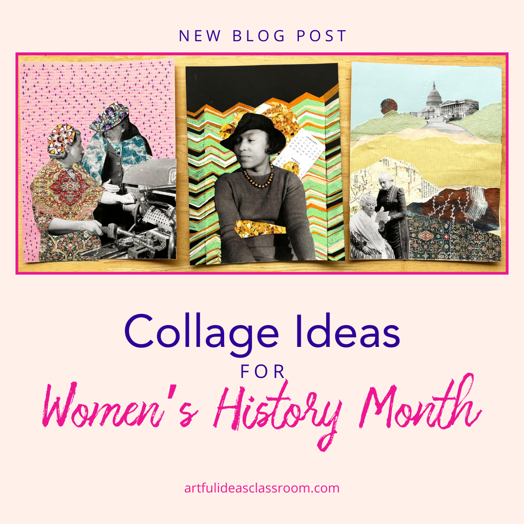 US Library of Congress Free to Use and Reuse Image LibrariesI was inspired to create these collages by the Free to Use and Reuse image sets on the US Library of Congress website. There is a photo library specifically for Women’s History Month as well as a photo library for African American Women Changemakers.) These high quality photos can be downloaded at different resolutions for printing. I recommend choosing the .TIFF file (large file) and then exporting to a jpg format once downloaded to ensure a high resolution image. I recommend using this image archive because it teaches students the importance of using images that are “fair use” and to respect copyright laws and creative property. I also like that these image libraries include images that are not as famous and there were quite a few historical figures I wasn’t aware of. There are also images of unnamed women at work (during WW2 for example) which I think is a nice addition to the project to show that the contributions of everyday people are also important to commemorate this month. Materials for Women's History Collage I find it helpful to curate the materials (have magazine pages torn out and printed images of US monuments and the architecture of Washington D.C.) for this and to have the photos of the historical women already printed so that students are ready to get started after introducing the lesson.
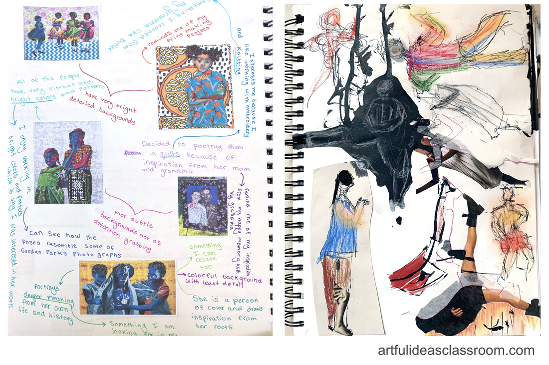
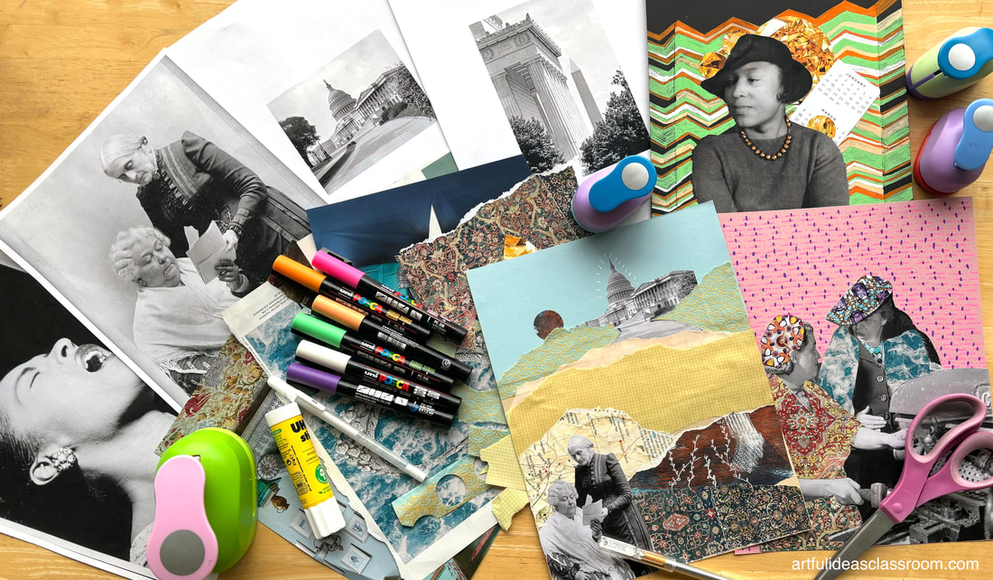 Introduction to Women's History Collage ProjectTo introduce this project I printed a number of photos from the US Library of Congress Free to Use and Reuse image library and laid them out on the back table. I wrote the names of the women represented in the photos on the back in pencil (so it wouldn’t bleed through the copy paper) and if a specific name wasn’t given to the photo I wrote the description from the image library. For example “Riveter at work on Consolidated bomber, Consolidated Aircraft Corp., Fort Worth, Texas.” I also wrote the name of the image library where I found the image so that students could locate their photo to do independent research. The Library Congress website includes some key information on the photos that could be used as search terms for deeper research. 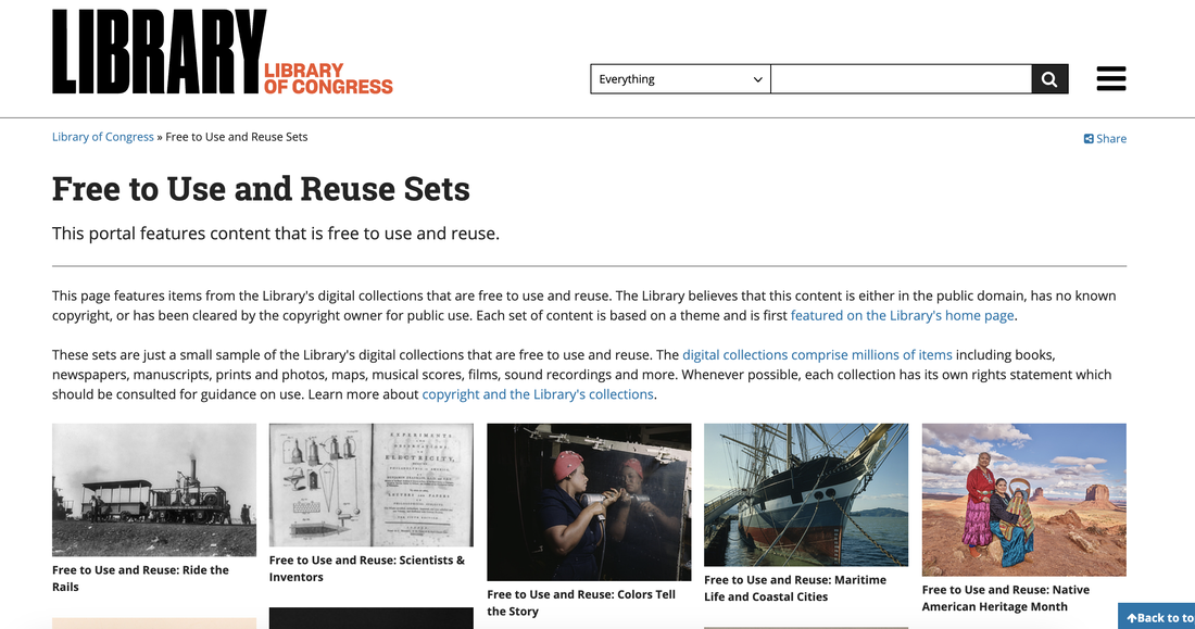 After choosing their photos students set to work doing some research about their image or historical figure. I put up a slide with some key information to find. This includes the time period, the profession or role of the woman(en), the topics or themes of their work/contributions, and a quote (if possible) of the figure. For the images of women at work this is a little more challenging to find, but they may be able to find a quote about the women who for example worked as riveters during WW2. Once students have some background information I demonstrate a few different techniques to help them get ideas for their project. I find that curating the materials that students have access to also helps with the timing of the project. I have found that when I give students free reign to go searching for images it takes a lot of class time and they often get distracted or overwhelmed by choices. I do think that searching for images has value but for this activity I chose to select the printed elements and it worked out well to keep the focus on the historical figure and celebrating women’s achievements. When selecting collage materials I have found that patterned paper, maps and printed images with an all over pattern or texture work best for this project. I also included some scrap paper from other projects like Gelli-Plate printing and the backing sheets from spray painting because the abstract markings had beautiful colors and textures. Women’s History Month Collage Ideas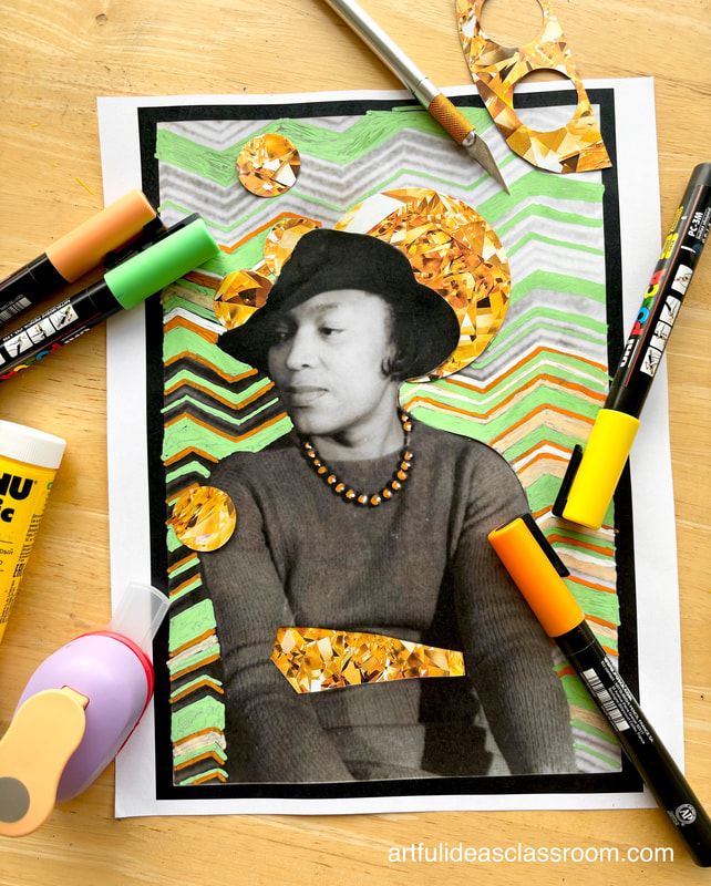 Patterned BackgroundThis idea was inspired by UK collage artist Naomi Vona who uses paint pens to embellish the background of vintage black and white photographs with intricate and colorful patterns. To create my example of this style of collage I chose a photo of Harlem Renaissance author Zora Neale Thurston. I liked the pattern in the background of the image and as I am not as gifted at freehanding patterns as artist Naomi Vona I thought this was approachable for me. Thurston was a bold and confident woman who was not afraid to speak her mind and her groundbreaking books shed light on the Black female experience of the rural US South. From my research of Thurston I found two quotes to guide my project, both about time, cycles and how the past shapes the future. To represent this I wanted to evoke the image of repeating rising suns to show the passage of time and repetition. To get the effect of rising suns I cut out circles from an image of a gem (to reflect complexity and boldness) I found and cut slits around the hat and in other areas of the image to place my cut out circles within. I chose a color scheme to work within (3-5 colors) and set to work tracing out the background pattern with paint pens. One thing I found with using the paint pens is that the dark colors layered better over the light colors and that I often had to add a second layer of paint pen to cover the shiny surface of the black and white laser print (if you are using an inkjet printer this might not be an issue.) As a finishing touch I added some cut outs of a calendar to show time and mounted the collage on a thicker piece of black paper. This style of collage creates a visual contrast between the figure and background that highlights the figure as the main focal point. 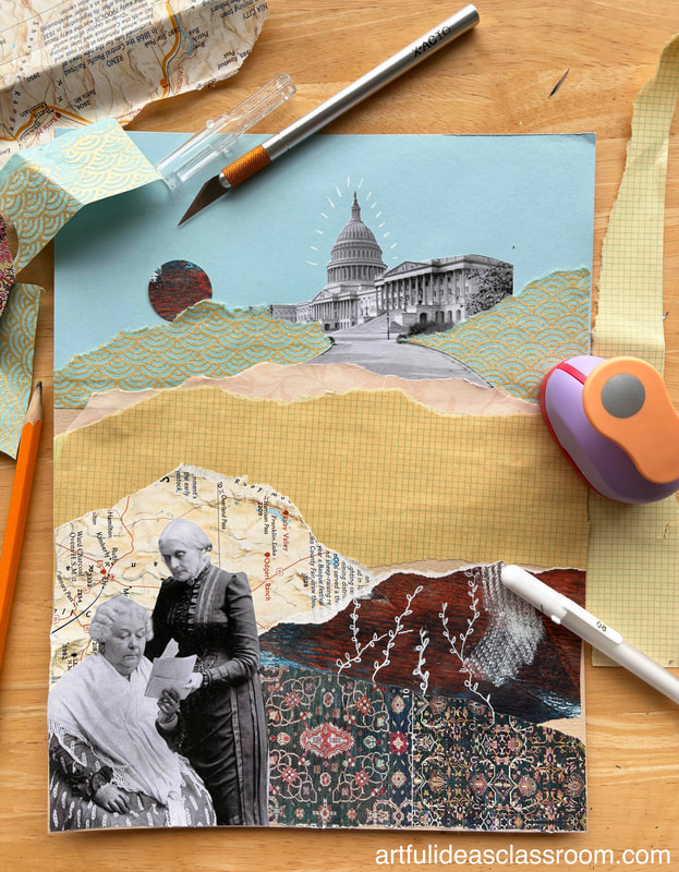 Narrative CollageThis approach to the project is centered around the idea of narrative or story telling and is inspired by Parisian artist Twiggy Boyer who uses torn paper, drawing and found imagery to create collages that evoke a scene or story. I chose to work with a photograph of Susan B. Anthony and Elizabeth Cady Stanton for this history collage project. Both of these women were key figures in the US abolitionist and women’s suffrage movements. For this collage style I needed the figures to be smaller so I had room to show a landscape in the background. I had the idea of creating a torn paper mountain range in front of the US capitol building to show the long climb towards the liberation of enslaved people and women’s right to vote. I chose mostly light toned paper inspired by Boyer’s style and tore the edges to create the ragged lines of the mountains. Once all the elements were glued onto a mid-toned backing paper (I used this Canson paper) I placed the photograph of Susan B. Anthony and Elizabeth Cady Stanton in the foreground to show the “mountains” they and other women fighting for their causes needed to “climb” to achieve the dream of equality. I noticed in Boyer’s pieces she often includes vines and flowers climbing through the collage and I wanted to add this element as well so I used white gel pen to draw on one of the layers of paper. When teaching the lesson it might be helpful to have a couple of versions of the photo printed out at different scales and even some black and white images (of related architecture/monuments) for this style of historical themed collage. 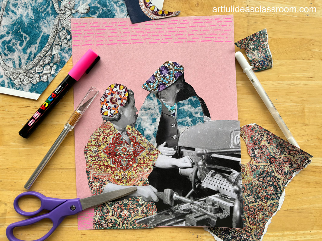 Replacing Elements with CollageI drew inspiration from US artist Bisa Butler who creates large scale figurative quilts characterized by their bold colors and intricate patterns. Bisa Butler uses her quilts to tell the stories of Americans with African descent throughout history and carries on a tradition of quilting that has been present in the African American community for centuries (to learn more about African American quilting traditions, check out this blogpost on the Quilts of Gee’s Bend.) I chose to work with a photograph of Eleanor Roosevelt speaking with a British female machinist while on her Goodwill Tour of Great Britain during WW2. Drawing inspiration from Butler’s collages I chose brightly patterned printed images from magazines. I divided them based on color scheme because I wanted the figures to have contrasting color palettes to create contrast as Butler does in her work. I used drafting vellum (thicker than tracing paper) to trace the outlines of the historical women’s clothing and then cut them out to make patterns that I used to trace onto the magazine images to make similarly shaped pieces. It was a bit like dressing a paper doll as I placed the colorful cutouts on the figures and glued them into place. As a finishing touch I cut out the figures from the background and glued them on a pink paper. Once again I drew inspiration from Bisa Butler who layers patterns, I used paint pens to draw a repeated pattern by hand. I kept the pattern small and used colors that would both complement and contrast the figures so they would remain the focal point of the piece. Reviewing the Elements and Principles of ArtThis project is a great way to review the Elements of Art and Principles of Design. Some of the visual concepts that can be highlighted in this lesson are:
Women's History Month Art DisplayOnce completed, students can showcase their collages in a Women’s History Month art display, accompanied by a paragraph of research on their chosen historical figure. This provides an opportunity for students to share what they learned about these historical women, with their peers and the broader school community.
Women’s History Month art projects offer a meaningful way to celebrate the contributions of women historical figures and changemakers. I hope you try this collage exploration with your students. It is a great way to engage in creative expression, storytelling, and reflection, fostering a deeper appreciation for the diverse narratives of women’s history. Figure Drawing for BeginnersThis year I had the opportunity to design a new semester-long honors level advanced studio art class for students interested in building a portfolio. When planning the curriculum (if you are interested to see how I plan my curriculum check out this blog post and download this *free* Syllabus Planner,) I knew I wanted to include a unit on gesture and figure drawing. Figure drawing helps students develop fundamental drawing skills like observation, proportion, and perspective while also offering opportunities to create expressive and meaningful artworks. When planning I wanted the unit to include sketching exercises students could do on their own using reference images, gesture drawing from life and a field trip to a local art studio for a class with a clothed model. 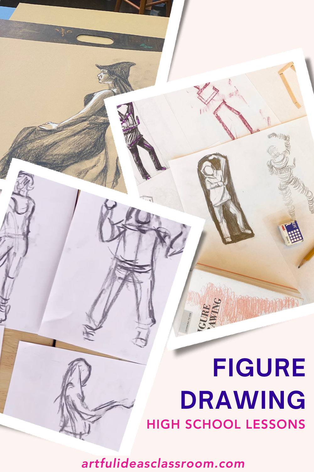 Figure Drawing ExercisesTo start the unit I really wanted to avoid overwhelming students with too much information about proportions or anatomy. While I think this is important for having a deep understanding of the figure, for this single unit in a semester-long class, I wanted to really focus on gesture drawing and observation from life. I wanted students to instead focus on the gesture of the figure. I began with the question “what is the purpose of gesture drawing?” and showed my students examples of gesture drawings and the many forms they can take. We then practiced creating gesture drawings using the book Figure Drawing by Peter Jenny. This small book is one of the best figure drawing for beginners books, it consists of drawing exercises anyone can do (from beginner to advanced) using photo references or from life. There are many gesture drawing exercises to choose from and I chose a few that looked fun and approachable to begin with. I had a printout of figure drawing reference images that I found years ago on Pinterest and have been using in my classes for years- I tried to use Google Lens to find it and find the image source and wasn't able to locate it so if you know where it's from let me know so I can make the proper acknowledgements here. I like this reference because the folds and stretching in the drapery and the hoodie wearing figure shows how the body position changes as the weight of the figure is on different feet (contrapposto) it is pretty nondescript and not overly stylized so students can just focus on the pose of the figure and draping of the fabric. 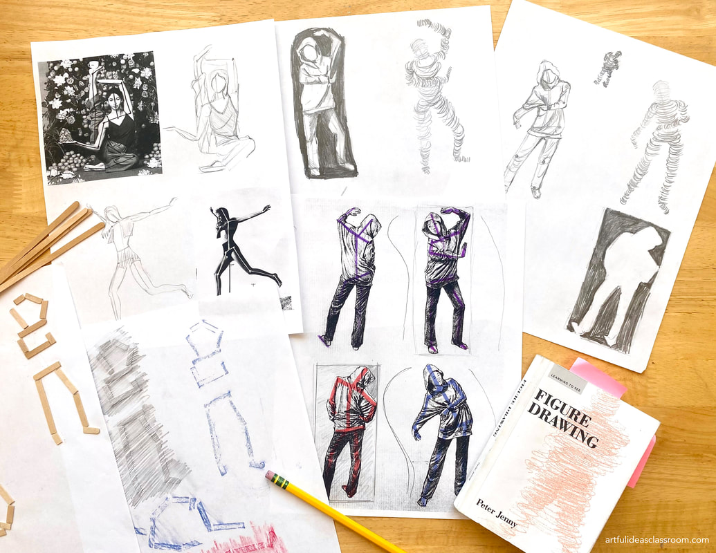 Stick Figures: Figure Drawing Exercise for BeginnersThe first exercise I chose for the students to try was one called "hold" where matchsticks were used to suggest the basic lines of the figure (essentially a stick figure) and then glued down and used to do a texture rubbing. The idea is that by using creating texture on the paper we can "see with our fingers." Instead of matchsticks because they are not readily available (or safe at school?) I chose to use wooden coffee stir sticks- these are easy to find and students don’t need many-I gave 2.5 sticks to each student. We conveniently have them stocked in the teachers lounge/ mailroom at our school. I created a few demo figures so I could try out different methods of sticking the stir sticks down, I found that glue sticks work just fine and scissors cut the sticks easily. Using the worksheet I was able to easily copy the angles of the hips and shoulders and to then add the arms, legs and head angles. I also experimented with using crayons and pencils for the texture rubbing. Both methods worked well. I demonstrated using the document camera in class and told students to use their reference images but not to get too bogged down in the details and in trying to make an exact copy with measurements. In my examples I focused on hips/shoulder angles as a starting point but some students looked at the line of the spine to begin their stick figures. Either strategy works for this because the goal is to really look at the elements of the body and how the position/angles of the body impact the gesture of the figure.  Left: images from Peter Jenny's Figure Drawing Right: Examples of the exercise from drawing reference images Cross Contour Volume: Figure Drawing ExerciseI guided my students through an exercise focused on using cross-contour or wrapping lines to give volume to a figure. In Peter Jenny's book it is called "Form." First, I showed them how to create a rough figure sketch based on reference images, similar to the lines in our stick figure exercise. Then, I explained the process of envisioning the curves and directions of cross-contour lines for each part of the figure. I encouraged them to imagine a string wrapping around an arm, leg, or torso, visualizing the curves it would create. I demonstrated drawing these curving lines throughout the entire figure. Additionally, I showed a more loose approach, skipping the stick figure sketch guide and just drawing the cross-contour lines. As a class, we agreed that these looser, more spontaneous figures conveyed more life and movement. For the activity, students used pencil, ballpoint pens, and felt-tip markers, experimenting with the different types of lines each drawing tool offered. 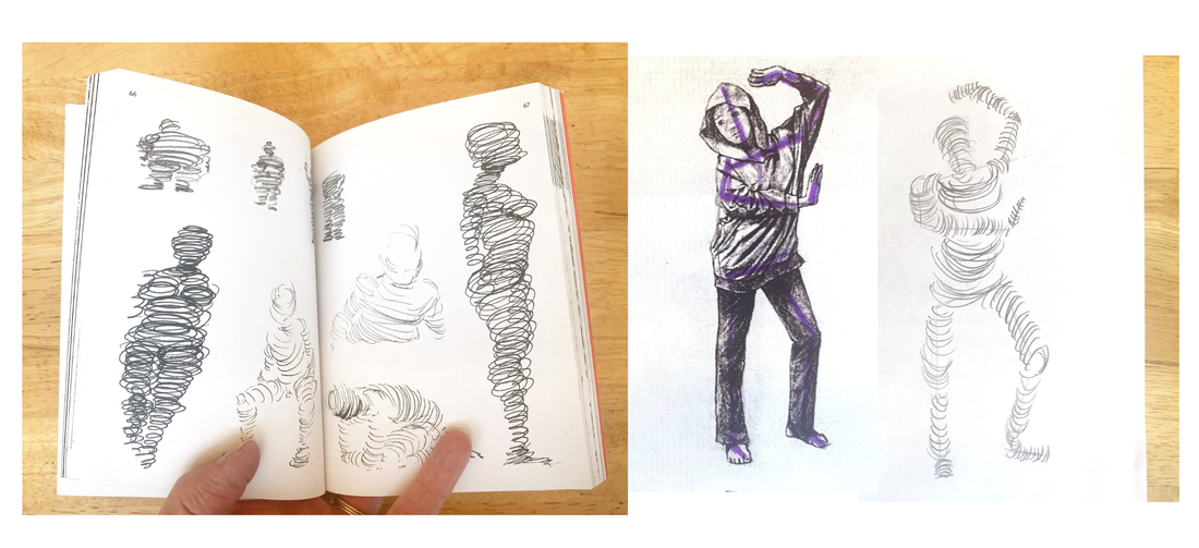 Left: examples of "surround" exercise in Peter Jenny's book Figure Drawing Right: My example sketchbook page Negative Space Figure Drawing ExerciseThe next exercise we attempted was called "surround" in Peter Jenny's book. It is a figure drawing exercise that focuses on negative space, or the space around the figure. I demonstrated using the document camera how to draw a box around one of the figure reference images (a close frame) so that students could really see the shapes of the negative spaces. For example the triangle made by the bending of an elbow. This also helped students notice the foreshortening in the images or the effect of limbs looking smaller than one another because of their positioning in space. During this exercise the room became very quiet because of the concentration of the students. I provided the students with felt tip markers and pencils for shading in the negative spaces they sketched so that the figure itself was left the white of the paper. 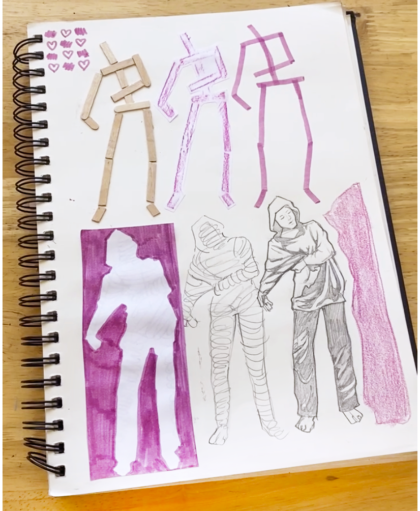 Example from a student's art journal Skeletonize: Figure Drawing ExerciseWe concluded with the "skeletonize" exercise from the Peter Jenny Figure Drawing Book. This activity required some preparation as I had to locate figures in magazines and make photocopies for everyone to choose from. After providing each student with three figures, they traced the major lines and added a circle at the joint, creating a simplified skeleton effect. I supplied white gel pens and black felt-tip pens for better contrast, especially with darker photocopies. Despite the exercise taking a full block period (80 minutes), it proved to be valuable practice time. I noticed an increase in students' confidence as they experimented, took creative risks, and innovated on the exercise to create more stylized and simplified figure drawings based on the reference images. 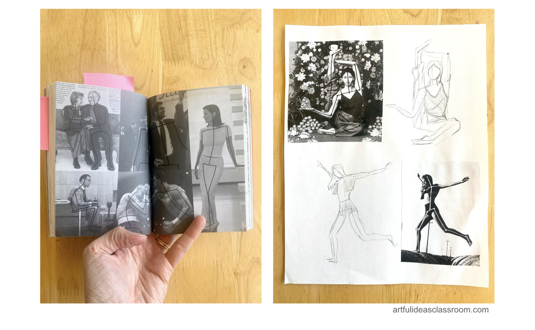 Left: examples of "skeletonize" exercise in Peter Jenny's book Figure Drawing Right: My example sketches using magazine pages as references Approaches to the Figure in Art HistoryCreating a slideshow exploring the figure in art is a tall order and there is just no way to cover the importance of the figure across time, cultures and different mediums/genres of art. I had to simplify the focus so I decided to compare a few of the different styles of representation of the figure from a sampling of cultures and time periods. I chose to focus on abstraction/simplification (symbolic figures), idealization and realism. This really helped to focus the discussion on what is conveyed through these different styles and through the poses of the figures themselves. The class that I taught this lesson to is an advanced class made up of only juniors and seniors in high school (16-18 year olds) and I asked ahead of time about their level of comfort with the unclothed form. I would recommend thinking about this before showing any nude figures in an art class. I chose examples carefully and made sure to reinforce the purpose of looking at these works of art, to learn about the way artists have represented the figures throughout time and not to objectify the male or female form. This discussion took 30-35 min and I paused for students to journal ideas/ speak in pairs throughout the slides. Since our class periods are 80 min this left 45-50 min for the hands on art journaling activity following the slides and discussion.  Stylized and Abstract Figures in Ancient Art HistoryTo explore stylized and abstracted figure art in the Ancient World, I decided to start with Venus Figurines, small carved stone or ceramic statues from the Upper Paleolithic that depict stylized female figures. Perhaps the most famous of these is the Venus of Willendorf, a small (11.1 centimeter/4.4 inch) tall figurine depicting a highly stylized rounded female body, which was found in 1908 in Austria. The artifact is estimated to be around 25,000-30,000 years old and is widely interpreted to have been a symbolic figure of fertility. I also showed students the Venus of Dolní Věstonice, which is another example of Venus figurine that is of the same time Paleolithic time period (25,000-29,000 years ago) but this one was made of fired ceramic (one of the oldest examples) and was discovered in what is now the Czech Republic. I chose to start with these because they are among the earliest surviving figurative artworks (along with cave paintings) that we have. It is fascinating to see the simplified curving forms of the female figures portrayed in these figures and think about why the artists may have chosen this style of representation. We also looked at figure sculpture examples from the Nok Culture in Western Africa from the Neolithic period (500 BCE). I shared some facts about the materials used to create these figures (terracotta) and we discussed the style and poses of the figures. I also shared images of figurative art from the “ancient world” including Egyptian papyrus paintings, Archaic Greek vases and Hindu temple statues from India and Southeast Asia. We discussed some of the symbolic meanings of the figures and how they were used to tell stories about gods, religion, mythology and heroics. The students noted the simplicity and abstraction of the representations and the rigidity of the figures. 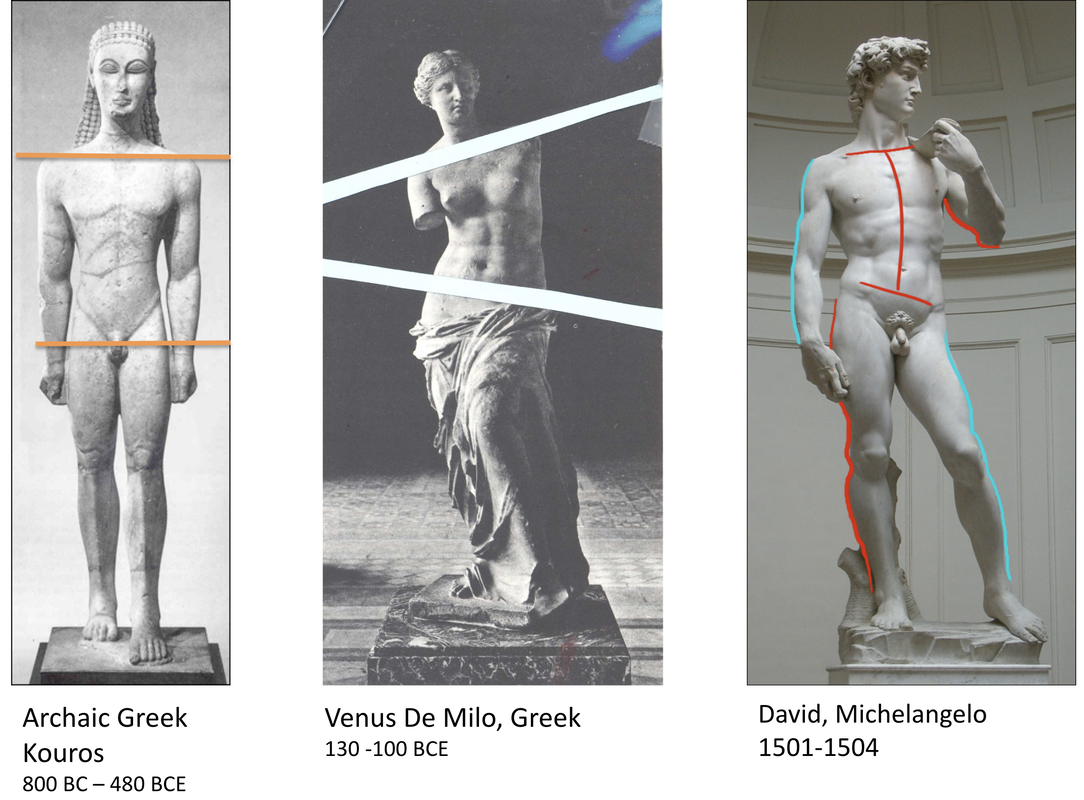 Idealized Figures in Art HistoryWe then delved into idealism in figure art, exploring examples such as Greek figure sculpture from the Hellenistic period, with a focus on Venus de Milo (150-110 BCE) to draw parallels to the Paleolithic sculptures discussed earlier. Students discussed with their partners what they observed in this idealized figure and considered the meaning of "idealize" in art and culture. In the discussion, we also examined Michelangelo’s David (1501-1504), discussing its subject (Hebrew King David) and why idealizing this form represented the grandeur of the Renaissance era and the significance of the city of Florence. A brief mention was made of contrapposto, a pose where the figure has more weight on one leg, evident in Hellenistic Greek figure sculpture and Renaissance artworks like The David. This pose gives a more naturalistic and dynamic look to the figure, mirroring how people generally stand. I presented a slide of early Archaic Greek sculptural figures known as kouroi, which have evenly distributed weight and appear more rigid and less lifelike. Students then compared the idealization of these past eras to the idealization seen today in magazines and social media figures. I was proud of my students for their ability to connect Art History with contemporary topics they are familiar with today. 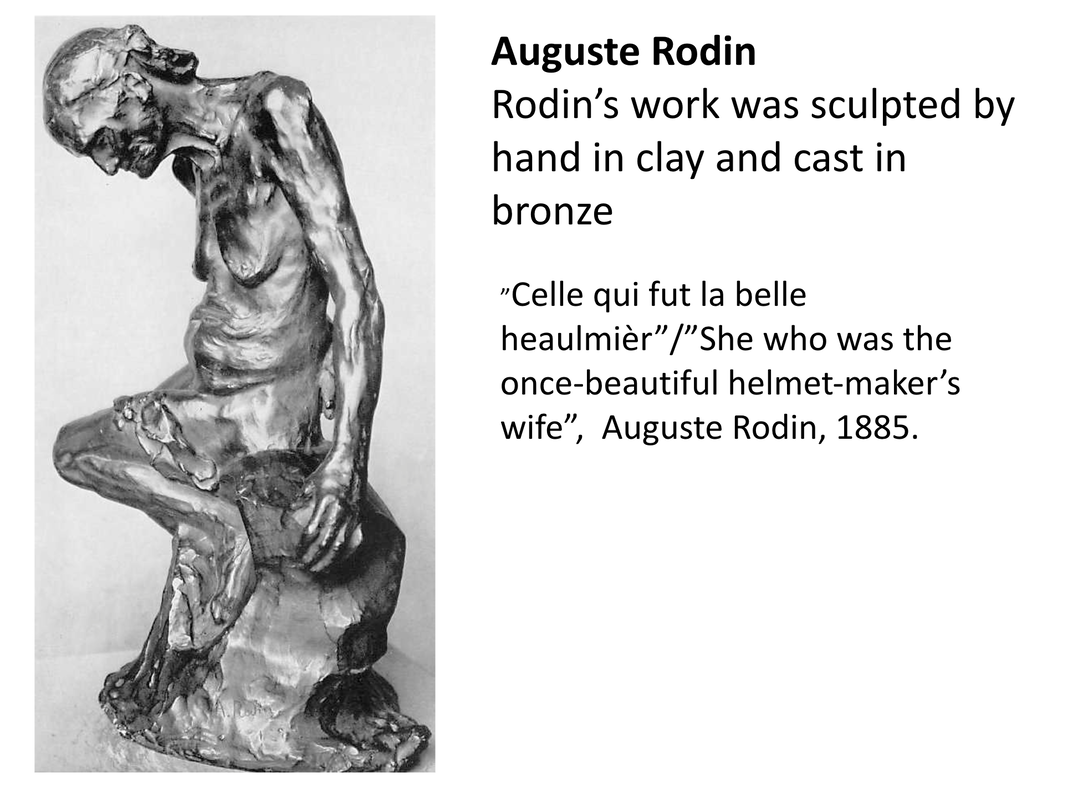 Realism in Figure ArtThe last style of representation in figure art that we discussed as a class was realism. We looked at the sculptural work of French artist Auguste Rodin. We started with The Thinker, 1902 to tap into prior knowledge, because most students had seen this figure sculpture before. We discussed the pose and how the texture of the sculpture is rough and the figure is represented in a quiet moment of contemplation rather than in a moment of heroic action as often depicted in idealized sculptures. Next we looked at “Celle qui fut la belle heaulmièr”/”She who was the helmet-maker’s once-beautiful wife”, 1885. This sculpture depicts an old woman, sagging chest bare with her head lowered in grief/exhaustion. The texture of the sculpture is very rough and the fingerprints of the artist can be seen. We talked about this style of representation and the humanity of the figure. Students expressed that although almost grotesque in its realism this figure evoked more emotion than the idealized figures. Art Journal Pages Exploring Figure ArtTo wrap up the discussion I assigned students a research page in their art journals, in which to explore how figures convey different moods/ emotions through the pose and style of representation of the figure. Students could take this research in any direction they wanted to explore and I made lots of resources available from Art History reference books to old art magazines to use for collage in their journals. I was impressed by the depth of the art journal research pages students created in response to our Art History figure art slideshow and discussion. Some students chose to focus on a particular artist or series of artworks while others focused on particular poses and gestures seen across genres of art. When students are working in their art journals I typically will walk around and have one on one discussions with students to get a sense of the ideas they are researching and exploring and offering suggestions when I can. I also encourage my students to include their own studies/sketches based on the artworks they are researching on the research pages along with the written information and reflections. It takes a while for students to grasp the idea of artistic investigation, often initially they will gravitate toward listing facts about an artist or artwork instead of analyzing and responding to the work. I was excited to see these pages because most students demonstrated deeper thinking and reflection on their pages. 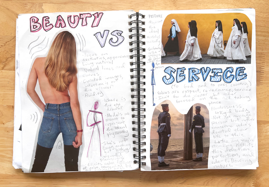 Student investigation into different poses and their meanings 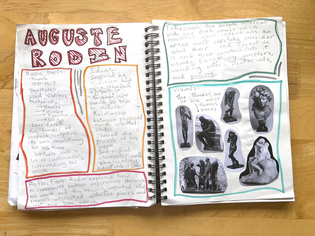 Student investigation into Auguste Rodin's figure sculptures What is Gesture Drawing?Our next studio session was focused on answering the question “what is gesture drawing?” Many students were unfamiliar with the concept and I began by showing some examples of gesture sketches. I explained how they are created from observing a model from life and in short time periods anywhere from 15 seconds to 1 minute. Next I showed students a video from artist Carlin Peters in which she describes/demonstrates how to find the “line of action” in a figure and how to approach gesture drawing for beginners. The line of action is a line that can be drawn to express the essential movement of the pose. It can be a hard concept to grasp because it is something the artist decides based on observation so there is no “right answer” so to speak, although experienced artists would probably agree on the lines of action of particular poses. Another great video resource I found on this topic came from the artist Josh Papaleo on Youtube, his video Life Drawing: Line of Action shows him finding the line of action in a variety of photos of figures in dynamic poses, I like how all the photos are clothed models and that he times the gesturing drawing process the level of detail he is able to achieve in short periods from 30 seconds to 2 minutes. After watching a portion of each of these videos we practiced finding the “line of action” in our figure reference image pages (from the first figure drawing lesson) and I demonstrated over the document camera how to use the line of action to create a gesture sketch. Students created their own sketches using their figure reference images and I walked around and checked in with students individually, I encouraged them to draw quickly and the whole warm up exercise took only about 5-7 minutes. 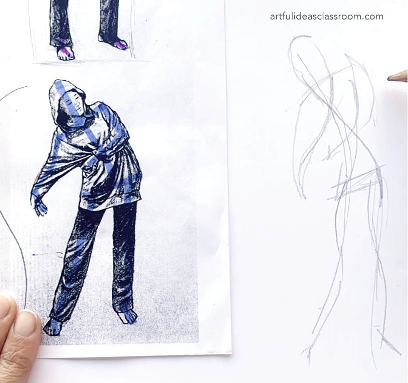 Gesture Drawing from Life in ClassNext we transitioned from gesture drawing from 2D references to drawing from life. I had arranged the room in a U shape so there was space in the center for a model. I also prepared by giving each student a large drawing board with several pieces of newsprint and a few pieces of charcoal paper. Students also had vine charcoal, graphite sticks and white charcoal pencils to work with. I explained to students that they would take turns posing for their classmates and would be holding the pose for 30 seconds to 1 minute to start. To make the process more fun and ease anxieties I prepared a set of silly prompts for students to base their poses on. I typed these simple prompts out, printed them and cut them into strips that could be selected at random by students as they got up to model. The prompts vary from simple to silly, some examples include: “You are leaping over a puddle” or “you go pooped on by a bird.” I told students if they didn’t like the prompt they selected they could choose again. This worked out pretty well and took the pressure off of students to come up with a pose all on their own. We started with short 30 second poses and worked our way up to longer 2-4 minute poses with a stool or chair to support the student/models. As we worked through the gesture drawing session students became more comfortable with both drawing and modeling and for the later long poses students didn’t need to choose a prompt, they simply used the chair or stool to support their pose. 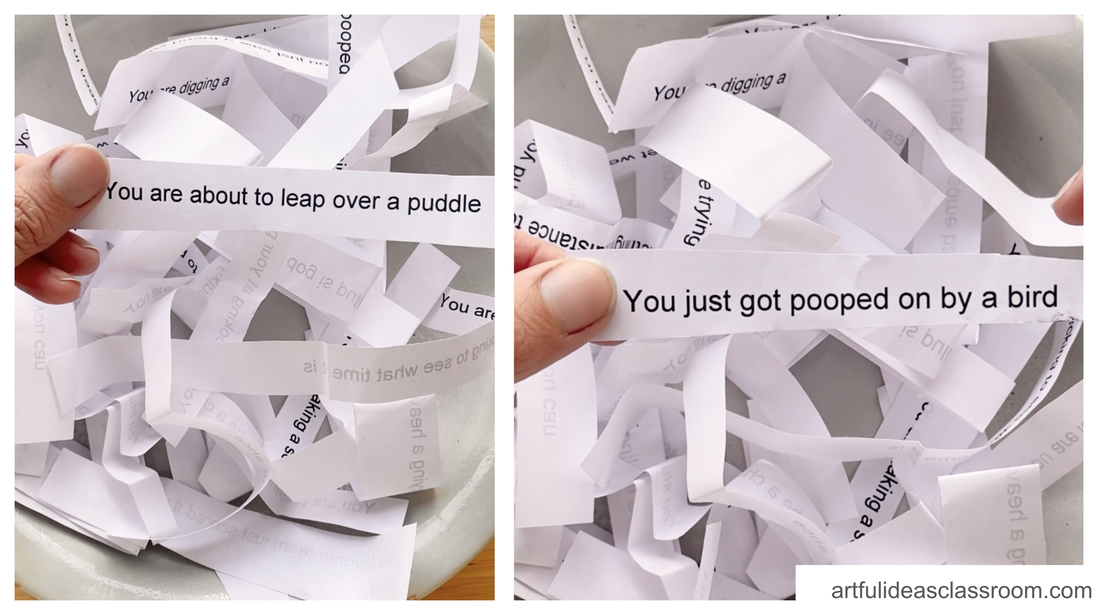 Gesture Drawing for BeginnersThe environment of the class was focused but also playful and supportive. I think this activity worked out so well because so much trust had already been built among the students. We did this project about 6 weeks into the semester and I think that was the perfect amount of time for students to build that trust and sense of classroom community. Building community has been a focus for me as a teacher the past few years following the remote learning days of the pandemic in 2020. I design structured interaction and collaboration opportunities into every lesson to help support students in building essential social skills and relationships with their classmates. This activity brought the students closer and brought a lot of joy to the group. We ended up doing these gesture drawings for two class periods. The first was just 40 min since we did the warm up lesson and the second we took the full 80 minute block period to model and draw. I even took part in modeling and had a lot of fun! 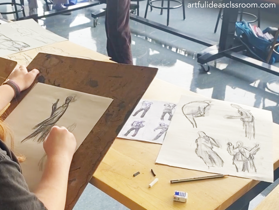 Student gesture drawing from life in class 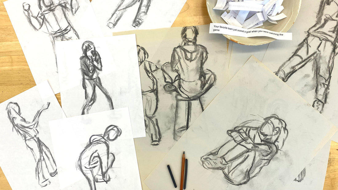 Gesturing drawings from our in class life drawing sessions Connecting Historical Figurative Art to Contemporary ArtIn this lesson, we also explored the connections between contemporary artists and art historical representations of the figure. As an art educator, it is important for me to demonstrate to my students that art-making is a "conversation" across time and cultures in which they actively participate. Establishing these connections between art history and contemporary art practice serves this purpose. We often looked at a few contemporary pieces as the day's “warm-up” and students responded in their art journals and discussed ideas in pairs. Some of the pieces and artists we investigated throughout this unit include:
 Art Journal examples of research into contemporary figure art Figure Collage ActivityAfter two class periods of gesture drawing and taking turns being the figure model, students had several pages of gestural figure drawings. I wanted students to use these drawings to create a study in a different material and to take time to develop the gestural image into something more substantial. I decided to take one of my own gesture drawings and try making a collage inspired by the lines of the drawing. The process was challenging and engaging and required visual problem solving and although the completed collage lost fluid quality of the original gesture drawing it had its own visual complexity that highlighted the aspects of the form in new ways. I also like how this activity directly connects to the work of Deborah Roberts and Bisa Butler, two contemporary artists that we discussed in class. Deborah Roberts works with collage to create figures often with exaggerated or distorted proportions because of the varied imagery she uses. While Bisa Butler’s textile work draws on the tradition of quilting and color and pattern are much more central to the compositions than proportions. A few students had even created art journal research pages about these artists so it was a wonderful opportunity to revisit this contemporary work and try our own collaged figures. I demonstrated a few techniques using drafting vellum to trace shapes to use as templates for cutting out paper to fit the figure. We also have a light table in the classroom which several students found helpful in their process of collaging the figure. The finished collages were varied and students enjoyed developing their sketches into a more finished composition. 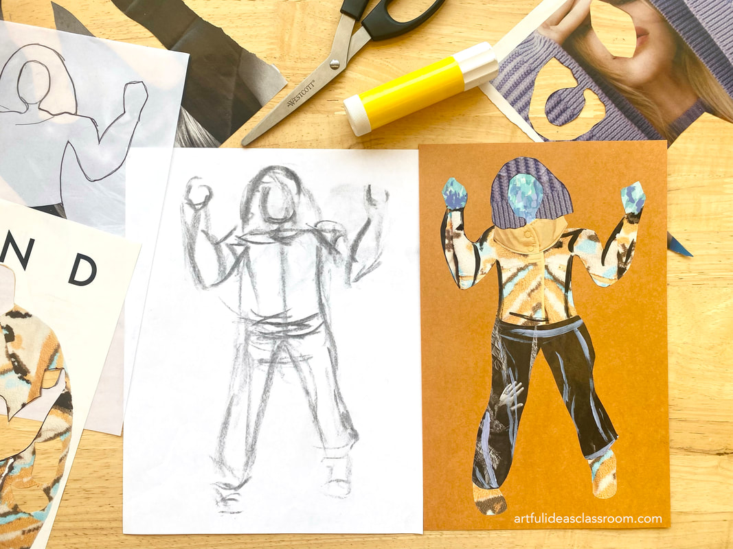 My example from the collage figure assignment lesson Life Drawing Class with Costumed ModelThis unit also included a field trip to a local life drawing studio for a costumed model drawing session. The timing, right around Halloween, added an exciting twist as the class featured a model dressed as a witch. To enhance the students' creative exploration, we prepared individual kits containing an array of materials, including vine and compressed charcoal, charcoal/white charcoal pencils, graphite sticks, colored conté crayons, and kneaded erasers. Additionally, we brought various types of papers, ranging from newsprint to pastel/charcoal drawing paper with different tones. The three-hour drawing class mimicked the structure of a college art class, starting with short 30-second to 2-minute poses for gesture drawing, followed by a few longer 10-minute poses and culminating in two extended 40-minute poses with breaks. Given that the model was clothed, we received permission to capture photographs of the longer poses for continued work on the drawings. The students actively engaged in the session, demonstrating enthusiasm from the outset. Despite being an optional weekend field trip, every student attended and stayed for the entire session. Their feedback at the end was overwhelmingly positive; they felt well-prepared for gesture drawing due to prior classroom practice, and the class seemed to fly by as they focused intently on observation and drawing. This unique experience provided a valuable peek into a college-level art class and left a lasting impression on the students' artistic journey. I highly recommend taking your students to a life drawing class, if possible. Most cities have studios or community colleges that offer these classes with clothed models suitable for teens. I discovered the class we attended through a simple Google search, and the teacher was incredibly accommodating and enthusiastic about our participation. I suggest reaching out to the studio in advance to inform them of the number of students attending and to inquire about reserving space to avoid the possibility of being turned away at the door on the day of the class. 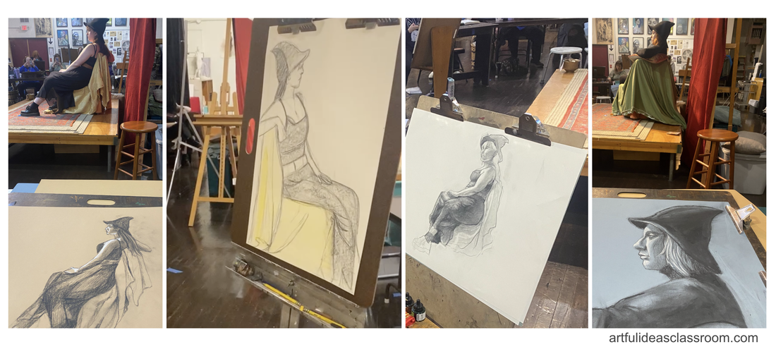 Photos from our field trip to a life drawing class with costumed model Final Thoughts on Teaching Figure Drawing for BeginnersTeaching figure drawing to high school students can be a rewarding and enriching experience. Focusing on the broader aspects of the topic, such as the purpose of gesture drawing and exploring the mood conveyed by different poses, allows students to delve into the world of figure representation without feeling overwhelmed. Introducing them to various historical styles of depicting the figure sets the stage for a more in-depth exploration in college, saving detailed discussions on proportions, anatomy, and musculature for later. Incorporating exercises that train the eye to perceive the figure as a whole fosters valuable observation skills. In-class gesture drawing sessions, where students take turns modeling, not only enhance community building but also provide a low-stakes and enjoyable way for students to draw from observation. While attending a life drawing session with a clothed model is a fantastic opportunity, it is not essential for the overall learning experience. This unit would work well in a first year IB Visual Arts class, offering a theme central to art across cultures and time periods. The discussion can seamlessly lead into the IB Art Comparative Study task, allowing students to practice visual analysis skills by comparing and contrasting representations of figures. For a more in-depth look at this lesson, you can explore the "Day in the Life" episode on the Art of Education University's YouTube channel, where I shared a full day of teaching during this fun and engaging figure drawing unit.  Pattern Design FundamentalsTeaching pattern design offers valuable lessons to art students, enabling them to transform basic elements and sketches into intricate compositions. Pattern design encompasses a wide array of techniques and approaches for students to experiment with. Also, pattern art and traditions can be seen across the globe within numerous cultural contexts. This makes it an excellent topic for students to explore and connect with diverse artistic traditions from around the world. This topic could also be a great opportunity for students to research the pattern traditions from their own cultural backgrounds. In my teaching practice, I incorporate a pattern design unit within both my advanced studio art class and digital art classes, utilizing software like Photoshop to craft unique repeat pattern designs. In both classes students explore the technical elements of pattern as well as the conceptual meanings patterns can convey and carry. We talk about the connections between traditional patterns and popular branding design, for example how Scottish tartan patterns are used by luxury brands like Burberry but also office supply company Scotch. It is fun to trace the history of patterns like Paisly or Boteh which traveled across the Silk Road, through Europe and into the American West to be used on bandanas. Patterns are endlessly fascinating both to design and study. I’m going to share some of the concepts I like to teach for these units in the hope that you can design your own pattern unit that fulfills your learning goals for your students.  Types of Repeat PatternsTo start off the unit I teach students the most common types of repeat patterns and show visual examples of the unit (the element that repeats) and the repeat pattern (created by the repetition of the unit). This will lead into the second part of the lesson when I teach them how to design patterns step by step.
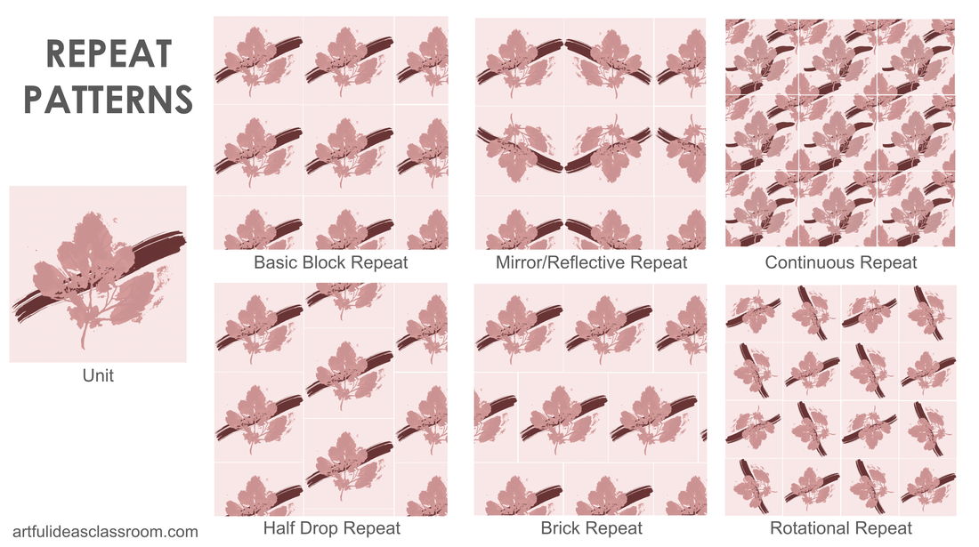 Discussing Pattern Traditions in Global CulturesThere are so many wonderful examples of pattern design in cultures across the globe. This can include textile patterns, ceramic tile patterns, decorative patterns and even tattoo patterns Some of the pattern traditions I like to share with students are:
Creating Handmade Repeat PatternsIf you have access to a copy machine or scanner (phone)/printer it is really easy to create quick but visually impressive handmade patterns with your students. Even simple brush strokes, textural rubbings or paint splatters can look sophisticated in a repeat pattern so it is a fun and low stakes activity where beginners can be successful. I like to start off with some simple techniques and demonstrate the pattern design fundamentals. 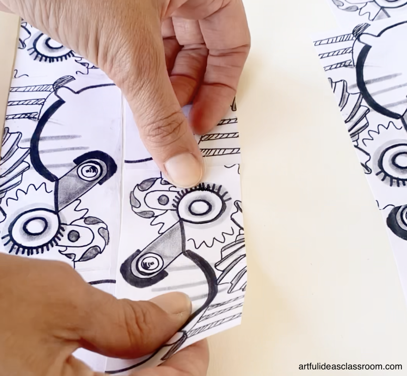 Materials and Tools for Pattern DesignI love to create the first patterns in a way that is less controlled so I avoid rulers and pencils/erasers and opt for crayons (for texture rubbings), india ink, or markers so that students don’t feel like they have to be so precise as they are creating their motifs. For latter activities like the continuous pattern I provide students with design vellum (which is a bit thicker than tracing paper) and thin markers like these sharpies and these Crayola SuperTips markers are great and affordable. Students will also need glue sticks, scissors, XACTO knives, cutting mats, rulers and paper. Designing a Pattern UnitFor our first pattern design I provide students with a piece of mixed media paper and India ink and rough brushes of assorted sizes to create textures or I set out crayons and textured items for them to create rubbings. Students fill the page with markings and then I give students a rectangular and square template to trace (I just cut these on the paper cutter using a thicker cardstock so they are easy to trace). Students trace the templates and give me a rectangular and square selection to photocopy to serve as the units for our first patterns - half drop and rotational repeat patterns. I fit as many of the extracted squares/rectangles as I can on a piece of regular copy paper (to save paper) and photocopy 10-12 copies. I roughly cut them out using the paper cutter to pass back to students. Then students will then cut them out more precisely and place in repeat patterns on a larger piece of paper and glue them down to form the repeat patterns. 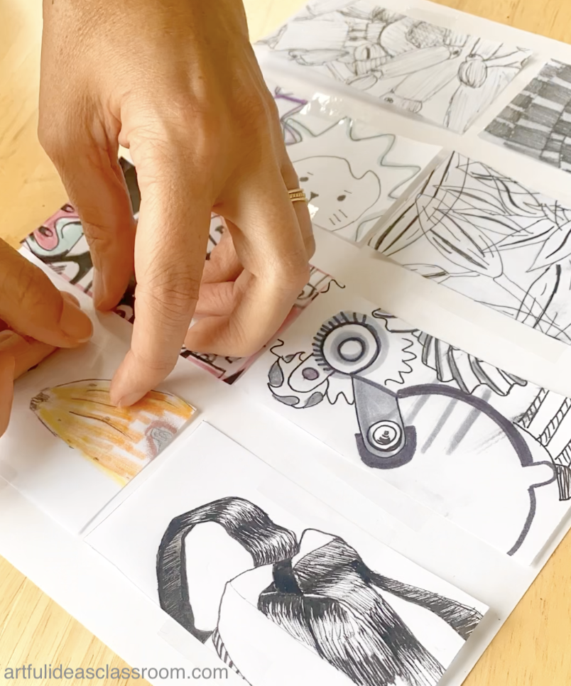 This is where the magic happens, really simple motifs become beautifully complex and students begin to see the power of repetition in their artwork. Following these exercises we move on to creating a continuous repeat pattern with a bit more intention using the design vellum and markers 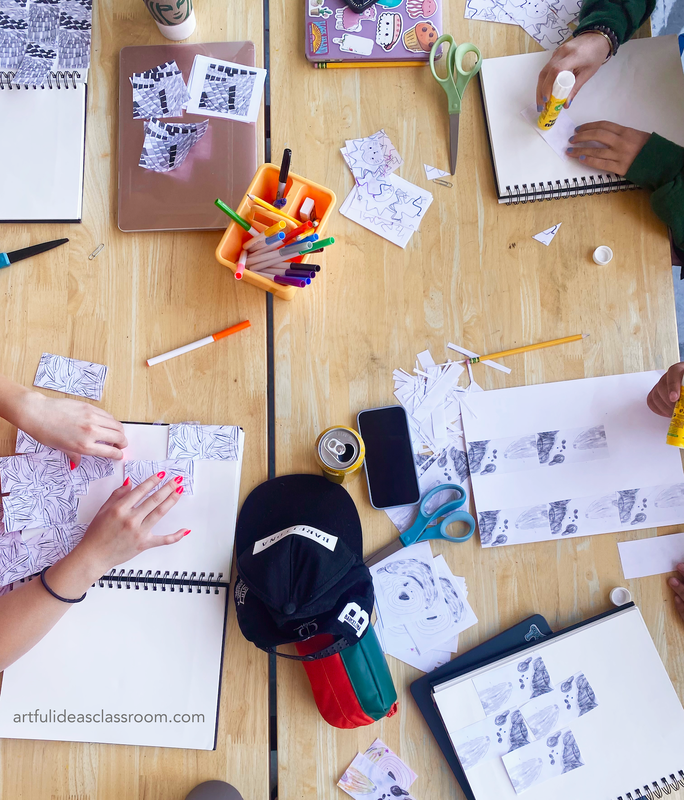 Continuous Pattern DesignTo create a handmade continuous repeat pattern students need to begin by creating a drawing within a square format where the elements do not touch the edges of the paper. This concept can be a bit difficult for students to understand so I typically provide an example and lead them step by step. For my students it can be difficult to come up with a theme for their pattern so I assign an observational drawing in their sketchbook as homework to draw an object they find visually/conceptually intriguing and then when they come to class they can use the design vellum to trace aspects of that sketch. But any theme will work here. I have also in the past brought in natural forms like flowers, shells and leaves for students to be inspired by for their pattern designs. As long as the elements are not touching or going off of the paper this technique will work. Once students are happy with their drawings they will begin to create the offset that will make the pattern continuous. The first step is to find the middle of the square vertically, students can fold the paper to find the center if the measurements are not even. I supply my students with a 5” X 5” square so it is easy to find the center at 2.5”, then students should carefully cut the square along that vertical line and switch the piece that was on the left to the right side and tape it on the back side of the paper to create the square again. 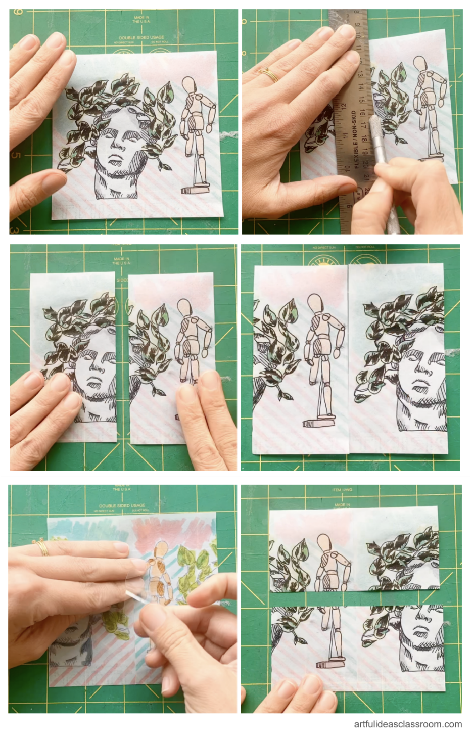 Then they do this process again with the horizontal axis, cutting it at the halfway point (again folding is fine to find the middle) and switching the pieces (what was at the top goes to the bottom and what was at the bottom goes on the top) and taping the back. If students followed instructions and didn’t draw their design to the edge of the paper there should be a bit of space in the center of their new square. In this space students should add another element/motif. Adding this extra element in the new center space is key to creating the look of a continuous pattern. If students didn’t follow instructions and filled the paper edge to edge they will not have the space to add the element (this has definitely happened in my class before and I just let the student follow along in the process but explain that this technique is not really necessary for their design because it will just repeat as it would without creating the double offset). 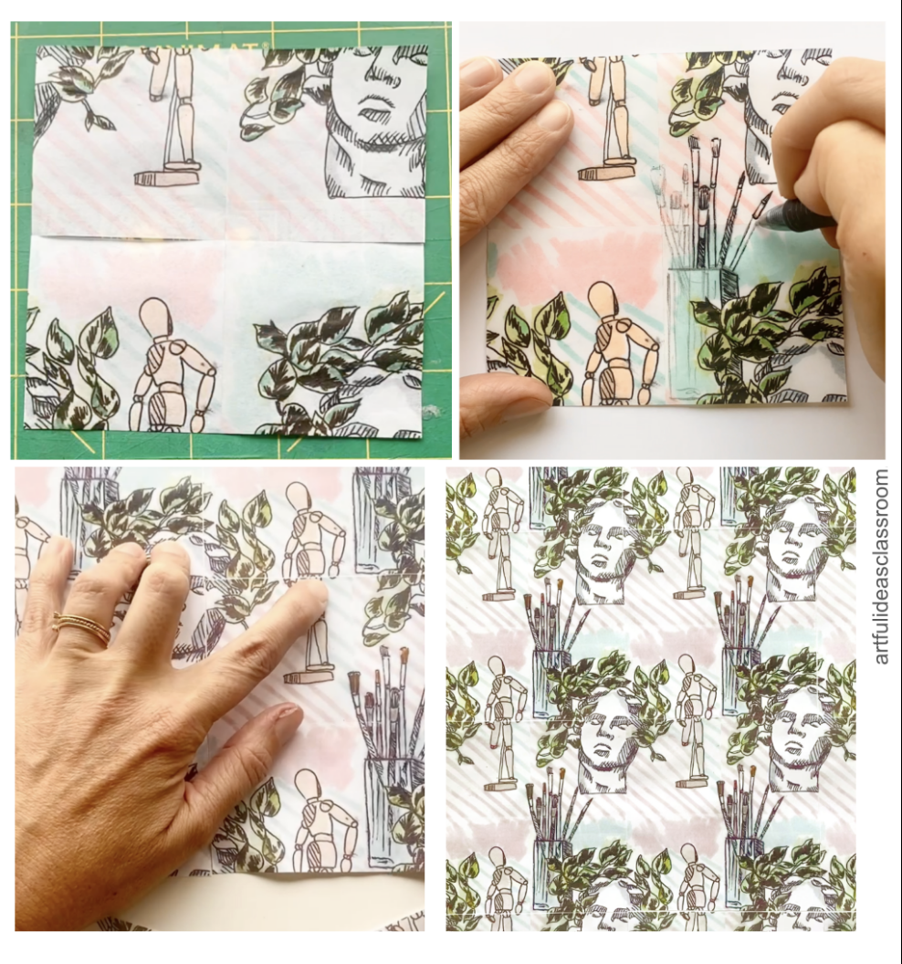 Once students add the extra element I photocopy their units again (we are lucky to have a color copier so I do this design in color.) Just as before I pass back the units and students line them up in a repeat pattern by hand seeing how the element they added after cutting their square creates a sort of bridge between the elements and breaks up the square format, making more of a diagonal half drop pattern. 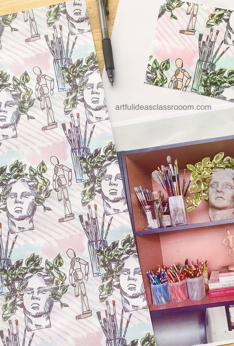 Now that students know how to make a unit for repeat they can think about how they can create patterns without using the copy machine and instead use printmaking methods. In my classes these exercises can lead into a printmaking project where students use relief printing or silkscreen to create patterns. This Tile Pattern Printmaking project inspired by Portuguese Azulejos and Mexican Talavera tiles is a great follow up to this activity! Creating Digital Repeat Patterns with Adobe PhotoshopIn my digital classes the pattern design unit follows much the same progression as in the traditional media classes. I like to begin with traditional materials because we spend so much time on the computer in this class and it is great to take a break from screens and work with our hands. We start out with a piece of mixed media paper and india ink and rough brushes of assorted sizes to create textures. I also set out some natural forms to inspire students like flowers, leaves, acorns, pinecones, and shells. Students created marks using the india ink inspired by the natural forms. Students were given the instruction to make their elements “islands” or to not have any marks overlapping or touching one another. This is key because students will be extracting these elements from the background to recolor and use in a variety of pattern compositions.  Once students have a few pages of elements created using black india ink that have white space around them (islands) then they are ready to photograph their papers using their phone (I found this works just as well as a scanner because phones have such great cameras nowadays!) How to Import the Design into Photoshop wStudents then email or airdrop the photos they took on their phones to themselves. These will come in as HEIC files which they can export to JPGs or just open as is in Photoshop. If they come in as “smart objects” all they have to do is right click the layer and “rasterize.” Once the photos are open in Adobe Photoshop students can use levels to adjust the white/black (I teach them to simply use the white eyedropper and black eyedropper for a quick white balance). Then they can use selection tools like the magic wand selection tool to select out the black from their design. As long as “contiguous” is left unchecked the magic wand will select all black pixels then I have students select the inverse and delete the white background, this leaves the elements on transparent background and preserves the gray tones in the elements that they created with the ink. From this point students can simply use the lasso tool to circle elements (that is why making them “islands” is so important!) they want to copy/paste into their pattern unit. To recolor the elements students use the layer effects “color overlay” which preserves some of the subtleties of the original brush painting. If you would like to purchase the full Pattern Design in Photoshop lesson which includes step by step video tutorials, visit my TPT Shop. 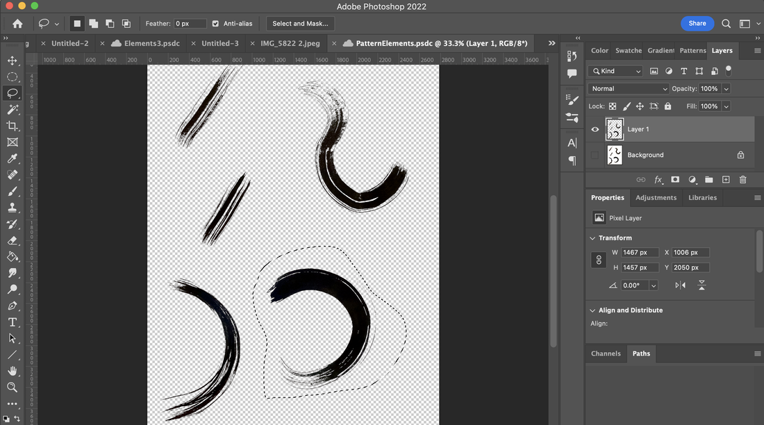 Defining a Pattern TileI guide my students to create a seamless/continuous repeat by starting with a square because it is the easiest to measure. I tell them to create a new canvas that is 4”X 4” or 1200 X 1200 px. This even number is easy to divide by 2 and that will come in later on when we use the offset filter. Students fill this pattern tile with elements and recolor as they like, some students leave the design black and white. I tell students not to let any elements go off of the canvas / touch the edges. I also tell them not to make a gradient background because this will interrupt the continuous pattern later on. 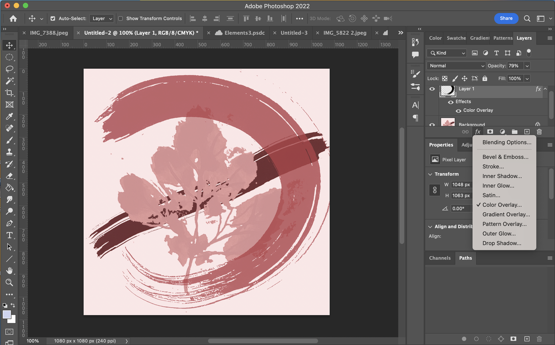 Creating a Seamless PatternOnce they have a design tile that fits this criteria we simply apply the offset filter which is located under Filter-Other-Offset. But it is important that before you apply the filter that you use the crop tool on the tile, not to crop the tile but to make sure there aren’t excess pixels outside of the canvas. So click on the crop tool and hit return and then apply the filter. On the offset filter we set the dials to half of the size of our tile which is 600 px. This will create the exact same effect that we created by hand in the other class. Now students will have some empty space in the center and they must add at least one more element to that space to create the bridge for the continuous pattern. This element should span from one section of the tile 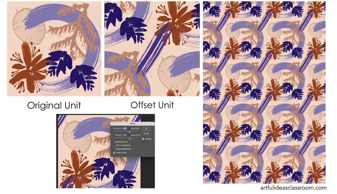 Refining Your PatternStudents can see how their pattern looks in repeat by going to EDIT-DEFINE PATTERN and saving their pattern there. Then they can create a new document that is large enough to see their pattern repeat, I recommended 12” X18” to my students, and reminded them to keep the resolution consistent at 300 ppi. Once they have the new document they will simply go to EDIT-FILL and choose “pattern” from the menu and select “custom pattern” scrolling down to find their pattern tile. This is the really fun part because students will see immediately what the pattern looks like in repeat. From here students can revise their pattern tile if they would like or use this repeat as their final design. There is also a tool called Pattern Preview under the View menu that allows students to preview and adjust their pattern in real time. Not all versions of Adobe Photoshop have access to this tool but it is really neat if students can access this tool because it allows students to view and refine their repeat in one step. 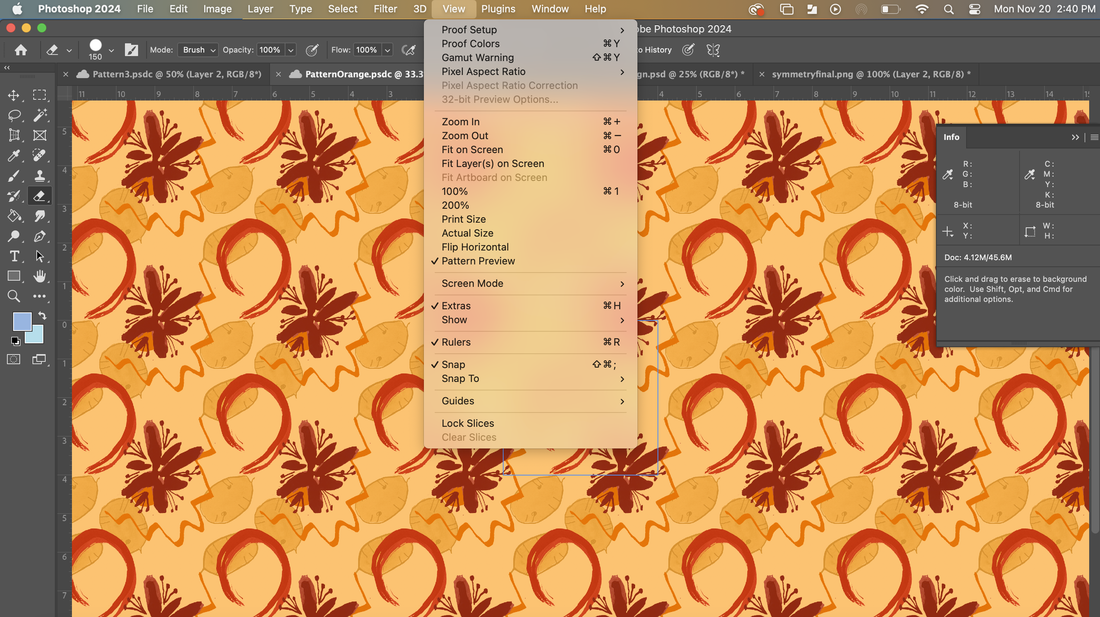 Saving and Exporting the Pattern in PhotoshopOnce my students have completed their Digital Pattern Designs I guide them to export the patterns into PNG or JPG formats for easy sharing and printing. Students also save a PSD file in their Creative Cloud so they can preserve editing capabilities. To export as a jpg/png students go to FILE-EXPORT-EXPORT AS and choose the desired file. This is such a fun lesson and easy to make several different patterns. In my digital classes we discussed color schemes along with this lesson so that students could recolor their patterns in multiple ways and explore the impact that color, tone, and value made on their finished repeat patterns. Getting Started with Creating PatternsMy biggest takeaway from teaching these lessons is to not be intimidated by the process, since there are many steps to both of these lessons, there will be students who miss part of the sequence and have less than perfect results but this is to be expected and those students are still learning through the process and will absorb the lesson even better because of their mistakes. I would say the most important thing you can do to help your students be successful in creating patterns step by step is to take the guesswork out of the measuring by providing materials or size guidelines that are simple even numbers and to begin with square shapes for the continuous pattern designs. Once students grasp these concepts they can take the ideas and run with them. Following this lesson my advanced class created their own pattern art projects based on ideas they are exploring individually in their art journals. Some of them purposefully broke the “rules” of repeat patterns and some adhered to the principles we discussed in the lesson. Both approaches led to visually compelling and personally relevant designs. To see their work and our pattern critique check out this Instagram Reel. More Artful Ideas HereIf you have additional questions about this lesson idea or are looking for more ideas you can use today in your art classes follow me on Instagram at @artfulideasclassroom, where I share weekly videos and art teacher tips. You can also email me at [email protected] to continue the conversation. If you’d like to see the exact materials I purchase for this lesson and others download my FREE ART MATERIALS GUIDE here.
Intro to Art LessonI love to start off the semester with my advanced classes considering the (unanswerable) question "What is Art?" in a discussion and reflective Visual Art Journaling activity. I find this is a great way to begin the class because my students are coming to the class from a variety of backgrounds and art experiences and this discussion allows students to share those experiences as well as create a foundation of understandings as a class group. Some of my students have traveled the world and have visited many museums while others have never set foot in a museum or left our city. I love this lesson because it creates a level playing field- each student regardless of their background has a valid opinion to share and the artists/artworks that I selected for us to discuss are often unknown/surprising to most if not all of the students and push all the students to question their assumptions of what art is. The guiding questions for this lesson come from IB Theory of Knowledge (TOK) so it ties in beautifully with the IB Diploma Program if you are teaching IB Visual Arts-(which I taught at my former school for 8 years) but could definitely work with any high school art class as an opening activity. 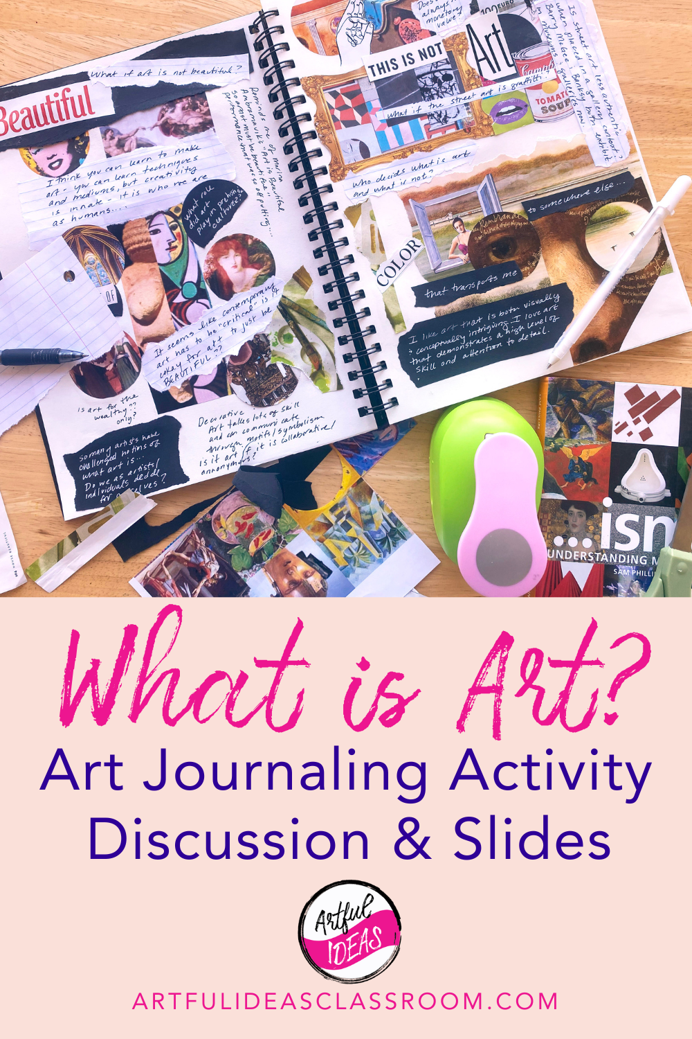 Reflection Activity for Art StudentsThe lesson begins with students reflecting individually prompted by a series of questions that I give to students at the start of class. Once they are done writing down their own ideas, students begin discussing their responses with their peers. The questions on this questionnaire are more focused on the student's individual experiences with art and beliefs about art, for example "how does art play a role in your life? and can art be taught?" This reflection activity is helpful for students to begin thinking about their connection to art and their beliefs about art and art making . Some of the students include these reflections in their art journal page collages later on in the lesson so I encourage students to hold onto the questionnaire or paperclip it into their visual art journals (I like to provide my students with hard cover spiral bound sketchbooks to use as visual art journals). Contemporary Art Slideshow and DiscussionFollowing that discussion we look at a series of slides with examples of contemporary artwork that challenges ideas of "what is art?" and I share background about each of the artworks. The slide also has a question for students to consider and I have a few follow up questions related to the artworks to pose as well. Then students discuss the questions at their tables with a partner and I call on students using equity cards to share out ( to make sure all voices are heard). There are some artworks that always get a big reaction: Duchamp's Fountain, Paul McCarthy's Complex Pile, an installation of larger than life inflatable dog turds or Patricia Piccinini's unsettling sculptures that combine human and animal anatomical elements in a hyperrealistic stye. This year I updated the lesson to include a slide with two sculptural works:Damien Hirst's For the Love of God a platinum cast of a human skull covered in flawless diamonds and Maurizio Cattelan's Comedian, a banana duct taped to a wall to discuss questions about the inherent monetary value of artworks and where that value comes from. Does it come from the materials? The labor put into the work? The idea itself? The prominence of the artist? It is fun to see the students assumptions being challenged as we go through this discussion and I am always struck by the thoughtfulness students bring to this activity. The slideshow I created has several slides and examples and each year I go through and choose which ones we will discuss based on the group and what I've observed of their interests and the time we have for the lesson. While this part of the lesson is valuable, I want to leave time for students to research and reflect on their own as they create their visual art journal pages. 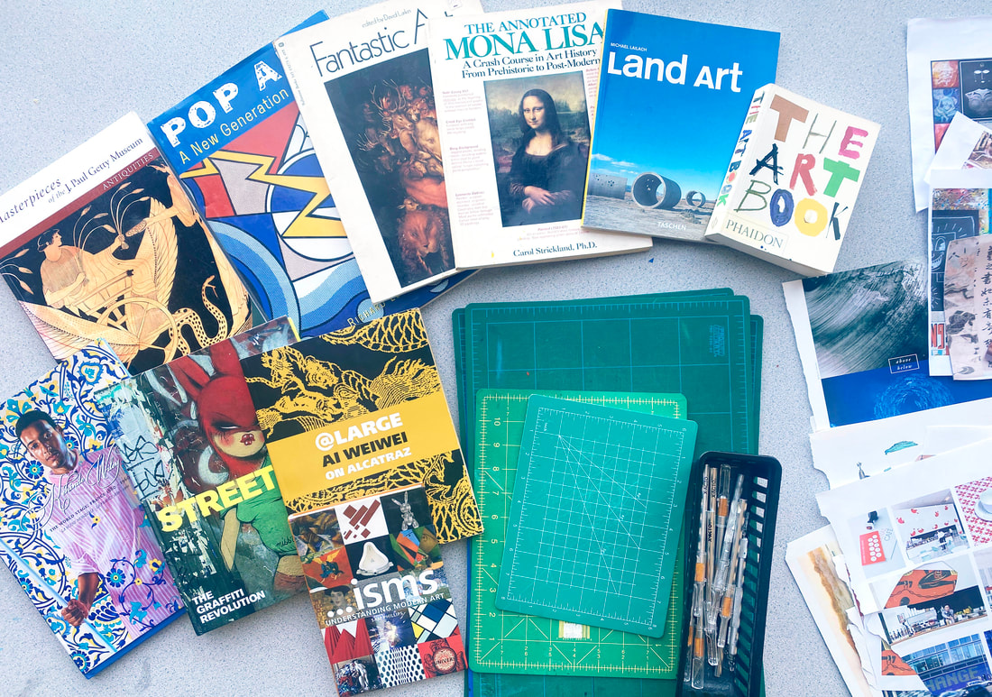 Art Books for High School StudentsTo prepare for the art journaling part of this lesson I gather some of my favorite art books to share with students that explore a range of artworks from different time periods. Some of my favorite staples to have are: Isms: Understanding Art by Stephen Little The Annotated Mona Lisa Third Edition: A Crash Course in Art History from Prehistoric to the Present by Carol Strickland and The Art Book (mini) by The Editors of Phaidon Press. I also include exhibition catalog books from exhibitions I have visited and some of the books I think students might find interesting from our class library. It is important when showing high school students contemporary art books to preview the books prior to putting them out. Some of these books contain challenging/disturbing/sexual imagery that is not appropriate for this age group and would require parental consent for students to view so make sure you preview all of the pages of the books before giving them to students. I always make the announcement that there might be nudity in the art books because the human figure has been an artistic subject for all of time, I typically cite the Venus of Willendorf, which is a prehistoric sculpture of a woman. But I make sure that if nudity appears in a book it is not in a sexually explicit manner. Some of the topics I include in the selection of art books are: Land Art, Street Art, Pop Art and examples of ancient artwork or folk art from a variety of world cultures. 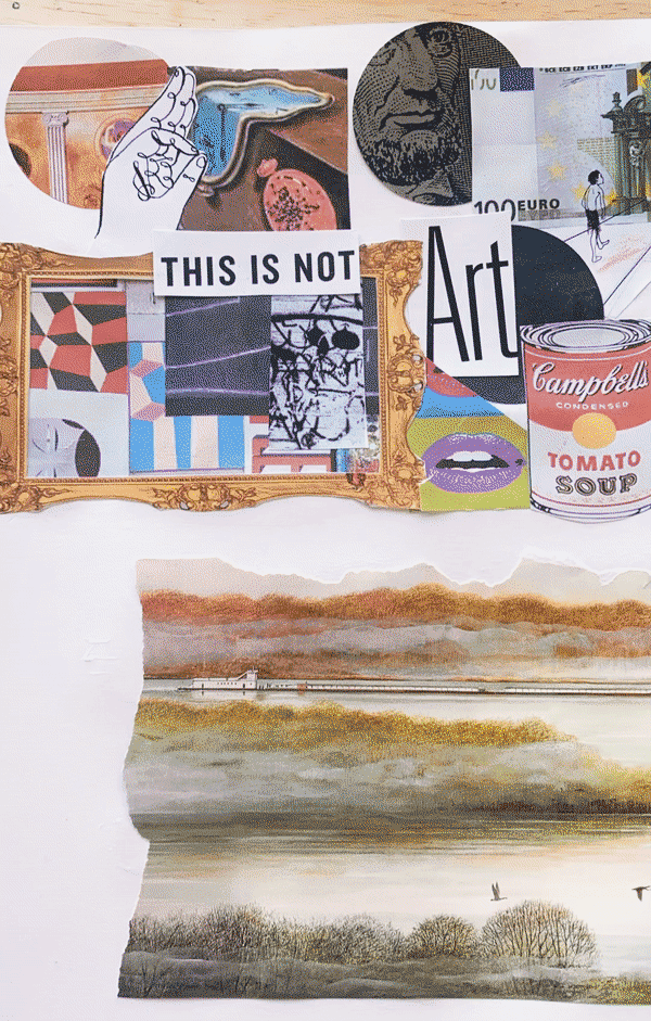 Tips for the Collage ProcessI provide a wide range of imagery and collage tools/materials for students when we do this activity. I curate the printed materials they can use in this lesson and avoid the typical magazines (sports, fashion, NatGeo) instead I put out the art school brochures, old art magazines the library was going to throw away and I even print out collections of images from art history for students to cut up. To find these images I just google image search "art history collage" or "art history artworks" and I find ready made grids with several well known artworks. I also like to set out Xacto knives, shape punches and colored paper. The Visual Art Journaling process is an artistic process so I typically will demonstrate some techniques like how to use an Xacto knife safely, how to use the negative/positive space of an image (see example in the image above) and ways that they can combine text and imagery in a more aesthetically pleasing way on the journal page. It is especially helpful to include white gel pens among the materials so that students can write on darker paper to contrast their collage elements and the white of the page. 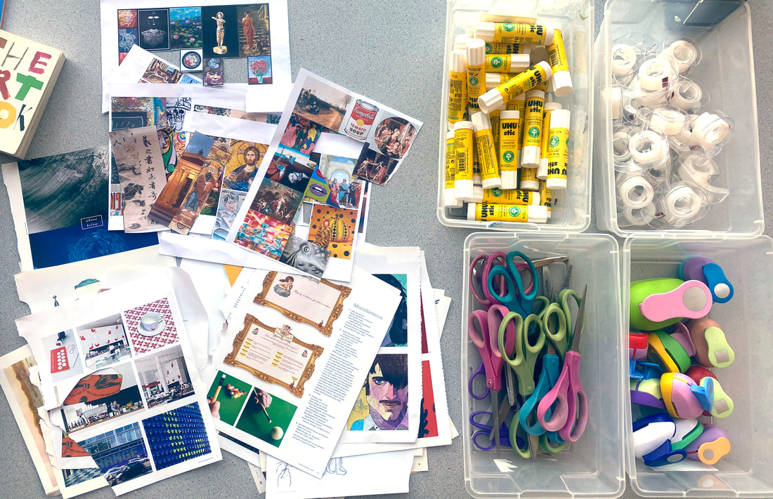 Written Reflection in Visual Arts JournalsMost art students really enjoy the collage process in this lesson and sometimes it can be a challenge to balance imagery and text (reflections) on the art journal page. Students will often ask "is this enough writing?" when they are working on their pages. It is important to guide student away from this kind of thinking, that there is a certain amount of writing they need to "check that box." Of course this activity comes with the expectation that students will include written reflections on their art journal pages but I don't want students to just write to fill space. The quality of their writing reflects the depth of their thinking around these complex philosophical questions. So it is important that students don't get so caught up in the collage process that the writing is an after thought. To facilitate the writing process I project a slide with guided questions on the board while students are working and frequently refer students back to the questions as jumping off points for their reflection writing. It is also okay for students to use these pages to ask additional questions about art, and I encourage students to include questions in their text. I also require that students choose one of the art books and take time reading about an artist or artwork (I usually do this as a warm up on the second day of the project). This exploration is really helpful for IB Visual Art students prior to beginning their Comparative Study project. 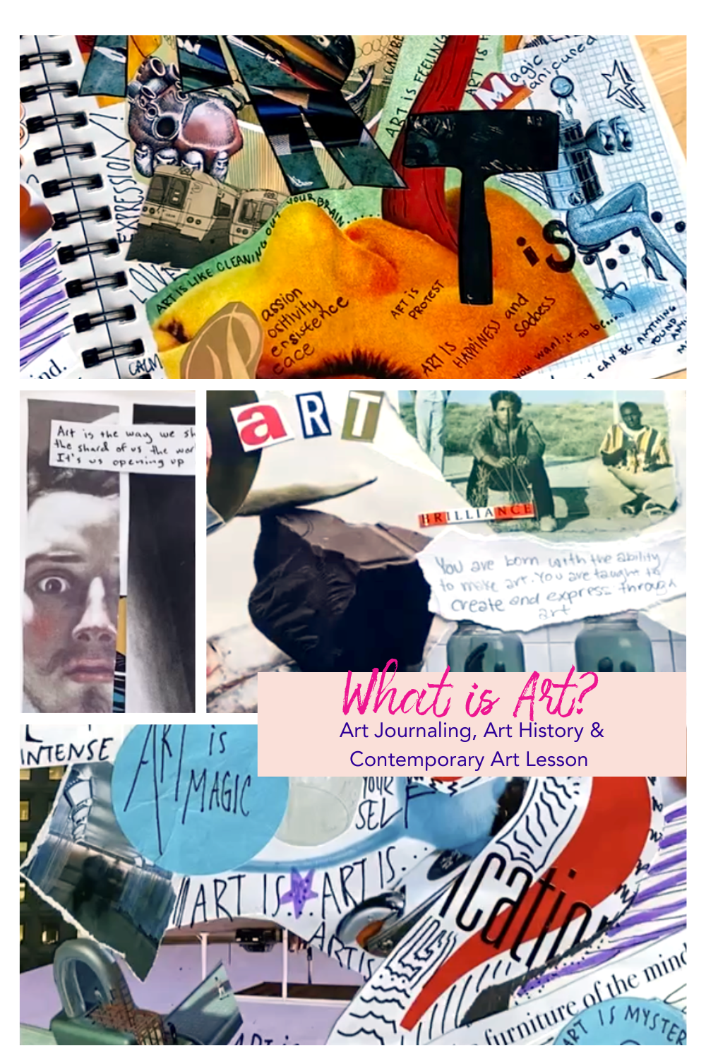 What is Critique?Following the discussion and making the Visual Art Journal pages we come up with a list as a class of the "standards" by which we can judge art. Some examples of what my students have come up with include: "how well conveys the message- can you get meaning from it," "if there is evidence of skill or effort in the artwork" or "base it on what the artist was trying to achieve in the beginning- is it successful?" I keep these responses on a list in the lesson slideshow to refer back to during the discussion. Then we watch the video: How to Critique on Youtube by The Art Assignment by PBS Digital Studios. The main idea of this video is that critique is a gift to the artist and that we should offer the artist insight into what their work is conveying to us as viewers both conceptually and visually. There is a beautiful line in the video when the host Sarah Green shares a quote from artist/writer Matthew Goulish who says to "let us look instead for the aspects of wonder." I love this idea for critique that we should be looking for the "wonder" in the artwork and describing what we perceive to the artist. Following the video we have a partner discussion and then we take our standards from the earlier brainstorm and discuss them a bit more narrowing them down into categories. The categories that I put forward are: Media, Composition, Conceptual and Technical. Each one of these has a different definition that we look at together and edit to express the understandings of the group. 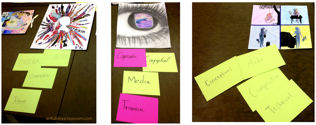 Creating Critique CardsI learned this critique strategy at an IB (international baccalaureate) conference in 2014. The presenter explained the procedure and then we were given an opportunity to create our own artworks and use the strategy for a critique. I have been using this strategy in my classroom since and have made only minor adjustments to how it was presented to me at the conference. Following this activity where we generated our group definitions for the four critique categories: Media, Composition, Conceptual and Technical, students are given 4 index cards. On one side of the card they write the word (media, composition, technical, conceptual) and on the other side they write the definition. These cards are used for our critiques as a way to comment on the strengths of these categories in the students' artworks. The process goes like this: A student places their work on the table for critique or pins it up on the critique wall and arranges their cards in front of their own piece in the order of the elements they think are strong in their own work. For example if a student thinks their use of media is particularly strong they will put the card that says "media" at the top of the arrangement of cards (closest to the base of the artwork). And if that student thinks that the conceptual qualities of their work are the least developed they would put that card underneath the others (farthest from the base of the artwork.) see in the photo above how students place their cards in preparation for critique. If two criteria are equally strong in the piece they can be placed side by side. The next step in the process is for students to gather around the work and look at the arrangement of the cards that the artist has put out. Students can then ask questions about the artwork and make adjustments to this arrangement by moving the cards. If a student moves a critique card to a new position they must give a justification as to why they are moving it. For example they might say "the drawing in this piece is highly detailed and demonstrates skill and sophistication using the elements/principles, so I'm moving 'technical' up in line with 'conceptual' here." The cards give students an opportunity to participate in the discussion and share their points of view without the repetition of statements "I like" or "it's really good" which was what I used to hear in critique discussions before implementing this strategy. Revisiting the Question "What is Art?"I have found that this "What is Art?" lesson and discussion opens up a dialogue that we can revisit throughout the year with each new unit or topic we explore as a class. I love that my students have a visual record of their thinking and beliefs around art and the philosophical questions people have been grappling with for centuries and still confront today. I find that my students often refer back to these pages and find connections to their work and visual investigations throughout the school year. I hope you try this lesson with your students, it is a great way to build classroom community and set positive norms around classroom discussion and critique! 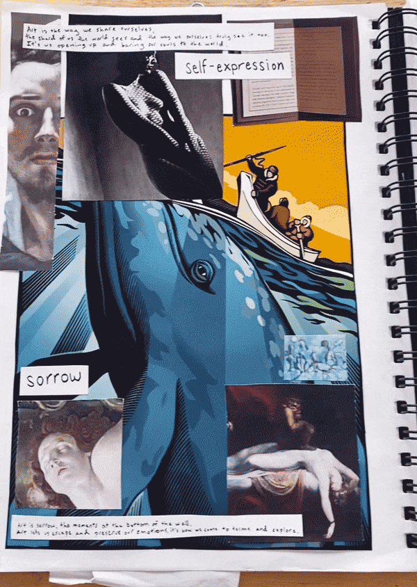 Art for Hispanic Heritage MonthI have long admired the work of Mexican printmaker and political cartoonist José Guadalupe Posada (b.1852 – d.1913). Printmaking is often referred to as the “democratic art form” because the production of multiples makes printed art more widely available, but also because in Posada’s time the populace was largely illiterate and relied on imagery to inform them of current events, and political issues. Posada’s work was especially impactful because of his use of symbols that conveyed meanings easily recognized by his audience. The most iconic of these are the calaveras or skeletal figures that are so prominent in his work. These calaveras have ties to ancient Aztec culture as well as the important holiday in Mexico, Día de los Muertos where families honor their departed ancestors and the natural cycles of life and death are celebrated. Calaveras can be used in art to convey a variety of messages, and are a intriguing topic to explore with Middle School and High School art students and a great way to learn more about Día de los Muertos artists and printmaking in art. 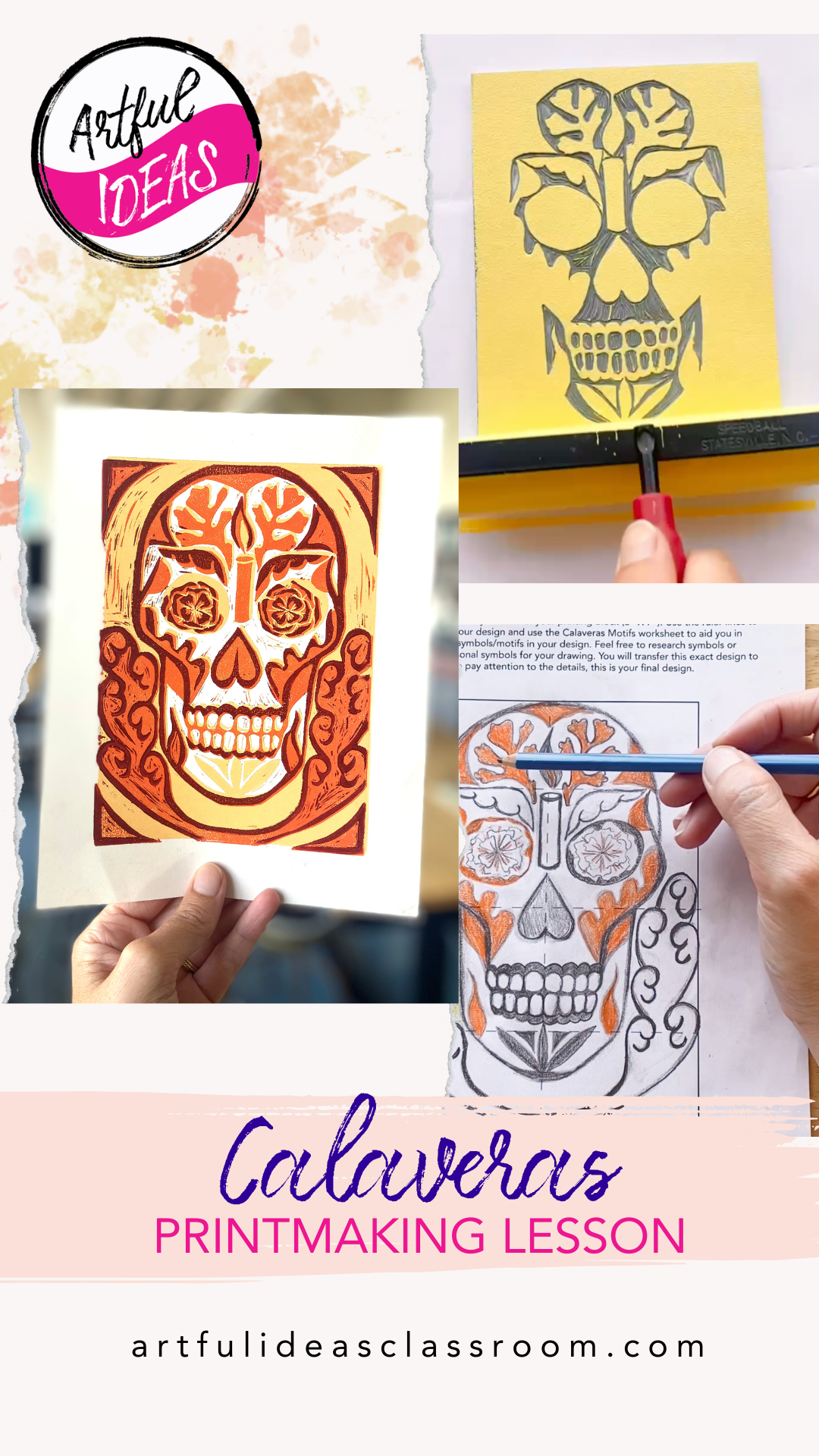 Bringing Calaveras to the ClassroomI wanted to design a culturally rich lesson, letting students use symbols akin to Posada's illustrations to convey messages relevant to their lives. Calaveras, or skeleton/skull symbols, have deep roots in Mexican culture and art, tracing back to the Aztec empire. Teaching this history is an important step so that student understand how symbols evolve and how artists can reshape them to create new meanings. To set up this lesson it is also important to convey the complex web of meanings surrounding calaveras. Since José Guadalupe Posada’s work is our guiding inspiration, I chose to use his work as a starting place. José Guadalupe Posada is considered the father of Mexican printmaking. He popularized calaveras in his Hojas Volantes (translated as “flying sheets”) or broadsheet illustrations. The idea behind using skeleton figures is to strip down all the trappings of a person (their wealth, status, social rank) and to show that we are all equal in our mortality. 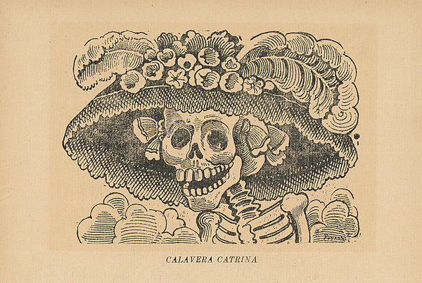 Calavera de la Catrina (Skull of the Female Dandy), from the portfolio 36 Grabados: José Guadalupe Posada, published by Arsacio Vanegas, Mexico City, c. 1910, zinc etching, 34.5 x 23 cm. La Calavera CatrinaThe most famous of Posada’s calaveras is La Calavera Catrina, or the elegant lady skeleton. Posada created La Catrina to criticize the Mexican elites of his time, specifically in their European manner of dress and customs and their scorn of the indigenous roots of the country. Today La Catrina has become a symbol of Día de los Muertos, a holiday that honors the lives of departed family members and ancestors. In Mexico, La Catrina can be seen on ofrendas or altars, in parade floats and as a popular costume for revelers in Día de los Muertos festivities. La Catrina also appears in one of Diego Rivera’s murals, “The Dream of a Sunday Afternoon in Alameda Park.” She appears in the center of the mural holding the hand of a young boy who is the young Diego Rivera. La Catrina even appears in the 2017 Disney film, Coco about a young boy who after a series of events is transported into the afterlife on Día de los Muertos. Calaveras de azúcar, or sugar skulls are another example of skull imagery associated with Día de los Muertos. These small intricately decorated confections harken back to the skull designs seen in ancient Aztec art. Aztecs held a yearly celebration to honor ancestors and the goddess of death/rebirth Mictecacihuatl who the Aztecs believed guided souls into the underworld. Día de los Muertos as a tradition represents the melding of Aztec and Spanish Catholic beliefs.  Girl in Catrina makeup and costume neighborhood of Coyoacán. The Art of Día de los MuertosCalaveras serve as joyful symbols of the cycle of life and death, embodying the idea that death is an integral part of the human experience to be embraced rather than feared. During Dia de los Muertos, celebrated November 1st and 2nd, families create ofrendas (altars) adorned with images of calaveras and other offerings to honor and remember deceased loved ones. Calaveras are meant to evoke a sense of playfulness and are often depicted dancing or playing music. Students can draw inspiration from a wide variety of calaveras imagery for this lesson and incorporate traditional symbols of Día de los Muertos like candles, marigold flowers, butterflies and a special bread roll called pan de muerto. Students can also incorporate symbols from their own lives or interests into the design. For example in the photo below, where the calavera has symbols of weath and social media fame. This concept is criticizing the cultural focus on accumulating views, likes and money instead of family and relationships. 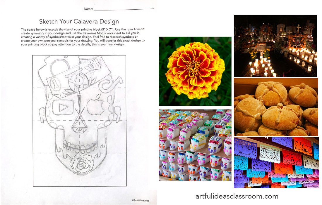 Students should spend some time researching symbols and sketching out ideas in their sketchbooks before drafting their final designs. Every symbol carries specific meanings so it is important students consider the message of their piece and the ideas they want to convey. It is also fine for students to include decorative elements that are more abstract and connect with the decorations seen on calaveras de azúcar and have mix of meaningful and decorative motifs in their design. 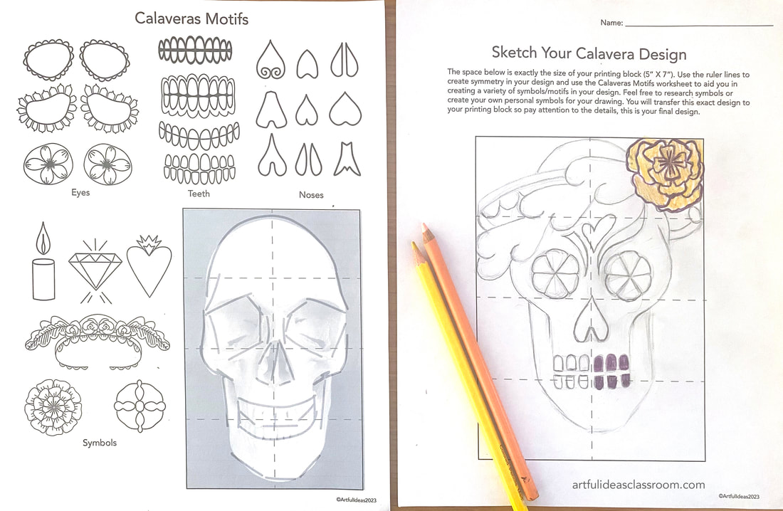 I present the idea of “stylizing” imagery or breaking it down into simple shapes and lines, this works well with relief printing and makes for a more successful design than drawings that are highly detailed with shading and subtle value shifts. Students should begin thinking in terms of layers and considering what will be “flats” or filled areas and what will be “line-work” or outlines. I created a worksheet and image reference guide to help students stylize their calavera designs and plan out the composition. All of the planning should happen on paper because you can only transfer the design to the block one time. Designs do not have to be symmetrical but the skull imagery lends itself to balanced designs. Sketching a Block Print Design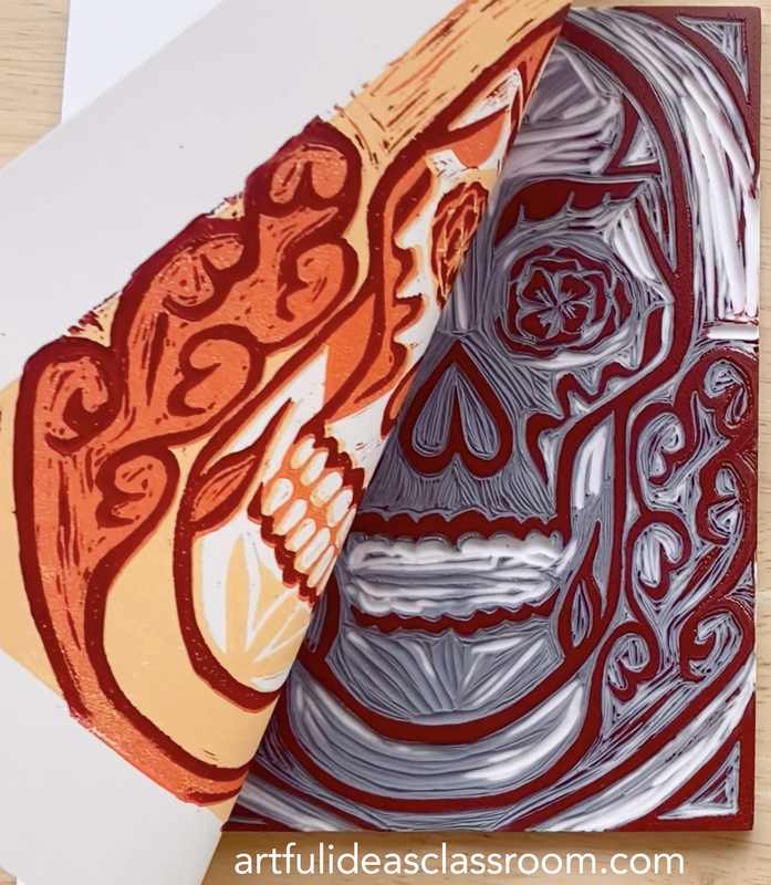 Reduction Block PrintingReductive printmaking, where a single block is carved multiple times to create a multi-colored print is a challenging form of relief printing but it is also visually impressive and teaches students valuable lessons of being decisive in their work (since you cannot go backwards in the process), and the importance of composition planning. The process requires careful planning and precise execution. Here's a brief overview of the reduction printing process along with some tips for success:
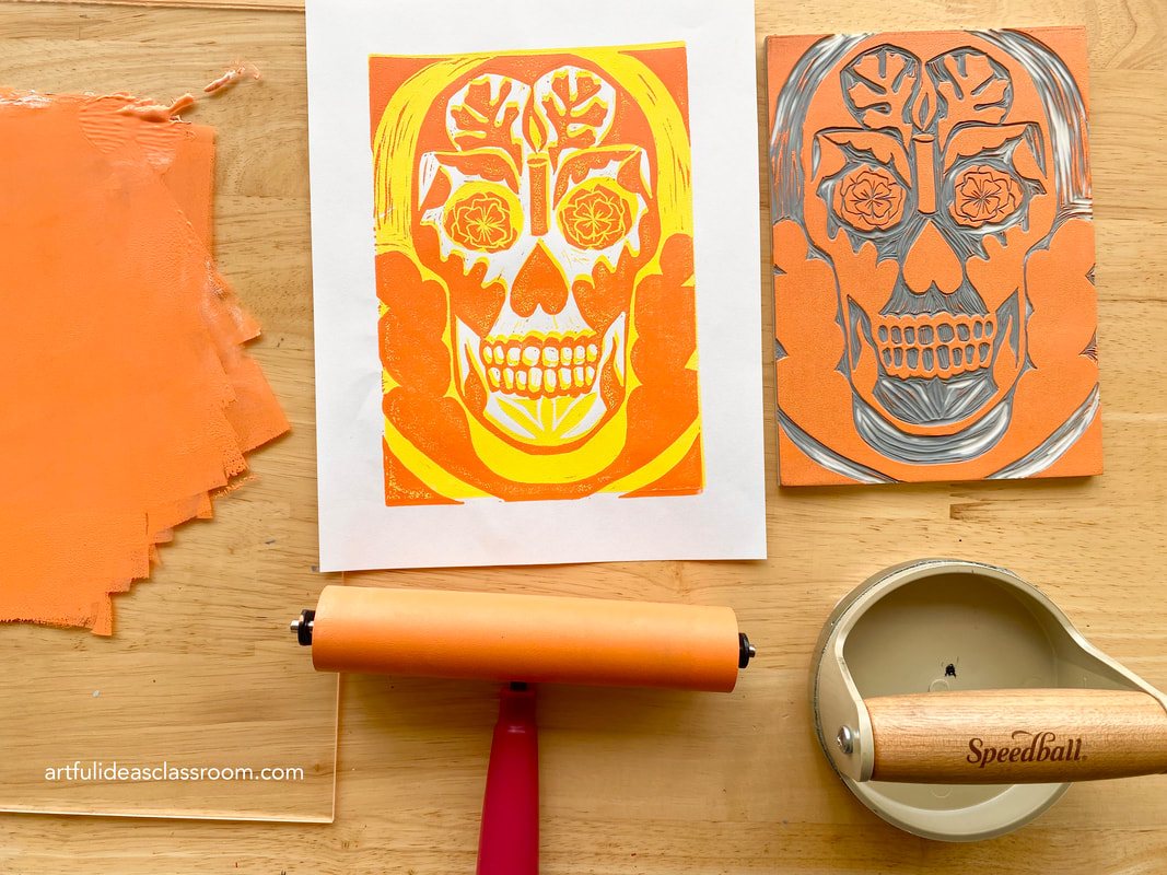 Reduction Printmaking Tips
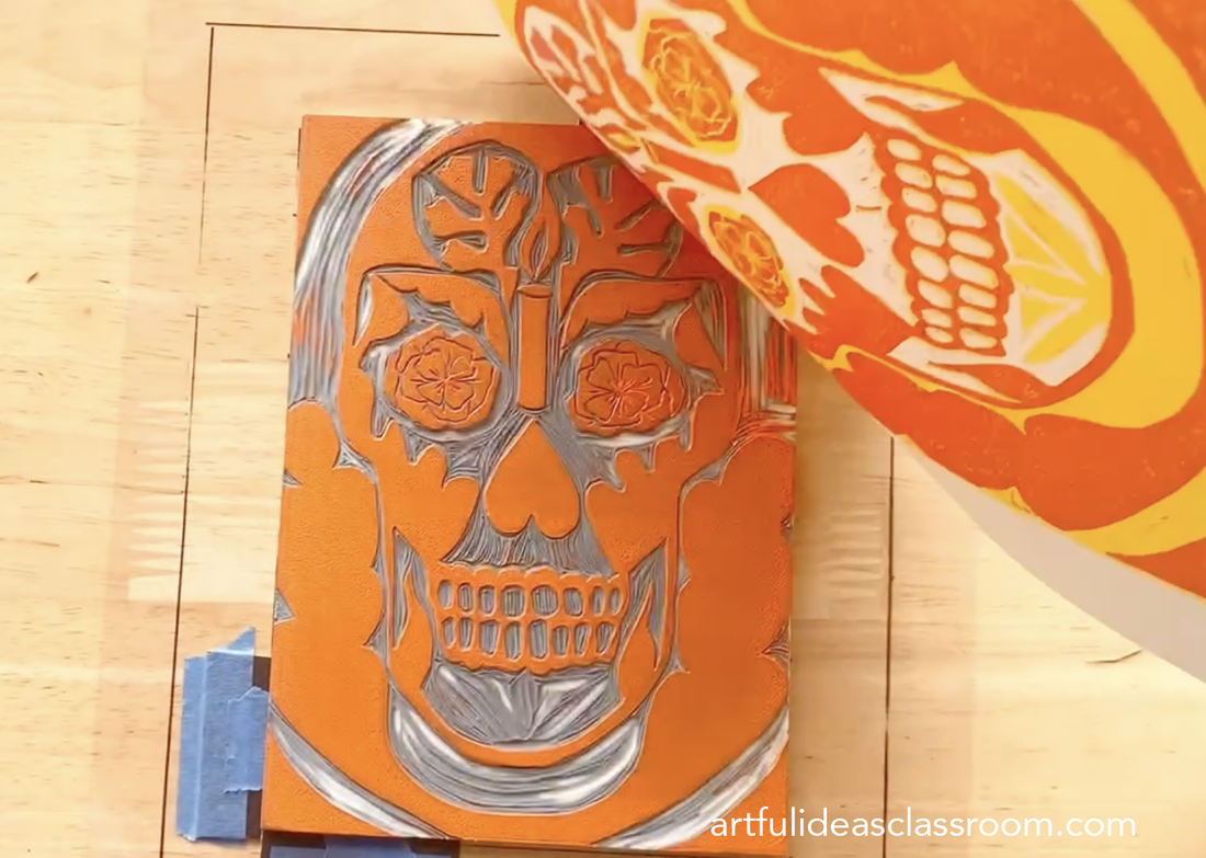 Registration jig made with transparency and cut mat board Connecting to Contemporary ArtI was first introduced to the power of the Mexican printmaking tradition while a student at Mission Gráfica printmaking studio in San Francisco, California. There I had the opportunity to study under renowned Chicano (Mexican-American) printmakers Juan Fuentes and Calixto Robles. The most amazing part of that studio is that like printmaking itself, it is a space accessible to the general public. The classes are on a drop in basis and affordable and the teachers are masters of their craft. If you are interested in visiting Mission Gráfica, it is located in the Mission Cultural Center for Latino Arts in the Mission District of San Francisco. Both Fuentes and Robles employ calaveras in their work and draw from a long lineage of Mexican printmaking traditions from both Mexico and the United States. Including the work of these contemporary artists brings the lesson into the present day and helps students understand how symbols can be reinvented and repurposed to approach contemporary issues in artwork. Both Fuentes and Robles create artworks that address current events and social/environmental issues in their work, much in the tradition of Posada. 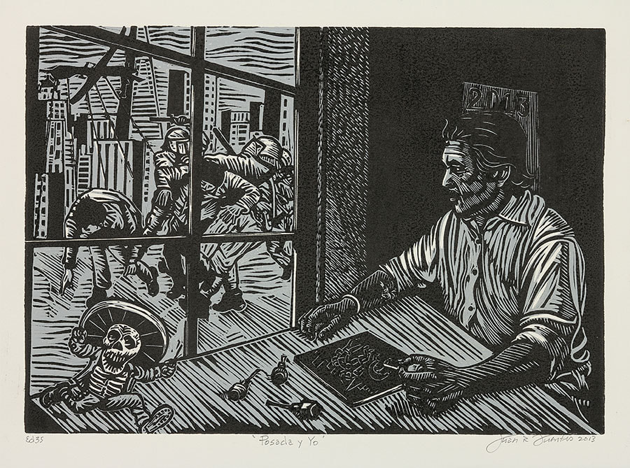 Juan Fuentes, Posada y Yo, linocut 2013, 12” X10” Get Students Thinking About ArtThis lesson, while challenging teaches students about the robust history of Mexican printmaking and the artists who continue that legacy today. Students also learn important studio habits of mind Engage and Persist as they work through a complex process. As the closing part of this lesson students write a reflection about their artistic choices and the meanings their calavera design conveys. They can also do a print exchange with their classmates and take home a variety of images since each student will print an edition of 7-10 prints. The final prints are vibrant and visually complex. If you are interested in the full lesson plan with slideshow and step by step instructional videos it is available on my TPT shop. *some links are affiliate links, as an Amazon Associate I earn a small commission on qualifying purchases. 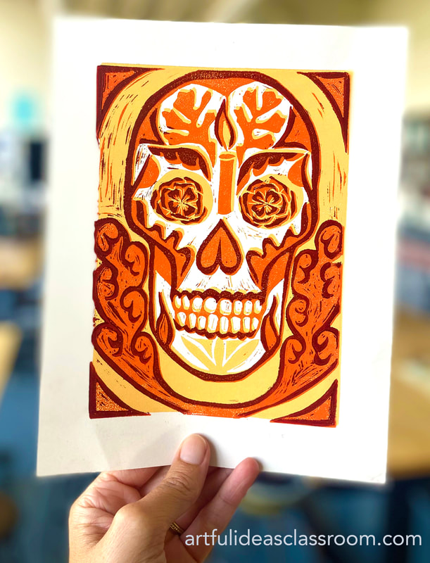 Sketchbook Front Cover IdeasCreating sketchbooks as a first project is a great way to start out middle school and high school art classes. When students design their own sketchbook covers they take ownership over them and each time they take out their sketchbook it is a reminder that they can create art. Designing and creating personalized sketchbook covers is also a great way to assess students' skill levels early in the school year and a way to get to know students and their interests. I love to keep these project prompts open-ended and low stakes so that students can showcase their styles and artistic abilities. I will share 3 easy and imaginative mixed media sketchbook ideas that require minimal prep and encourage creativity. I will also show you my “no-bind” system of creating sketchbooks that students can easily add pages/worksheets to throughout the year. All 3 of these ideas only require the simplest and often recycled art materials: magazines, copy paper, card stock, pencils, markers and glue sticks. To get the full list of the supplies I purchase for these projects, download my *Free* Art Materials Guide. 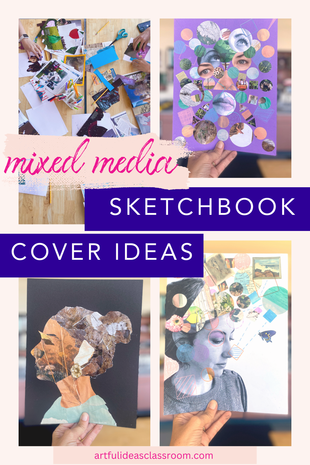 Mixed Media Self Portrait Collage Cover Inspired by Giuseppe ArcimboldoGiuseppe Arcimboldo was an Italian Renaissance artist who is known for his bizarre portraits of the Hapsburg court. Arcimboldo, like many artists of his time, was fascinated with hidden images, puzzles and visual illusions and he created portraits of the Austrian nobility using fruits, vegetables and objects standing in for the various features and volumes of the face. He often included visual puns in his work in the arrangement of the objects and their placement. For example using an “ear of corn” as the actual ear in a portrait. Arcimboldo was classically trained and had a sophisticated understanding of facial proportions and because of this his portraits look uncannily like the subjects even though the style is far from realistic. He also used these portraits as a way to subtly criticize the opulence of the nobles he painted, for example he represented a book collector with his face filled with books, but he also included several dusters to highlight that this wealthy man collected books only to gather dust. I love to share this Art History with students but to also relate this artist with contemporary artist Wangechi Mutu whose mixed media collage work is more closely tied to the medium students will be using for this project. I find that this style of mixed media self portrait is far less intimidating than a realistic portrait and allows students the freedom to express their own interests and offers a clear achievable entry point for beginners. It also allows me to assess some basic skills like using scissors, pencil control/tracing, using glue sticks, recognizing shapes/colors and visual problem solving. 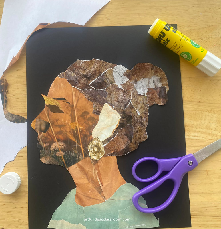 Steps to Creating the Sketchbook CoverI give students two options for getting started on this project. They can either let me take a photo of their face in profile and trace the image or use a generic profile outline that I have available. Both methods can lead to beautiful results, but I try to encourage students to use their own silhouette because it is much more personalized that way. The generic profile is a great option for students who do not want their photo taken or to use their own face and I like to have it available knowing that not all of my students have the same comfort level in art class and I definitely don’t want to exacerbate any discomfort this early in the year. 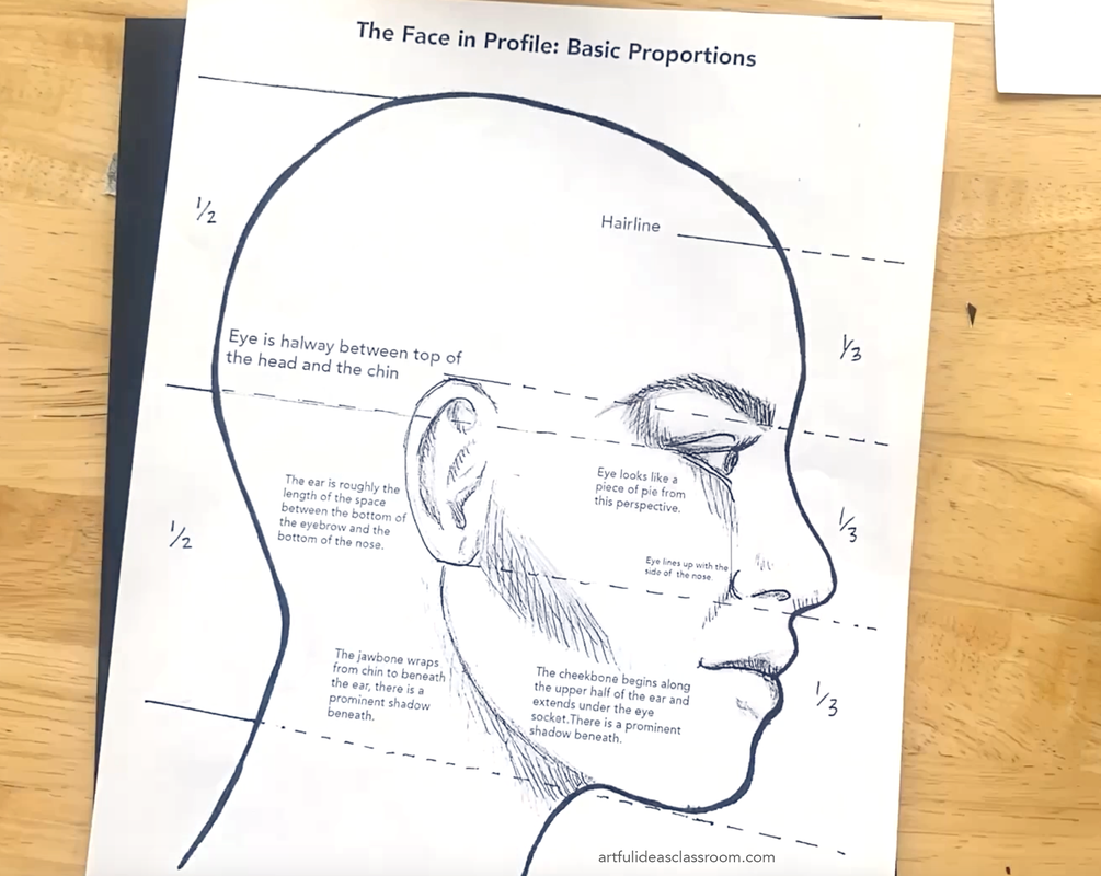 I typically introduce the proportions of the side of the face and students follow along with a simple drawing demonstration. Although they will use the proportions to guide the placement of the objects, there is room for exaggeration and distortion in this project. Following the demonstration I pass out an illustration guide handout (see above) for students to reference when sketching out rough outlines for the features of the face. If students traced their own silhouette for this project they can use their reference photo to guide their sketching. This part of the project is tricky, it is necessary for creating the Arcimboldo style which has a connection to the facial anatomy but some students lean too heavily into this more realistic part of the project and it prevents them from embracing the visual problem solving aspect of this lesson which is to substitute the features for images, shapes and textures. My advice is to demonstrate a very roughly sketched example so students know what to aim for. Also, when students are sketching keep an eye out for students spending too much time on this part of the process and guide them back to your rough sketch example. I have this full lesson up on my tpt store including the slideshow, handouts and step by step instructions. 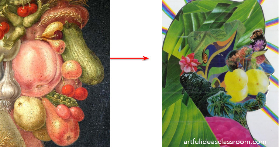 I make a wide variety of materials available for students for this lesson including several types of magazines (Nat Geo, Design/Architecture, Popular Science, Sports) I make sure to look over magazines thoroughly before putting them out to make sure that there isn’t any imagery inappropriate for the grade level of students. I collect these magazines from reuse supply stores in my area, but if you don’t have that available you could ask your school community for donations. I also provide drawing tools: pencils, sharpies, gel pens, colored pencils and markers. Some students prefer to draw all the elements in their design. This is more labor intensive but it comes out beautifully if a student has the dedication to follow through. 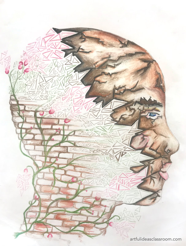 It is important to show a demonstration of how to place images, shapes, colors, and textures into the silhouette to suggest the facial features. I like to show this on my document camera so students can see my hands trying out different arrangements before gluing anything down. I also explain that the face must be built up in layers, laying down the background and layering the features on top. The best method is to wait until the design is mostly figured out before gluing anything down. Because of this I provide each student with a gallon size ziplock to keep all their collage pieces together during the process. Often students will have an object for the “eye” early on only to change it at the last minute when they stumble upon something that just works better for their portrait so waiting to glue is key! These sketchbook covers are incredibly creative and give students the opportunity to work through visual problem solving and to see images, textures and shapes in a new light. They often look like the students themselves and that is so fun to see! Below is a student work gallery showing a variety of approaches to this project. "Open Mind" Collage Sketchbook CoverThis “open mind” sketchbook cover idea originated from images I saw on Pinterest a few years ago. These images depicted a head opening up to reveal a series of images and shapes, some of them are titled "head explosion" but I would rather use the term "open mind" because it relates more to the way artists see the world. I love the metaphor of showing what is inside the head as a sketchbook cover because I always tell my students that their sketchbook is essentially their “brain on paper.” I’ve used this idea in my advanced level drawing and painting classes and students have either used a photo of themselves (they email it to me to print out on regular copy paper) or draw themselves on a separate paper to collage into the cover design. Then students simply cut the top of the head off and position it in another location in the composition. They can make it look like the top is hinging open or blowing off in an explosion. I’ve even had students cut one side of the face and separate it from the other to create the design. The main idea is that the student shows some of their interests or just the style aesthetic they are drawn to by what they choose to include. 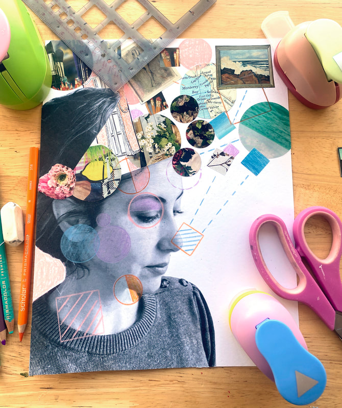 Once again, I encourage my students to wait till the final stages before gluing anything down so they can play with compositions, angles and overlapping to achieve a more dynamic and intriguing cover. Some students like to print images at home to bring in and I will often let students print a few personal images on our classroom printer, keeping it limited to the students own photos and not internet search images. As a final touch students can embellish these designs using the drawing tools. I also provide shape stencils and drafting tools for this stage of the process. The final sketchbook covers are so unique and tell a story about students’ experiences, identity and interests, it is a great way for students to introduce themselves visually to the group! 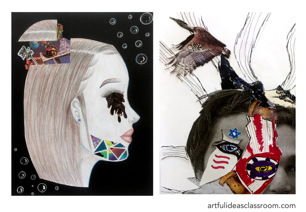 Dada Inspired Collage Sketchbook CoverThe final idea is a Hannah Höch inspired Dada collage cover. Hannah Höch was an influential artist of the Dada art movement in Europe during WW1. This art movement was a reaction to the devastation of WW1 and artists in this movement were interested in countercultural ideas for the time period, including irrationality, the subconscious and free association. Collage was one of the main mediums for this movement, and was called “photomontage.” Hannah Höch often created very fragmented portraits of herself and others, a famous work entitled “ Bouquet of Eyes” (1930) depicts a bouquet of flowers that is full of human eyes cut from magazines, the image is unsettling but also thought provoking.  Hannah Höch, Bouquet of Eyes, 1930 For this sketchbook cover idea it is good to also begin with a printed photo of the student (or a few photos from different angles). As well as magazines, scrap papers, glue sticks, and drawing tools. I like to demonstrate how to create compositional guidelines on the cover paper (marking the center vertical, horizontal and diagonal lines to each corner) these guidelines are helpful for intentionally creating areas of symmetry and asymmetry in the composition. I also like to provide geometric shape hole punches for this lesson so that students can easily cut out shapes to create a complexly layered collage as seen in the work of Dada artists.  The idea of fragmentation is interesting to discuss in a portrait because all of us are in a state of flux as we grow and have new experiences. I like this metaphor for adolescent students especially because it is a stage in life where they are growing and changing so rapidly as they try new activities, meet new friends and discover new interests and passions. Colored card stock makes a great background for these collages and the topic of color can be woven into this activity as students choose which colors they want to use for the project. It might be a good idea to introduce some basic color schemes (complementary, analogous, warm/cool, triadic, monochromatic) so that students have something to reference when choosing colors. Sketchbook Back Cover Design IdeasBut what about the sketchbook back cover...? For the back covers I provide my students with the prompt “the artist’s hands,” students have to show one hand to represent how they use their hands to carry out their creative ideas. Some students include several hands, some include only one. I like to demonstrate how to trace their hands to make simple silhouettes that they can fill with collage or drawings. If students trace these silhouettes in sharpie (permanent marker) it will bleed through the paper and make it easier to cut out later if they collage outside of the lines, they simply turn the paper over and their lines will be visible. 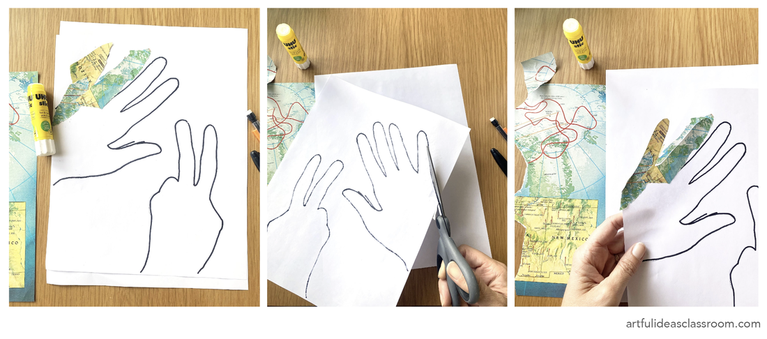 Silhouette Design Sketchbook Back CoverAnother idea for the back cover is to provide printed silhouettes and let students fill them with collage/drawing using the same technique of tracing the outline in sharpie to let it bleed through. I have done this in the past and printed out silhouettes of animals, athletes and anything students express interest in. Students who are more advanced can draw the silhouette themselves as a good observational drawing challenge. 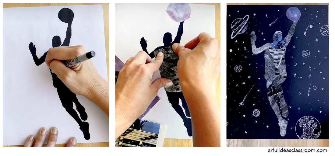 Easy Sketchbook Binding ProcessI love the look of artistically bound sketchbooks, but for my classes I need my students to be able to add pages of different types of papers, add worksheets, handouts and be able to move pages around and organize sketchbooks. So in that way the sketchbook operates more like a binder in my classes. The simple binding solution that I use to accomplish this level of flexibility, is by using a three hole punch and book rings. Students laminate their sketchbook covers and then hole punch them with a three hole punch. I provide a large stack of three hole punched copy paper for sketching that students can add to their sketchbooks right away. Then throughout the year they will add in the various materials studies we do on different types of paper, worksheets, graphic organizers for notes and any personal sketches they would like to add. Their sketchbook is part of their grade and they feature their favorite pages in their final Process Portfolio slideshow. 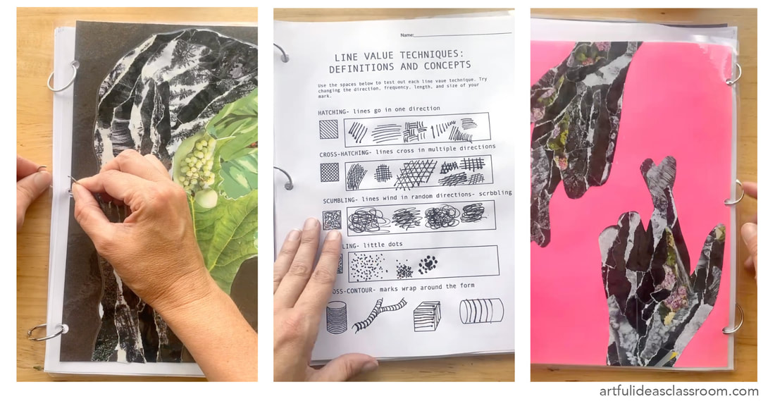 Starting the School Year with Self ReflectionBeginning the school year with this self portrait sketchbook cover project is an excellent way to better understand your students’ artistic perspectives and encourages students to engage in self-reflection. I have observed that this project leaves students feeling confident and proud of what they created and it makes the sketchbook a special personal artifact that students can take with them when they leave the class and continue to use. The artists explored in these lessons come from diverse backgrounds and time periods and this helps students glimpse the scope of art history and contemporary art, making it much more accessible to the beginning artist. I love to point out how centuries after Arcimboldo we are still exploring alternative styles for portraiture and that they are participating in that “artistic conversation” through creating their sketchbook cover designs. 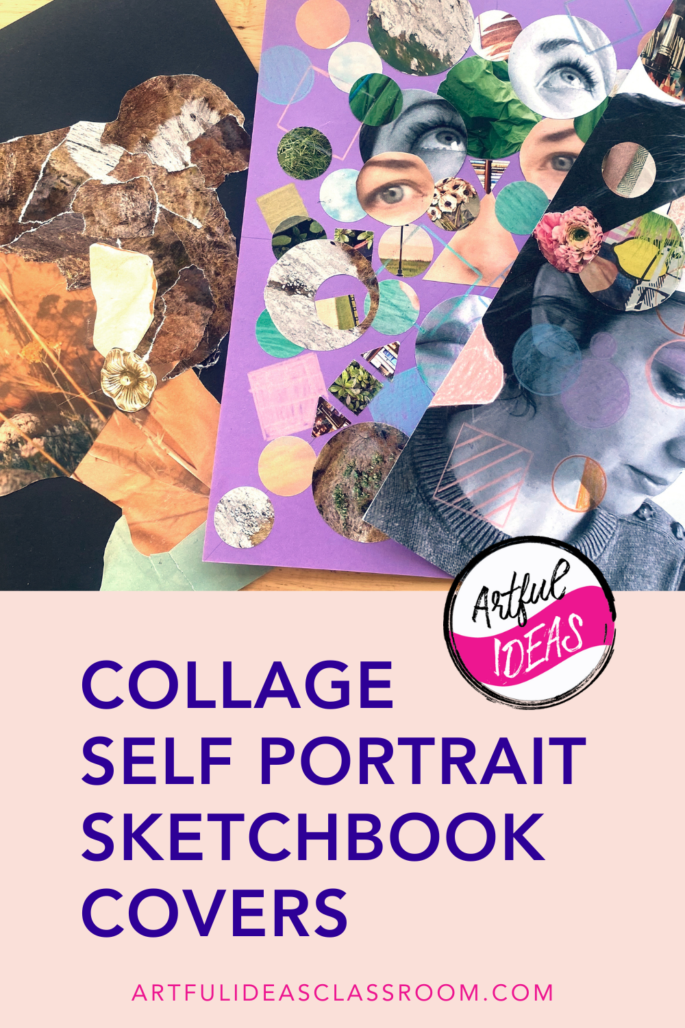 Art Curriculum PlanningLast Spring I was asked to design a curriculum for an honors level advanced studio art class. The class would be one semester long and require a portfolio review to be accepted into the class. The idea would be that the class would prepare students who are interested in creating a college art portfolio. The class itself is too short for students to create a whole portfolio but it would serve as a jumping off point for students and teach them strategies for artistic investigation so they could find themes and concepts that they want to explore in a portfolio. The class would also need to include elements of Art History and Contemporary art as well as research and interpretation of artworks. This is the kind of class that is a DREAM to teach so I immediately said yes and began the planning process. Having previously taught International Baccalaureate Visual Art for 8 years, I immediately thought of this class as a “mini IB Art” class and went back to my IB Art curriculum as a jumping off point. Since IB Art is a two year course and I taught it for nearly a decade I had a lot to work with and it became overwhelming to look through these lesson materials and to condense them down to a semester long course. Also the block periods in my current school site are 20 minutes shorter than at my previous school so there is less class time overall. I knew I needed a better way to sift through these lessons and organize my ideas…my previous system of writing on post-it notes and in random pages in different notebooks was not going to cut it. I wanted to create a template that allowed me to create a mind map, lists and charts of possible units and see the themes, skills/techniques and concepts each unit explores as well as how I would assess the activities and projects in each unit. I got to work sketching out the templates I wanted to create and then used Canva to make the final draft. I know myself and I wouldn’t want to use the template if it wasn’t pretty so I used aesthetic fonts and my favorite pink hues. Free Art Syllabus Planner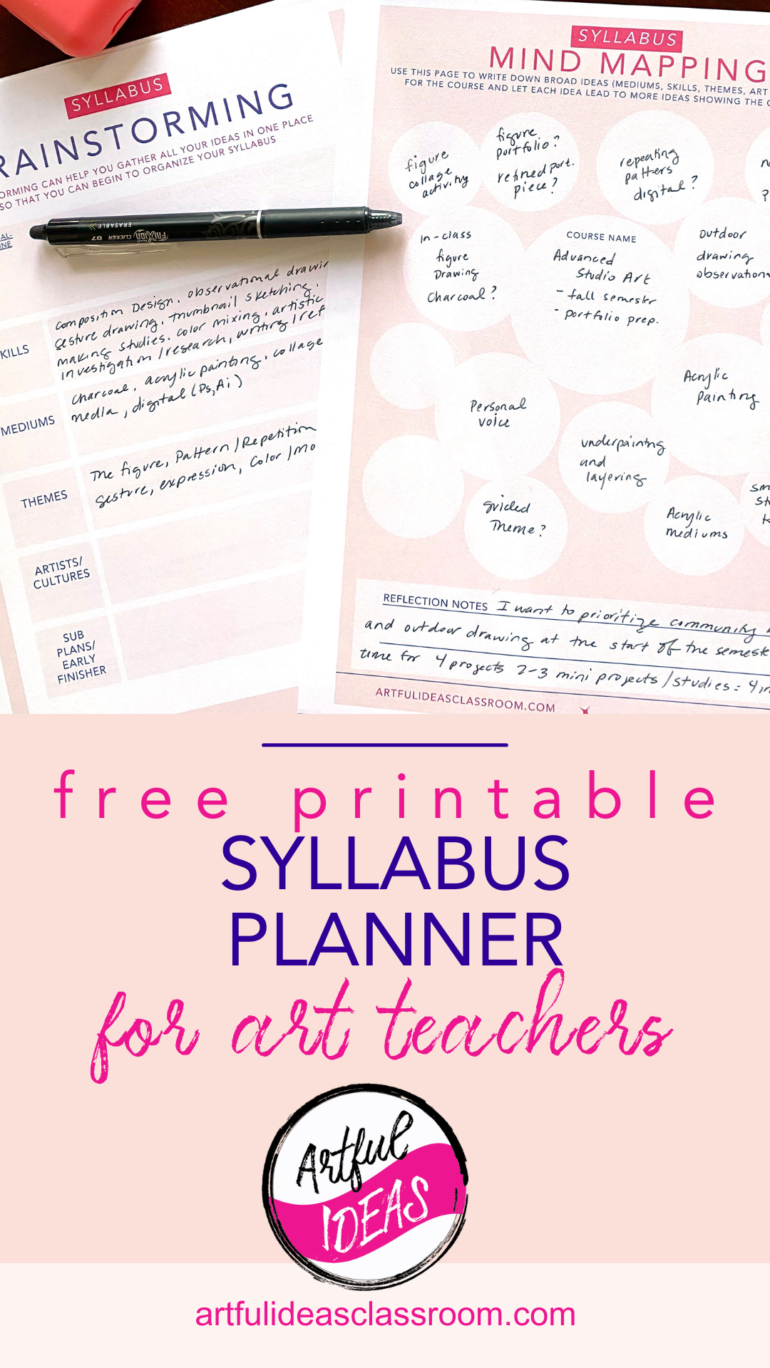 The final Syllabus Planner includes a variety of pages to guide the curriculum planning process from the early stage of mind mapping and brainstorming to deeper thinking with journaling prompts and finally laying out the timeline and actual unit plans. I also included the US National Core Art Standards so that I could make sure my plans were hitting key standards at the advanced level. As a final page I included a page where I could refine my classroom policies/procedures as much has changed in the past few years after returning from online/remote learning. The entire printable (pdf) Syllabus Planner is *free* to download. Mind Mapping and Brainstorming for Curriculum DesignI found that starting with mind mapping really helped me get my ideas down without committing to any of them. The idea of a mind map is that one idea leads into another, so the bubbles on this page connect and branch out from a central bubble which is the class itself. I personally struggle with ambiguity in the planning process and want to get things set as soon as possible, but for this I really wanted to do the opposite to let myself really explore a variety of ideas before creating the unit plans. I even found myself writing question marks at the end of each idea to further highlight that these ideas were just possibilities. There is also a place to reflect at the bottom of the mind map page where I wrote down my priorities for the class and an idea of the structure of the units that came to me while mind mapping. I decided I really wanted to focus on only 4 units or projects and for each unit there would be at least two smaller investigation or skill building assignments before the final project. The Syllabus Brainstorming Page is designed to help organize ideas from the mind-mapping page by breaking ideas up into five categories: skills, mediums, themes, artists/cultures and sub plans/early finisher activities. I used this to help solidify the ideas I had on my mind map into clear categories and it helped me figure out my course guiding goal or through-line. I came up with the goal of “How can I use artistic investigation strategies/practices (studies, sketches, research, material tests) to develop my artistic voice?” Having this guiding question helped me narrow down the unit/project ideas by first asking if they serve that learning goal for students. 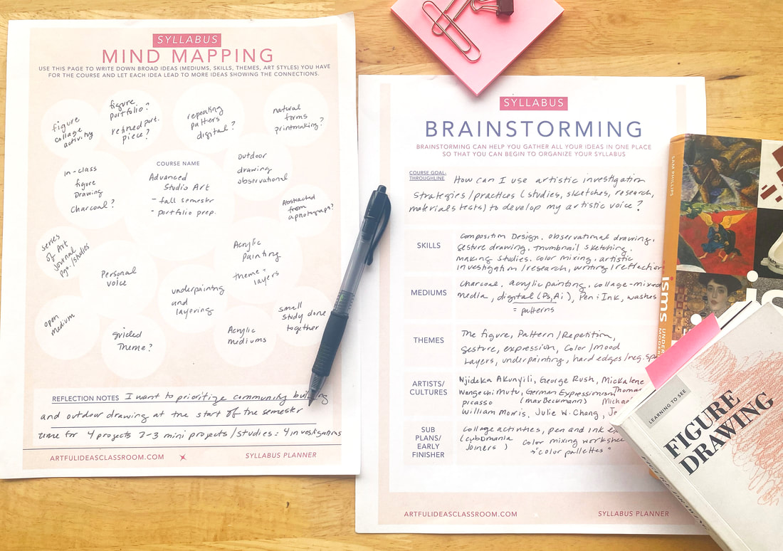 Guided ReflectionThe guided reflection pages have several questions to help consider all the different aspects of the curriculum and student experience of the class. I based some of the questions on the indicators in the National Core Art Standards (USA) as well as my own goals for the class. One of my big goals this year for all of my classes was to include more collaborative and community building activities so I included the question “What collaborative art experiences can be included in the syllabus to promote teamwork and engagement?” Through these reflection questions I came up with some ideas that carried into the course including planning a visit to a local figure drawing studio for a life drawing session with a clothed model, which I researched at this time and had the information ready to go for planning the experience once school began. Doing this reflection gave me time to pause and pull together all the ideas I had brewing in my mind. I think the most helpful part was that this reflection gave me a place to consider the curriculum as a whole and narrow my ideas down to themes/projects that would build on one another and lead my students to the core learning goal of learning how to use an art journal / artistic investigation to develop their ideas and artistic voice. 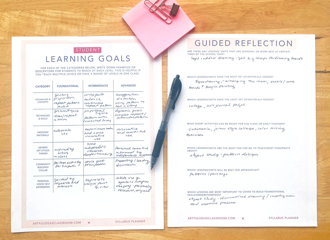 Learning Goals for Art CurriculumTo distill the ideas that came out of the Guided Reflection, I included a page to record the Learning Goals for the class. At our school we create our learning goals or outcomes based on the National Core Art Standards (USA) but we also use the Studio Habits of Mind (Project Zero Harvard) to guide the language of our goals and indicators. It is impossible to cover every standard/goal in every class especially when teaching a semester long course but the Studio Habits of Mind can be incorporated into every project as they follow the creative process closely (Develop Craft, Engage & Persist, Envision, Express, Observe, Reflect, Stretch & Explore, Understand Art Worlds). This Learning Goals planning grid includes three levels of proficiency along the top and six categories along the side: vocabulary/concepts, techniques/skills, mediums/materials, genres/art styles/themes, mediums/materials, community building/collaboration, and personal voice/self expression. When using this grid it is helpful to pick one unit to focus on to fill in the full grid, for example I chose to focus on my unit on Gesture/Figure Drawing. You can print more copies of this and fill in your goals for the other units or even just use this for units that are new to your curriculum. Timeline and Syllabus UnitsMy school uses Google Calendar to record all the school wide events and classes. I find this helpful in the day to day but I can’t visualize the whole year with the month by month format. So to help myself get a sense of the flow of the entire year I created a timeline page where I could mark the start/ end of the semester, grading periods, breaks, and special events. This idea isn’t totally original, this is something my union used to provide at my former (public) school and I always made two copies hung one the bulletin board in front of my desk and glued the other in the inside cover of my planner. I took this new timeline, placed it in a sheet protector and put it on the corner of my desk to reference when working in my planner. Probably the most important part of this Syllabus Planner is the Syllabus Units page. For me as a teacher a unit is a set of lessons that culminate in a larger art project. The unit has a theme, artists/art movements/art history examples, techniques, skill building activities and then finally the project where students can employ the content from all of these lessons in a more creative/individualized form. This planner has blanks to fill in the title of the unit, the themes explored, the media/materials, the number of weeks, the skill building activities planned, and a space to briefly describe what will happen each week of the unit. My units don’t typically last longer than 6 weeks of instruction so I limited it to 6 weeks but there is space to fit a few more weeks at the bottom for teachers who have longer units, I would imagine in classes like ceramics the units might stretch to 8 weeks. This unit planner is not meant to be a place where you flesh out every lesson plan but a brief overview that you can refer back to and adjust as you make your weekly lesson plans. 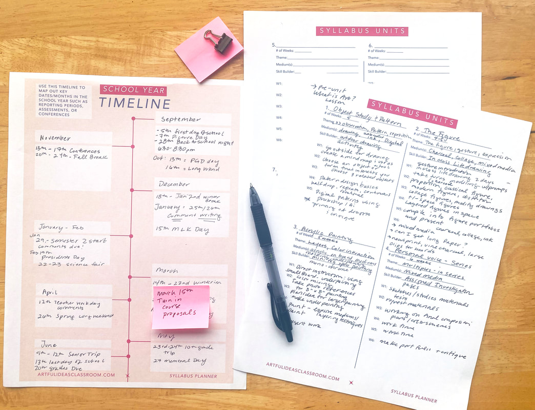 Managing Back to School StressThe start of the school year is always marked with a flurry of activity. I found that my only strategy the past (15) years was to have a random collection of post-it notes and scraps of paper with scribbled lists. This was not ideal to say the least and only added to my back to school anxiety. So I made this Back to School To-Do List page. I kept the to-do list on my desk from the beginning of August (my school starts the first week of September) and everytime I thought of something I needed to do before the start of the school year I jotted it down. For me, materials ordering usually happens mid-August to ensure everything will arrive by September so that is always set as an alarm in my Google Calendar. But there are always the small tasks like cutting paper sheets for the first day drawing activity or buying repositionable labels so students can write their names on the drawer where they will store their work. Even just simple things like making sure I have comfortable shoes to wear at school for teaching. This page becomes a catch all for the random thoughts that can contribute to pre-school year anxiety. I also made a Weekly Planner for the first two weeks of school but it could also be copied and used for the entire school year. This is a place just to write the schedule and a brief description of the plan for each class. I found that it takes me about two weeks to settle into my new class schedule each year so having a look at the first two weeks at a glance really helped me feel more grounded in the new school year. 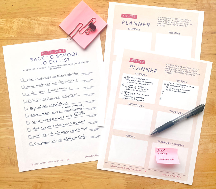 Additional Resources for Curriculum PlanningI included some additional pages in the planner to collect my favorite websites to get inspiration for curriculum design including: Artful Thinking (Harvard Project Zero), Annenberg Learner Art Through Time: A Global View, InThinking IB Visual Arts, Google Arts and Culture, and Tate: Art Terms. I also included a page with each National Core Art Anchor Standard where I could make quick notes about which projects/activities fulfill the standard (generally) as well as a link to the full standards guide at a glance. One of my goals this year was also to organize and align my classroom policies with my school’s revised policies (after returning fully from remote learning.) Some of the main areas that changed were the late work and tardy policies which were much more flexible during the pandemic. I made note of these new policies on this page so that I remembered to add to my new syllabus at the start of the year! 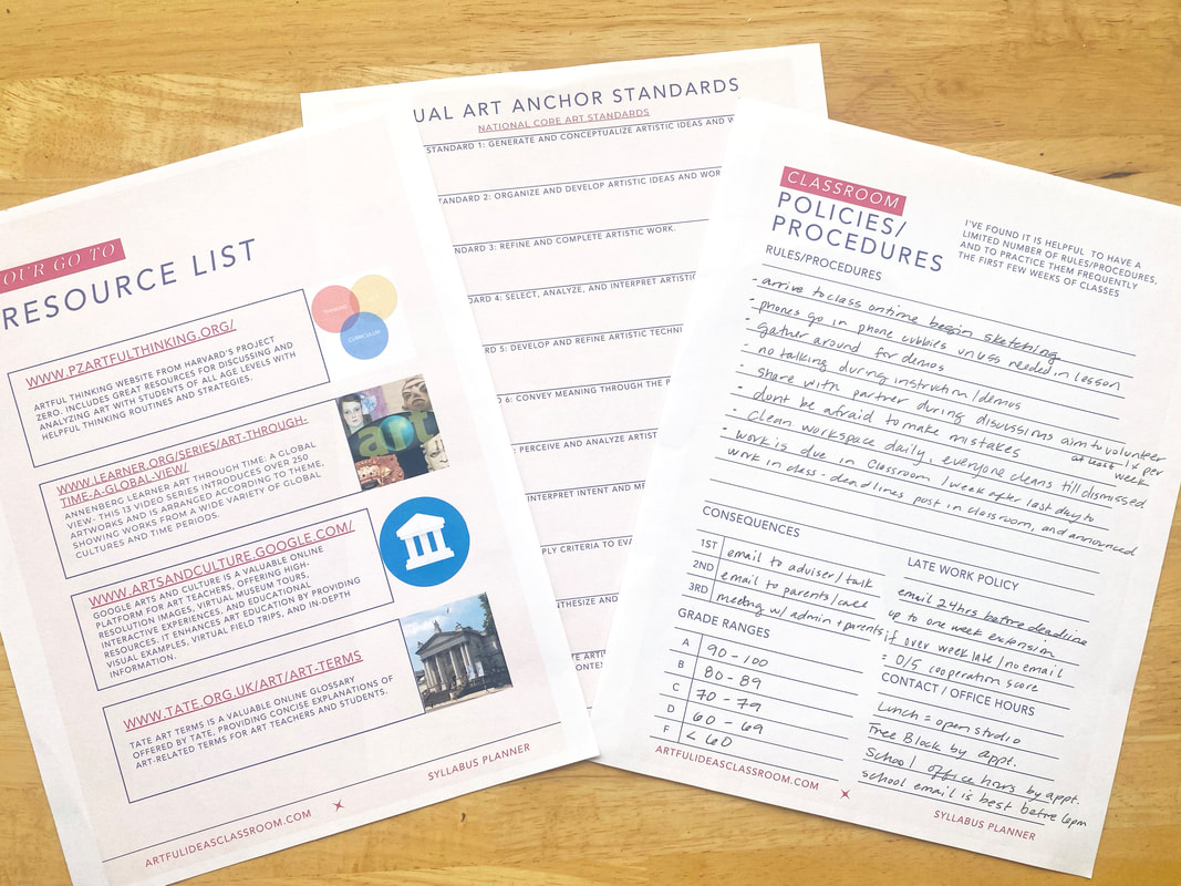 Syllabus Planning Challenge GroupIn late July in 2023 I hosted a Syllabus Planning Challenge. I invited teachers to join via Instagram. To join the challenge, the teacher downloaded my Free Syllabus Planner and joined a daily Zoom meeting where we went through each part of the planner and shared our ideas and questions. We met for three consecutive days. Teachers shared photos of their planning pages via a shared Google Slide presentation. I love using Google Slides for collaboration, we were able to see one another's planning pages and make comments and share links. I’ve never hosted something like this and was a little intimidated but I’m so glad that I just went for it! I met several wonderful educators and a small group of four teachers came to all three zoom meetings and we had the opportunity to really discuss one another’s syllabus plans. I also provided some additional activities and prompts on the Slides including one to make a Pinterest board for each course to save images/links and to make a “mood board” or slide with images related to the activities and projects planned for the course. It was like a mini professional development workshop but a lot more fun! 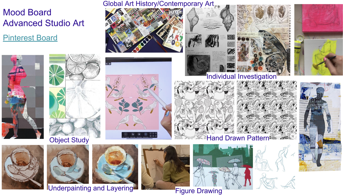 Mood Board for Advanced Studio Art - Images from various artists found on Pinterest Using the Syllabus Planner DigitallySeveral of the teachers in the planning group opted to use the Syllabus Planner digitally rather than printing it out and using a pen or pencil. The ability to quickly erase and zoom in and out on a tablet was an advantage. Since the planner is in PDF form it is easy to use an annotation app to write directly on the PDF pages and save changes. I am far less techie and prefer to write by hand but having it digitally has advantages like being able to share the pdf to other device to have on hand when out buying supplies. 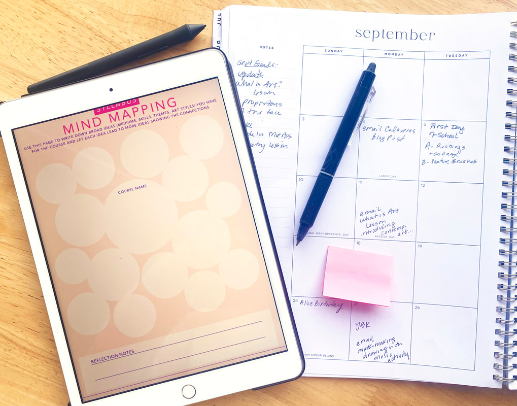 Advanced Studio Art Syllabus Update After all the planning, you might be curious about how the semester turned out. Did the plans work well? What did the final syllabus end up looking like? As the semester comes to an end, I'm pleased to report that it went very smoothly, and we achieved most of what I had initially planned. Some notable moments included our class field trip to a local life drawing studio, where we drew a costumed model (she was dressed as a witch, fitting the Halloween theme), engaging in gesture drawing with students posing for each other in class, and our class critique where students actively participated and provided thoughtful feedback. We also made significant progress with artistic investigation and utilizing art journals to document the creative process. By the end of the semester in two weeks, students will have completed three larger projects along with several studies and journal pages. Although I initially planned for four projects, I believe the time invested in developing artistic investigation skills was a worthwhile trade-off. If you are interested in seeing the completed syllabus the highlighted text is a google drive link to the PDF. 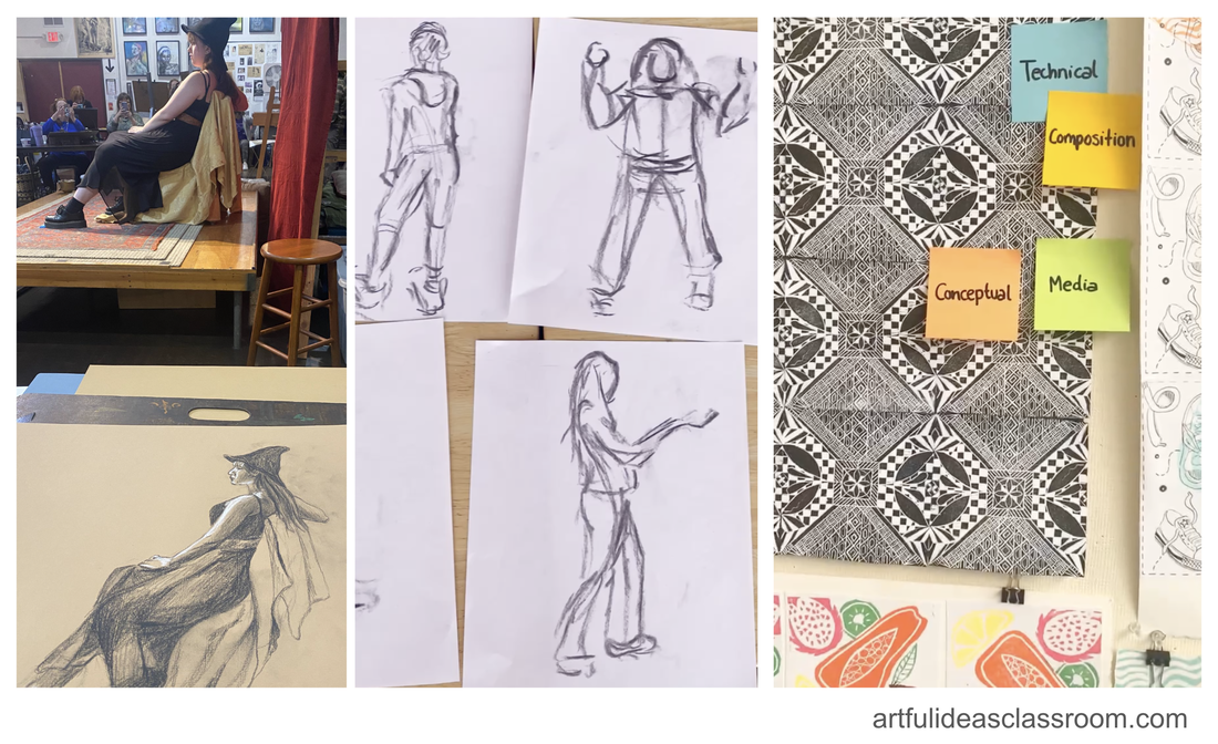 Highlights from the Advanced Studio Art class this semester Art Journal UpdateLearning to use the art journal took longer than anticipated as I needed to find a balance between time spent in the studio working on projects and time dedicated to the art journal. Without the IB expectation (that pages would be submitted to an outside grader), there was less pressure to delve deeper into reflection. In the early part of the semester, many of the art journal pages students submitted lacked depth in content and were somewhat superficial. Students tended to focus more on the visual appeal of the page rather than investing effort in reflection, analysis, and research. Midway through the semester, I guided students in an activity where we compared and contrasted IB Art Journal pages from my former students. We looked at one example that was superficial and another that was rich in content. This comparison allowed students to see how the latter utilized sketches, images, research, and reflection to develop ideas and compositions more meaningfully. Providing them with a tangible example proved to be very beneficial. On the left is an example of an earlier art journal page, and on the right is the result after the compare and contrast activity with examples of IB art journal pages. 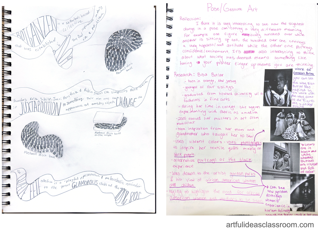 Final Thoughts on Using a Syllabus PlannerIn reflecting on my experience with the syllabus planner, I believe it significantly contributed to the smooth flow of the course. While we did run out of time for the final project I initially planned, we successfully achieved all the learning goals set for the class. The students notably improved in their ability to reflect, conduct artistic research, and provide constructive feedback to each other. The pacing was effective, providing students with a solid foundation for building their college portfolios. Our school conducts surveys for each course, and the feedback for this class was overwhelmingly positive. Teaching became more enjoyable for me as all the details were sorted out at the beginning of the year, consolidating all the necessary information in one place. Surprisingly, writing the actual syllabus document was a breeze, a process I usually find challenging. Looking ahead, I am considering using the planner digitally and making it accessible on my phone for easy updates to my to-do list and checking off tasks on the go. For the next year, I plan to make some adjustments to the class structure, particularly in providing more structure to the figure unit project and allocating less time for the pattern project. Overall, I am very pleased with how this class unfolded this semester. To see how I use this planner step by step click the video link below for a full tutorial!  As an avid admirer of Surrealist painting, especially the works of René Magritte, I've always been intrigued by the unconventional and thought-provoking nature of this artistic movement. Bringing Surrealist techniques into my classroom has been an exciting journey that has revolutionized the way my students engage with creativity and each other. I’m excited to share how I incorporate three Surrealist techniques—Exquisite Corpse, Cubomania, and Frottage—into my lessons to encourage imagination, foster community, and inject a playful spirit into our activities. These techniques have become my secret weapons for breaking free from creative ruts, nurturing collaboration, and making learning a joyfully low-stakes adventure.  Exquisite Corpse Activity for Classroom Community BuildingExquisite Corpse, originally developed by Surrealist artists, is an ideal technique for building a sense of community at the start of the school year. In this activity, students work in teams of 3 or 4, typically at their tables, to create a collaborative creature. Each student contributes a part of the creature by drawing, then folds the paper to hide their contribution, leaving only minimal visual cues for the next person. This process continues until the creature is complete. I love to do Exquisite Corpse on the first or second day of school in all of my art classes as a way for students to get to know one another and tap into their creativity. It is a low stakes activity and students can chat as they draw. I typically have students use 11” X 17” photocopy paper and colored markers and discourage the use of pencil so that students have to commit to the marks they make (here is my full art materials guide with links to everything I purchase for my classes). The Surrealists were champions of free-association and spontaneity in art making so I tell my students not to overthink the process. 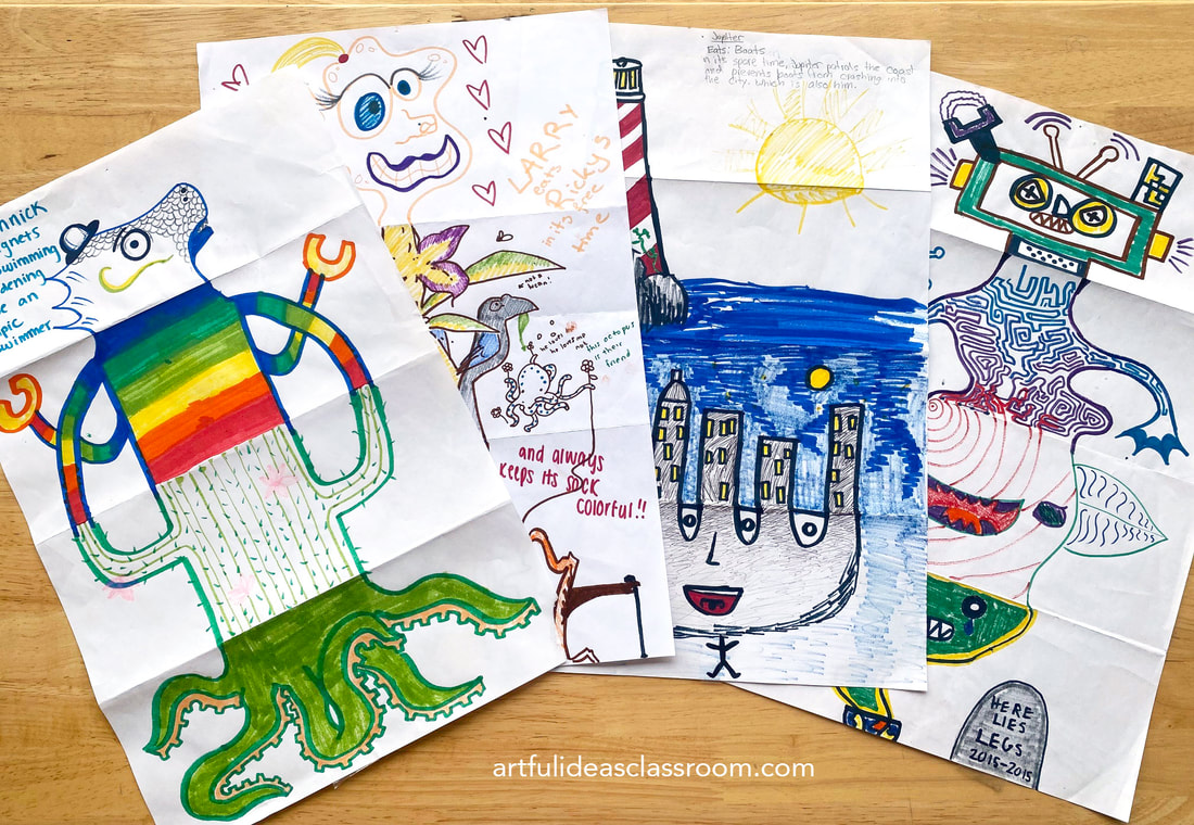 To extend the activity, students engage in character development by writing information about the creature they created, including its traits, background, life's goal and name. This additional step adds depth to the collaborative artwork and encourages students to exercise their individual creativity while working together toward a shared goal. It also gives students a chance to be silly and playful together. Typically, during this phase of the activity, my class bursts into spontaneous fits of laughter. Cubomania: Encouraging New Perspectives on Colors and Textures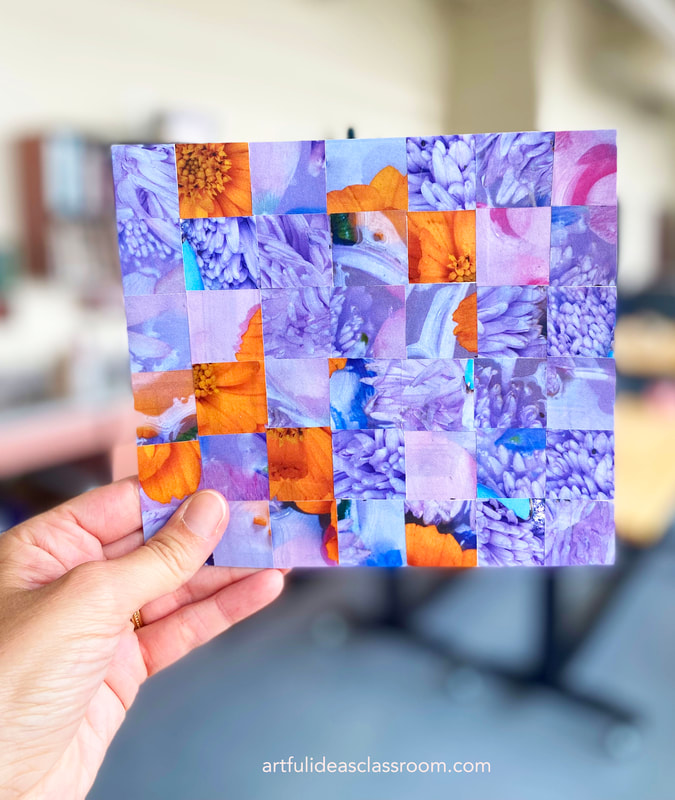 Cubomania is a technique that challenges traditional perceptions of reality by disassembling and rearranging images or elements. In the classroom, it can be utilized as a powerful sketchbook exercise to inspire students to observe colors and textures in a fresh way. To begin, students select images—such as photographs, magazine cutouts, or prints—that capture their attention. They then cut these images into irregular shapes of varying sizes. By rearranging and gluing the shapes onto a blank page in their sketchbooks, students create collages that reinterpret the original images. This exercise prompts them to explore new connections between colors and textures, fostering experimentation and novel insights. 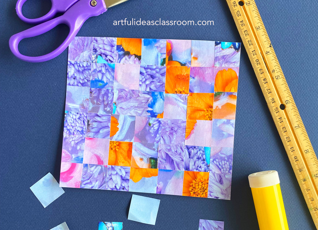 The resulting collages from Cubomania can serve as excellent reference images for future projects, such as colored pencil drawings. Students can draw inspiration from their collages, exploring different color schemes and incorporating the textures they discovered during the exercise. Frottage: Interactive Texture Exploration and Understanding Pictorial Space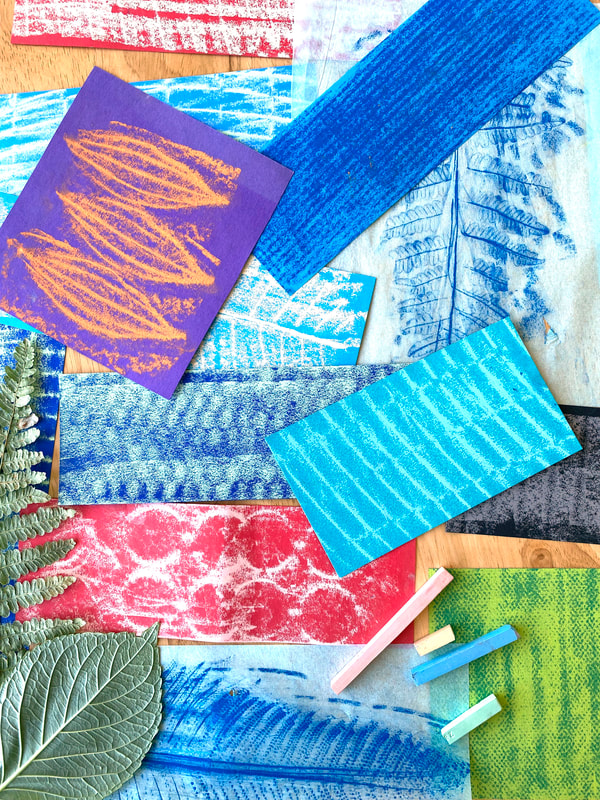 Frottage, a technique involving the creation of rubbings from textures or objects, offers a hands-on approach to exploring textures and developing an understanding of pictorial space. To engage students in texture exploration, provide them with soft pastels, different types of paper, and encourage them to actively seek out interesting textures within the classroom or school environment. By placing paper over these textured surfaces and rubbing the pastels, students can create texture rubbings that capture the unique patterns and qualities of the surfaces they encounter. 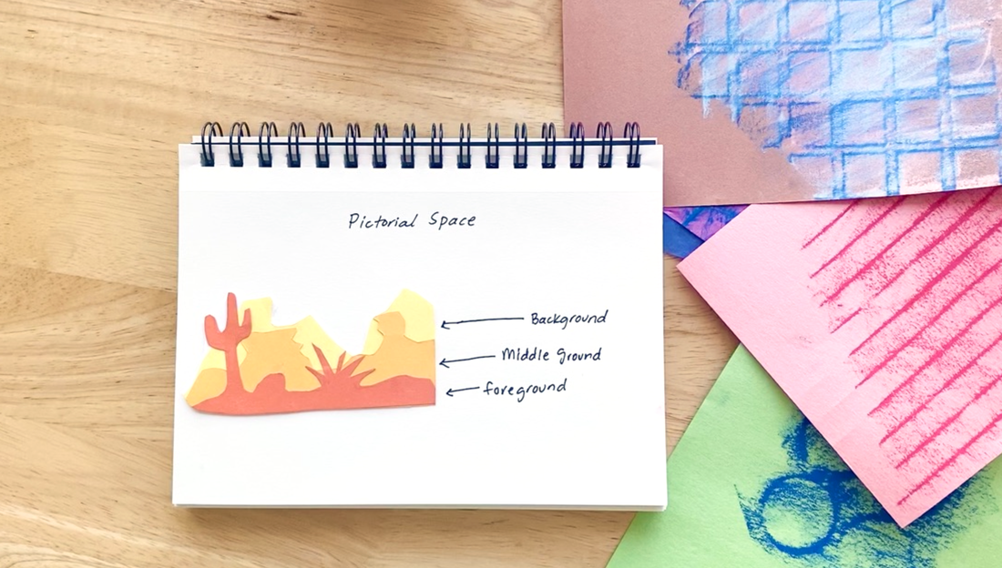 Building upon this, introduce the concept of pictorial space by explaining the foreground, middle ground, and background. Students can then create landscape collages using their texture rubbings, arranging them in a way that depicts different layers of pictorial space. This exercise combines tactile experiences with a deeper understanding of composition and spatial relationships, allowing students to create captivating collages that showcase their textured landscapes. 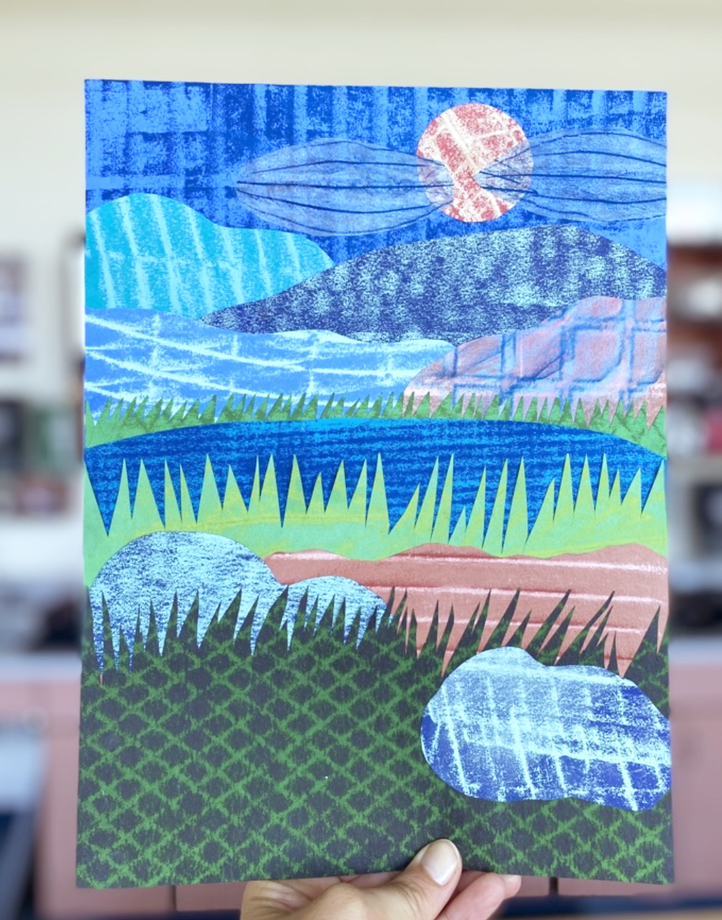 By integrating Surrealist techniques like Exquisite Corpse, Cubomania, and Frottage into the classroom, educators can foster creativity, encourage collaboration, and engage students in meaningful ways.
Embrace the potential of Surrealist techniques in your classroom and witness the transformation as students unleash their creativity, expand their horizons, and develop a deeper appreciation for the power of art. |
AuthorI'm a high school/middle school art teacher with 16 years of experience. I'm here to help art teachers free up more time and space in their lives through lesson ideas and ready to go content rich, engaging curriculum. Categories
Syllabus Planning
Sketchbook Covers First Day of School Avoid Teacher Burnout Digital Self Portraits Surrealist Techniques Features of the Face Bilateral Mirror Activity Gees Bend Art Lesson Arts Assessment Favorite Fall Lessons Chicano Artists Art Materials Guide IB Process Portfolio What is Art? Pattern Design Figure Drawing |


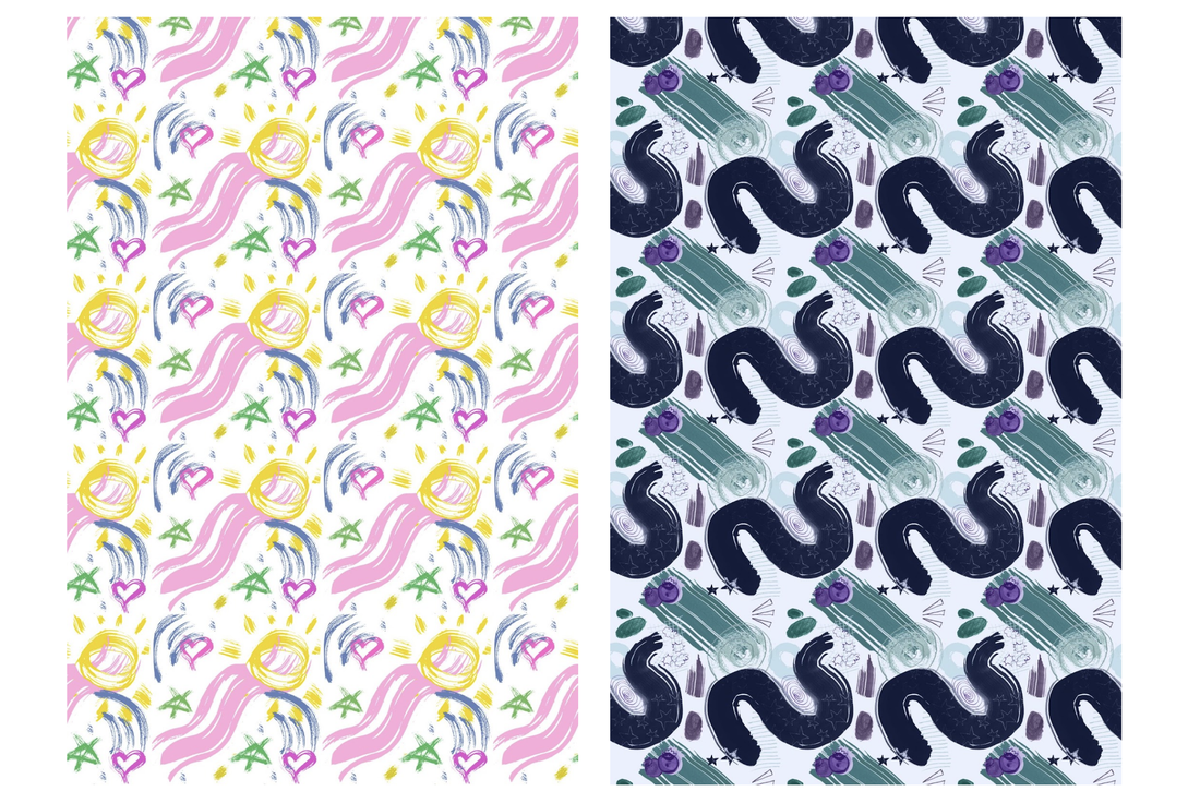
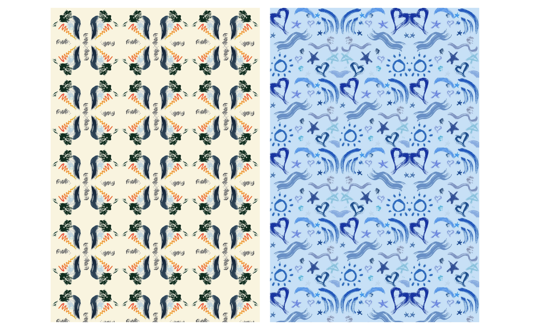
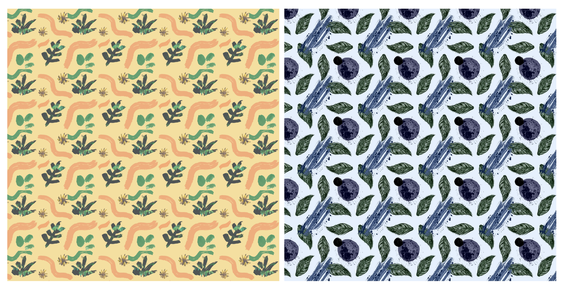
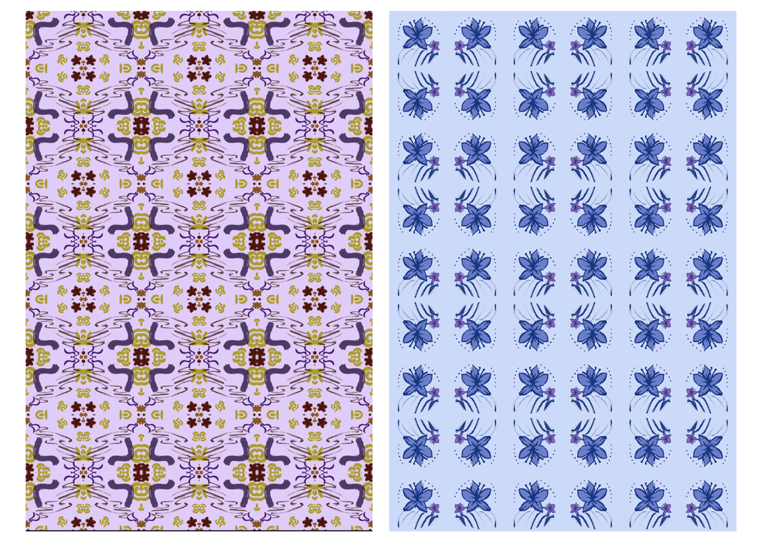
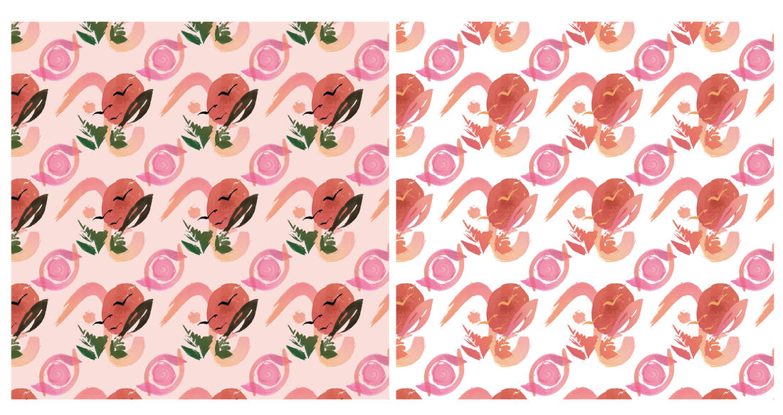
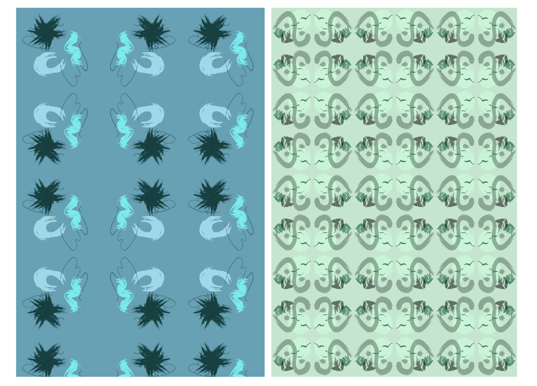
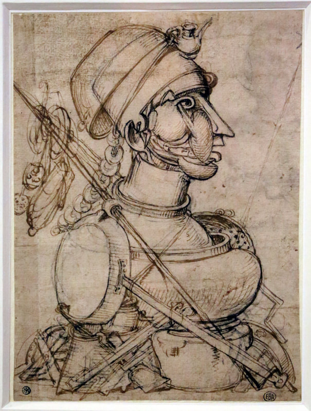
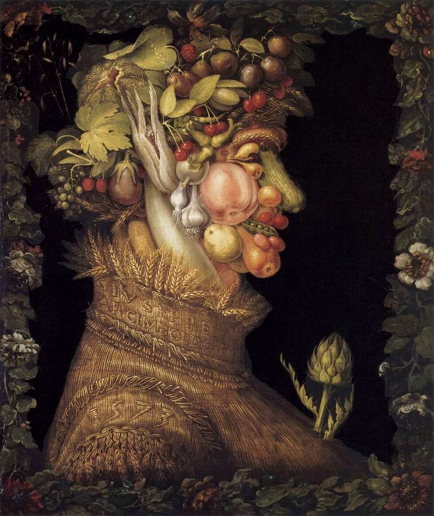
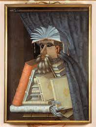
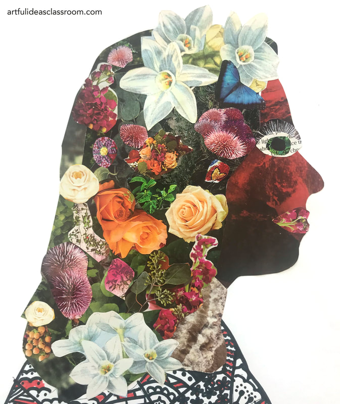
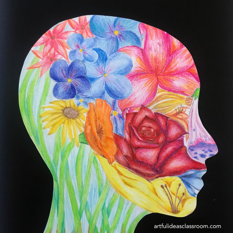
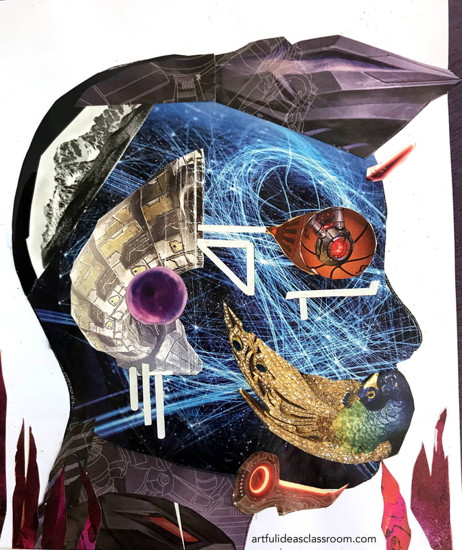
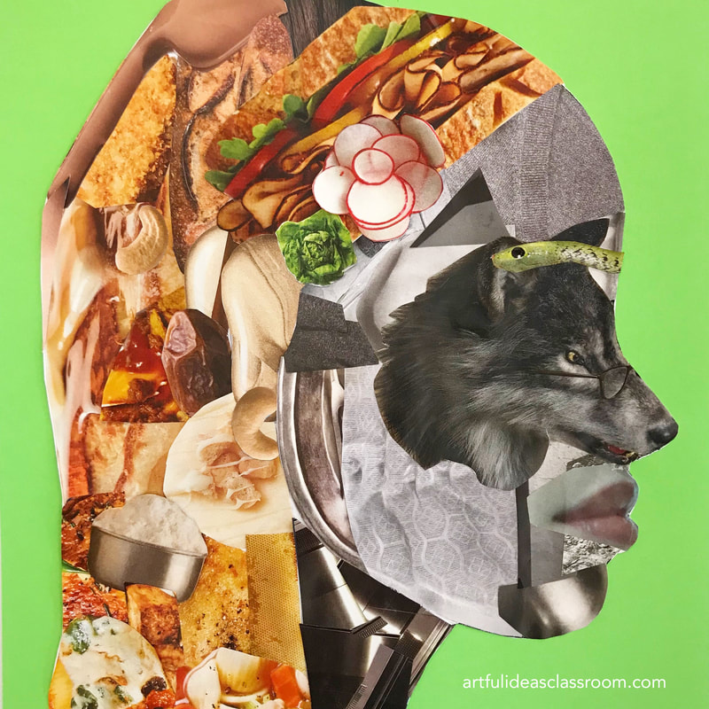
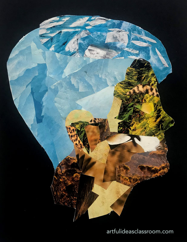
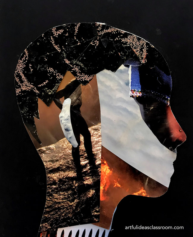
 RSS Feed
